Plus Blocks
Blocks, pages and whole sites you can copy
Every block is a finished page section that works in four styles, light and dark. Browse a ready-made site, open any block, and copy what you need.
- blocks
- 105
- sites
- 7
- pages
- 53
- styles
- 4
Sites
Linked pages with one navbar, footer and style. Click through them like a real site.
 8 pages
Tessaly
Product analytics SaaS — landing, pricing, company, blog, changelog and contact.
 7 pages
Halftone Atelier
Independent product design studio — home, work, a case study, services, studio, contact and journal.
 17 pages
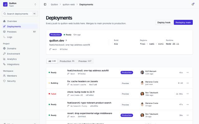
Rivetlane app
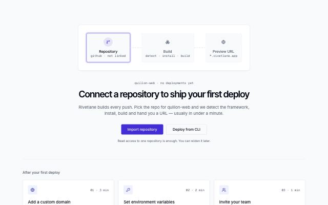
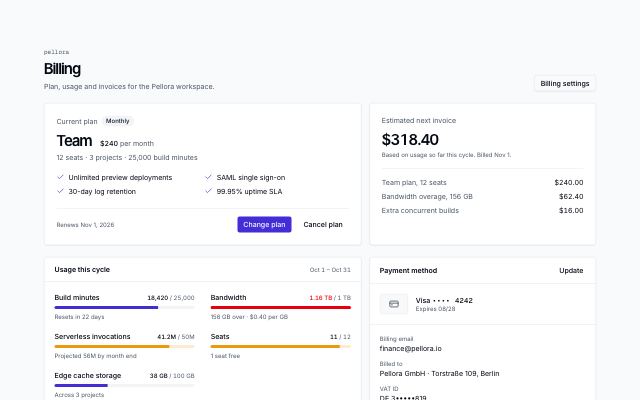
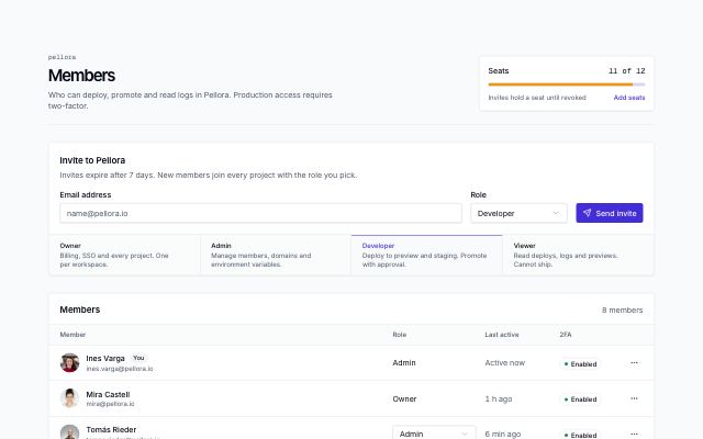
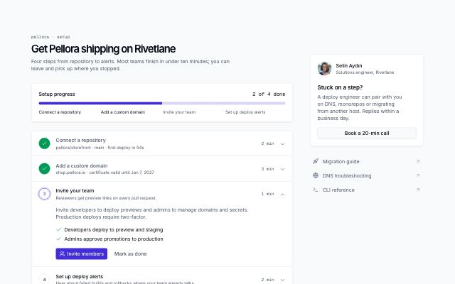
Deploy platform app screens — sign-in, two-factor, first run, deployments, dashboard, settings and billing.
 9 pages
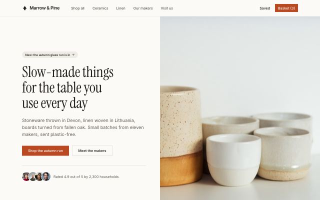
Marrow & Pine
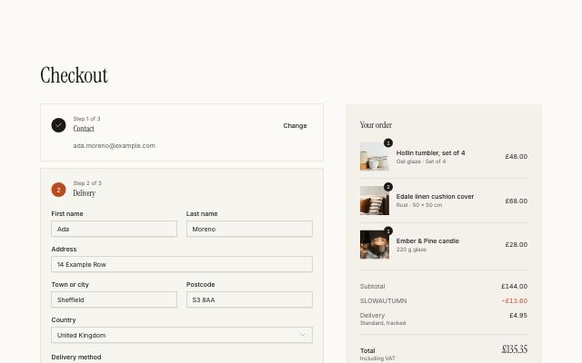
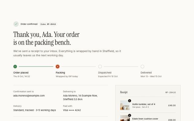
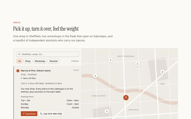
Independent home-goods store — home, shop, product, makers, basket, checkout, order, saved and stores.
 6 pages
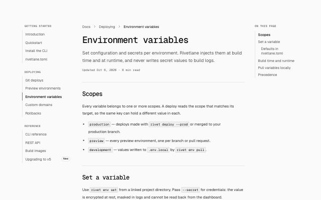
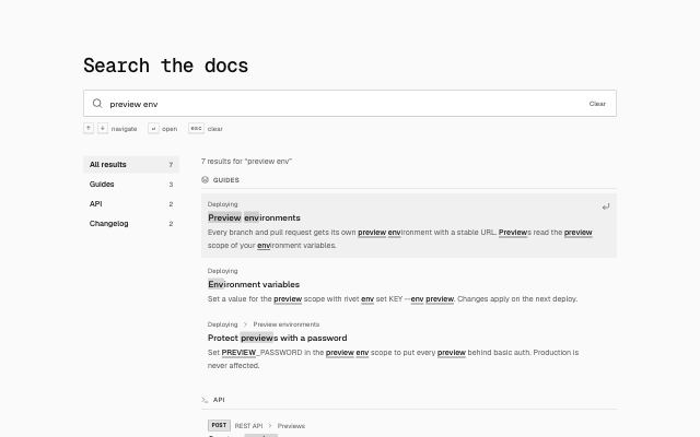
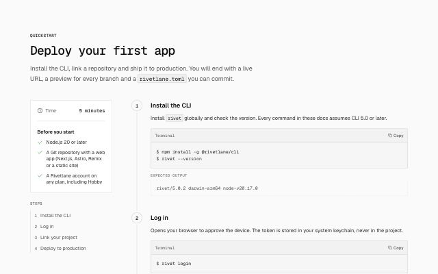
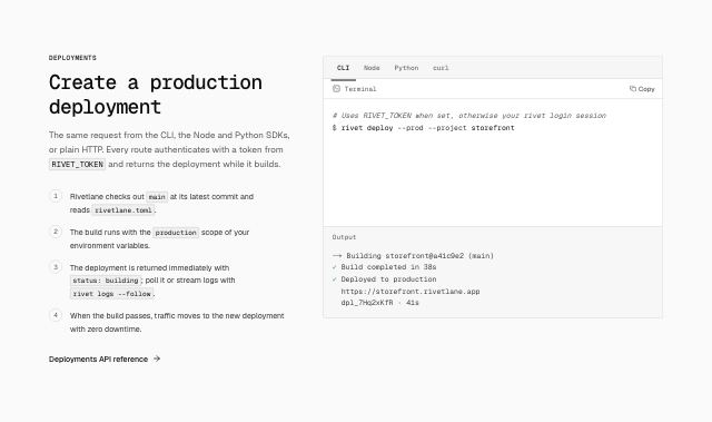
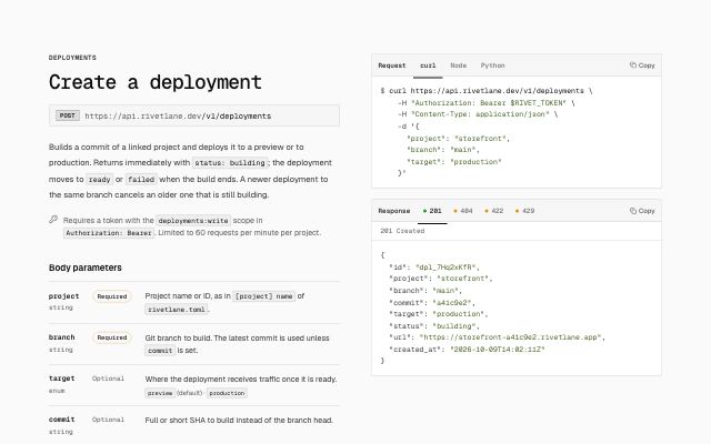
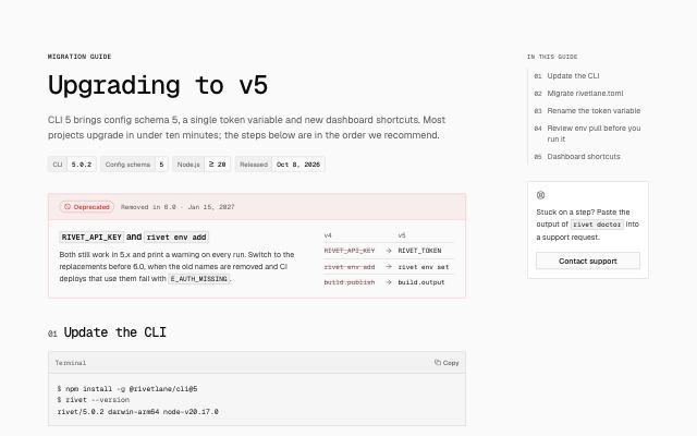
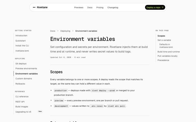
Rivetlane docs
Developer docs — guide, quickstart, API reference, code samples, search, upgrade guide and changelog.
 4 pages
Wisplight
AI assistant for teams — landing, chat, new chat and pricing.
 1 page
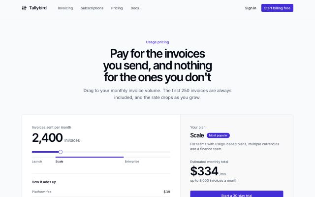
Tallybird
Billing platform — pricing with usage estimate, comparison and FAQ.
Blocks
Each one is shown in the style of a site that uses it. Open it to switch style, theme and width.
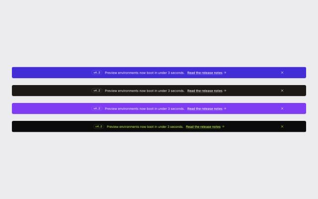
navbar · 4
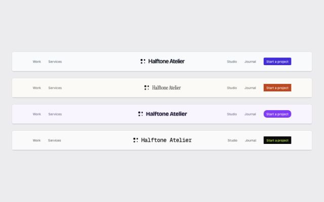
Navbar with a centered wordmark
editorialAn editorial masthead: a display-type wordmark on the center axis, links split either side and the actions pinned to the far right.
In Halftone Atelier
Floating pill navbar
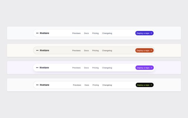
monoA rounded bar inset from the page edges on the style's surface, with the logo, compact centered links and a single action.
In Rivetlane docs
Navbar with a product mega menu
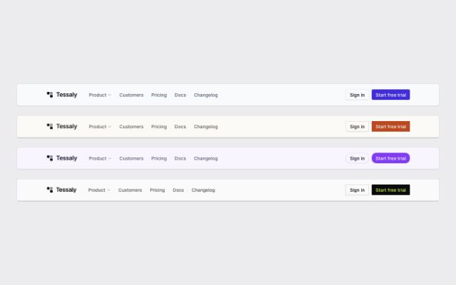
productA product menu that opens a wide panel of grouped links with icons and one-line descriptions beside a featured story, next to plain links and two actions.
In Tessaly
Navbar with simple links
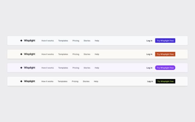
editorialLogo and a short row of links on the left, sign-in and a primary action on the right; folds into a sheet menu on small screens.
In Marrow & Pine, Wisplight, Tallybird
hero · 6

Centered hero with a bleeding product screen
productLarge centered headline over a wide, slightly tilted product screen that runs into the next section, with a logo row beneath.
In Tessaly
Editorial hero with oversized type
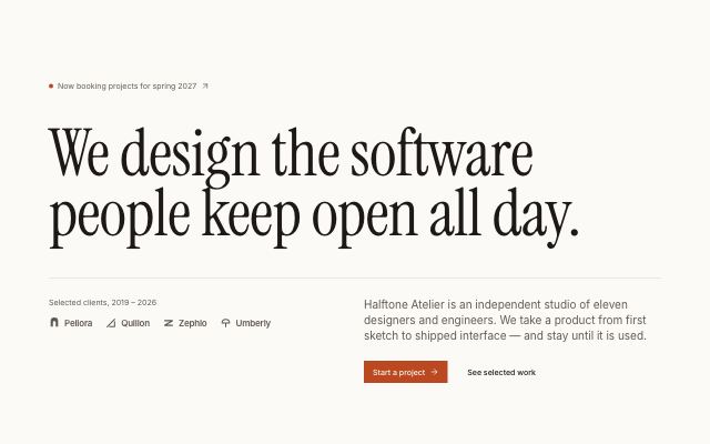
editorialA display headline that spans the whole container, with the description and actions set off-center beneath a hairline rule and an optional client row.
In Halftone Atelier
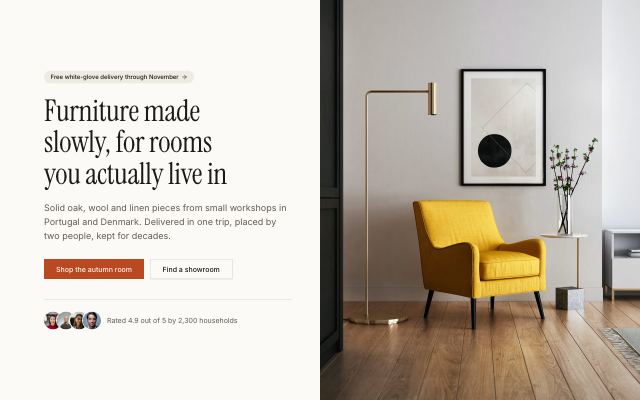
Split hero with a bleeding photo
editorialHeadline, copy and actions on the left; a large photograph filling the right half of the section to its edges, with an optional avatar proof line.
In Marrow & Pine
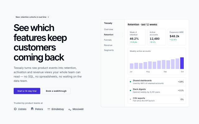
Hero with product screen
productHeadline, supporting copy and two actions beside a live product screen, with a customer proof row.

Hero with a video poster
productHeadline and copy set side by side above a wide video poster with a play control and caption, followed by a customer logo row.
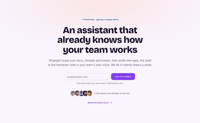
Waitlist hero with inline email form
studioCentered headline with an inline email field and submit button, a privacy note, and an avatar stack with a waitlist count.
In Wisplight
logo-cloud · 3
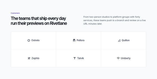
Customer logos in a tile grid
productA short heading and note above five to eight customer marks, each centered in its own tile of a hairline grid.
Scrolling customer logos
productA centered label over a slowly drifting row of customer marks with faded edges; it pauses on hover and stays still for reduced motion.
Customer logo strip
productA short label beside a single row of five to eight monochrome customer marks, framed by hairlines as a thin band between sections.
In Tessaly
feature-bento · 2
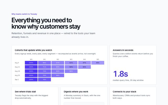
Feature bento with live visuals
productFive capability tiles, each proven by a live visual — a cohort heatmap, a funnel, a Slack digest, integrations and a headline metric — instead of icons.
In Tessaly
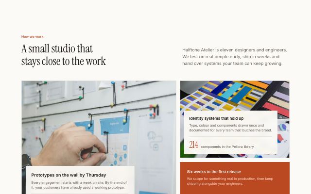
Feature bento as a photo mosaic
editorialFive tiles in an asymmetric mosaic: cells with a photo fill their tile and carry a caption card with their proof, the others show a metric, funnel or logos on a solid tile.
In Halftone Atelier
feature-split · 3
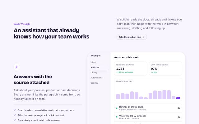
Alternating feature rows
studioA section heading over two to four feature rows, each with its own heading, text, bullet points and a product screen or photo, alternating sides.
In Wisplight
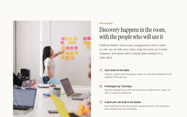
Capability list beside a photograph
editorialA headline and a ruled list of two to four icon-led capabilities next to a tall captioned photograph; the photo can sit on either side.
In Halftone Atelier
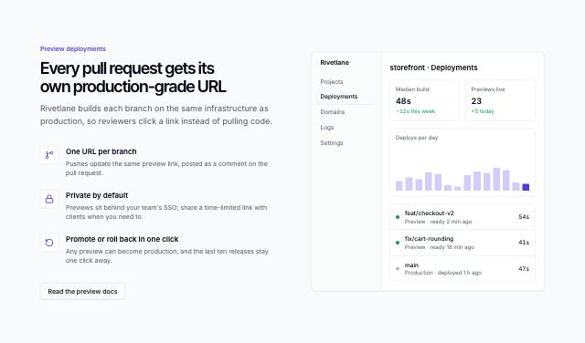
Feature list beside a product screen
productA headline and two to four icon-led capabilities next to a live product screen; the screen can sit on either side.
In Tessaly
feature-grid · 3
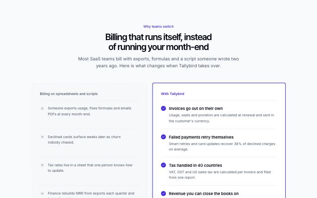
Before and with the product
productTwo aligned columns: the old way in a recessed dashed panel with neutral marks, and the same jobs done with the product on a highlighted surface.
In Tallybird
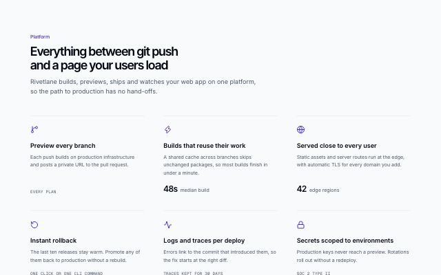
Capability grid with icons
productA headline over three to six capabilities in a three-column grid, each under a hairline with an icon, a line of copy and an optional figure.
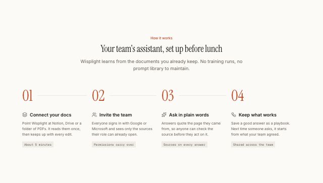
How it works in numbered steps
editorialA centered headline over three to five steps with large display numerals joined by a rule, across the row on desktop and down the side on phones.
In Halftone Atelier, Wisplight
feature-tabs · 2
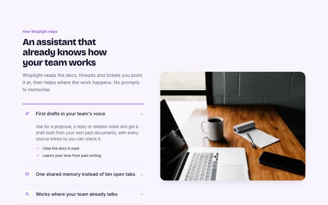
Capabilities accordion with media
studioAn accordion of capabilities on one side; the open item's photo or product visual fills the other. On small screens the visual opens inside the item.
In Wisplight
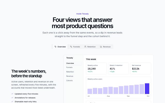
Capabilities in tabs with a product visual
productA tab strip switches between three or four capabilities; each shows its own copy beside a product screen, chart, funnel or cohort panel.
stats · 2
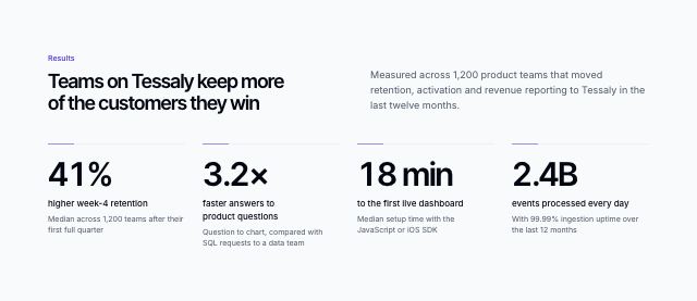
Metric band with sourced numbers
productA short headline over three or four large figures, each on a hairline with its label and a line saying where the number comes from.
In Tessaly
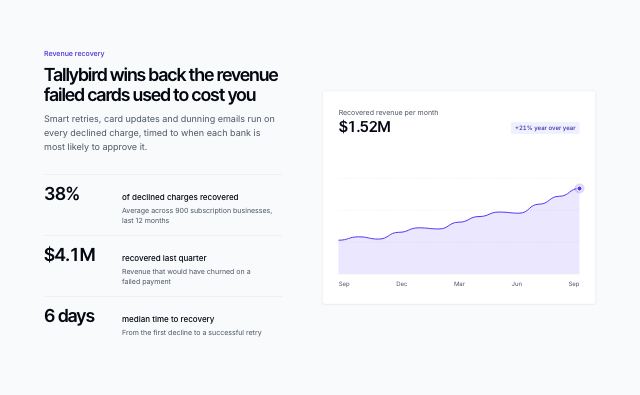
Metrics beside a trend chart
productA headline and three or four sourced figures in a ledger beside an area chart of the trend behind them.
In Tallybird
integrations · 2
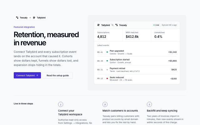
Featured integration story
productOne integration told as a story: paired brand marks, headline and actions beside a live sync panel, numbered setup steps and related connectors from the same category.
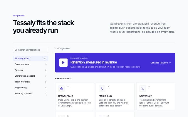
Searchable integrations directory
productEvery integration as a mark tile with a one-line summary, grouped by category, with a search field and category filter in a sticky sidebar and the featured integration on top.
testimonial · 4
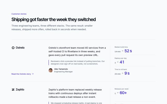
Customer stories with before-and-after metrics
productTwo or three customer stories as ruled rows: company logo, a short narrative with a pull quote, two or three before/after metrics and a link to the full story.
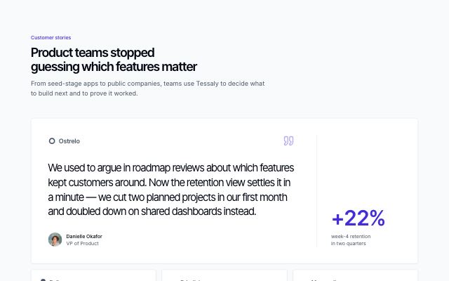
Featured customer quote over a quote grid
productA large featured quote with the customer's logo, photo and an outcome metric, followed by two or three shorter quotes in cards.
In Tessaly
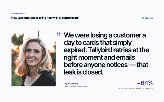
Single customer quote in display type
productOne customer quote set very large beside a tall portrait, with the customer's name, role, company logo and an outcome metric.
In Tallybird
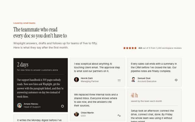
Wall of customer quotes
editorialA heading with an aggregate rating over six to ten customer quotes of mixed length in masonry columns; quotes can lead with an outcome metric.
In Halftone Atelier, Wisplight
case-study · 2
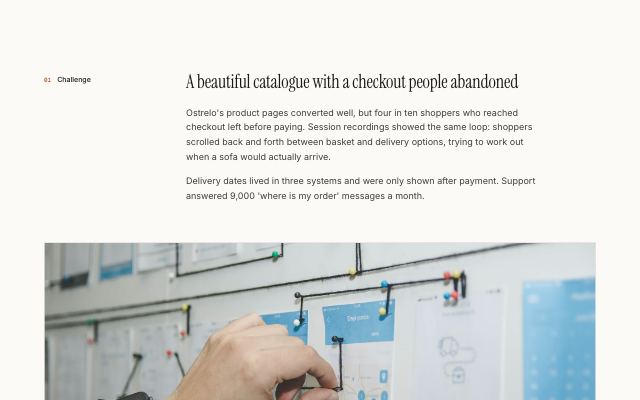
Case study story with gallery and pull quote
editorialThe body of a case study: numbered challenge, approach and result sections in editorial rows, broken up by a wide photo, a captioned image grid and a large client pull quote.
In Halftone Atelier
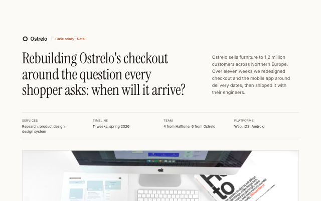
Case study header with outcome metrics
editorialThe top of a case study: client mark, a long headline beside the summary, engagement facts, a wide cover photo and three or four outcome metrics lifted onto its edge.
In Halftone Atelier
portfolio · 2
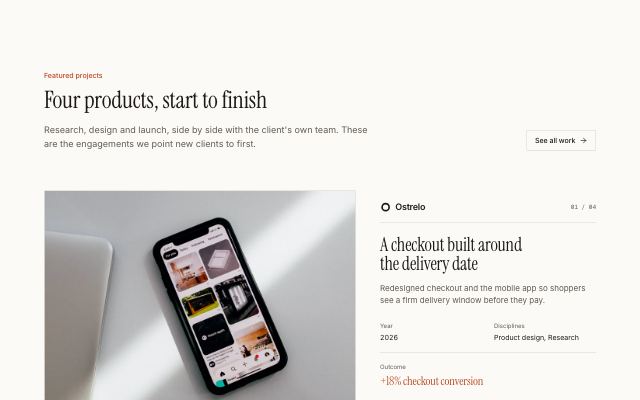
Project showcase in alternating rows
editorialEach project as a large photograph beside its client, numbered title, summary, year, disciplines and headline outcome, alternating sides down the page.
In Halftone Atelier
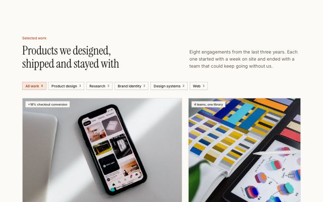
Selected work grid with discipline filters
editorialA studio's projects in a staggered wide/narrow image grid with outcome tags, client marks and meta, filtered by discipline, with a closing call to action.
In Halftone Atelier
pricing · 4
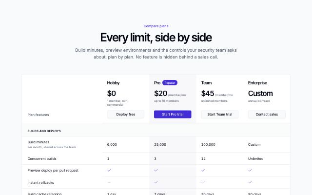
Plan comparison table
productEvery plan in one table: a header row with prices and actions, grouped feature rows with checks, dashes and values, and actions again at the foot. Scrolls sideways with a pinned feature column on small screens.
In Tallybird
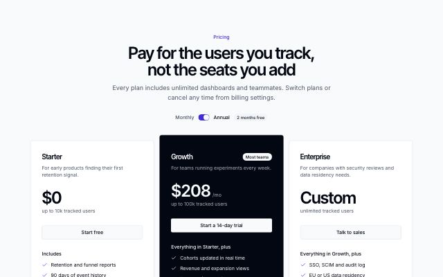
Pricing tiers with a highlighted plan
productTwo to four plans with a monthly/annual switch; the recommended plan inverts the palette and rises above its neighbours.
In Tessaly
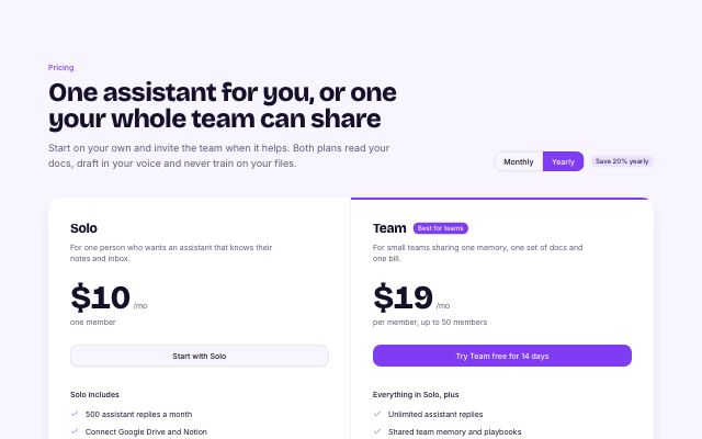
Two plans side by side
studioA personal and a team plan share one panel with a monthly/yearly toggle; a strip underneath lists what both plans include.
In Wisplight
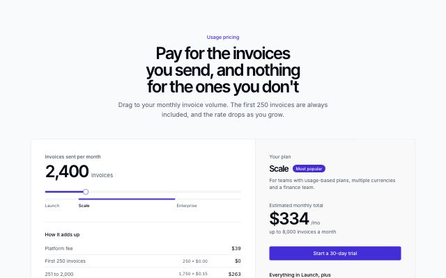
Usage slider with a live estimate
productA slider sets monthly usage; graduated rates from content recompute the price live, show the band breakdown and name the plan it lands on.
In Tallybird
faq · 3
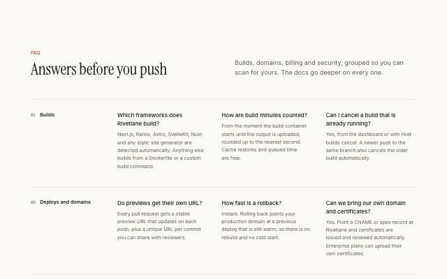
FAQ grouped by category
editorialEvery answer visible at once: numbered category headings, each with its questions in a two- or three-column grid, and a contact panel below.
In Halftone Atelier
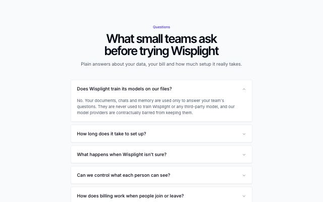
Centered FAQ accordion
productA centered heading over a single column of questions on separate surfaces, with a one-line contact prompt underneath.
In Tessaly, Wisplight
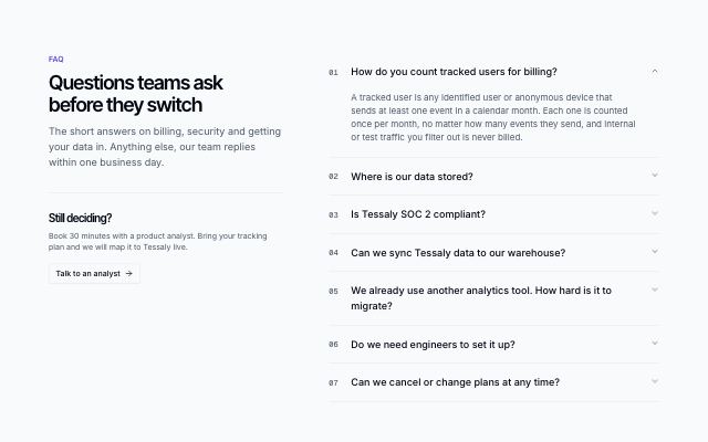
FAQ with a sticky intro and an accordion
productHeading, summary and a contact prompt stay pinned on the left while numbered questions open one at a time on the right.
In Tessaly, Tallybird
about · 2
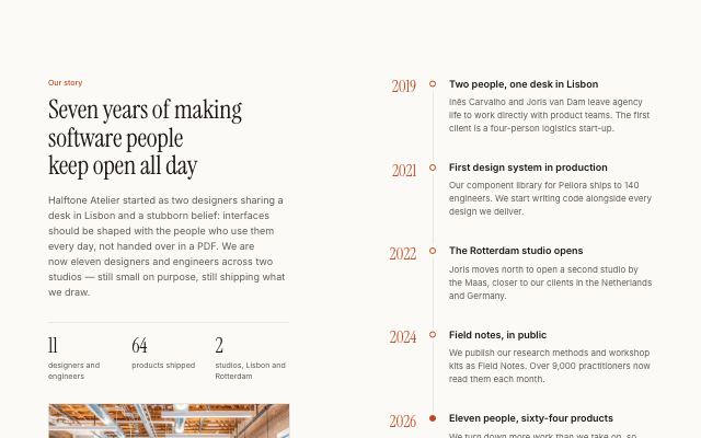
Company story with a milestone timeline
editorialThe company's story, key facts and a studio photo held in view beside a vertical timeline of four to six dated milestones.
In Halftone Atelier
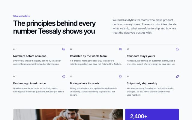
Company values in a numbered grid
productA headline and intro over four to six numbered principles, closed by a team photo beside a panel of company facts.
In Tessaly
team · 2

Founders with large portraits and bios
productAn intro and hiring note held beside two or three founders, each with a large portrait, role, bio and profile links.
In Tessaly
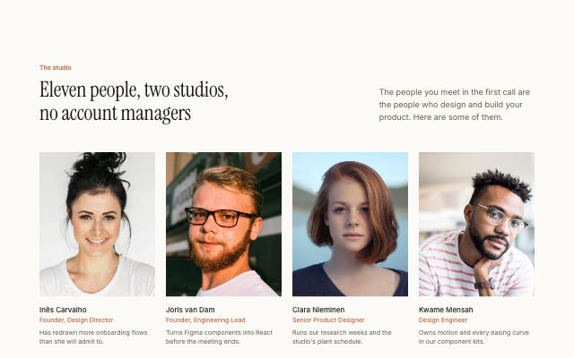
Team grid with portraits
editorialA headline over a grid of up to nine people with portrait photos, name, role and a short line, closed by an optional hiring tile.
In Halftone Atelier
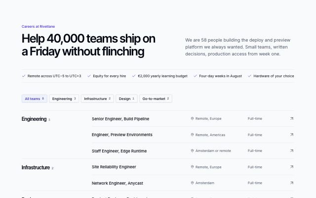
blog · 3
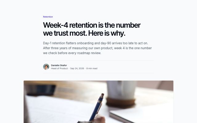
Article with typed prose body and related posts
productA long-form article: category, title, lead, author byline and cover, then a readable prose column built from typed blocks (paragraphs, headings, quotes, images, code, callouts, lists) and a related-posts strip.
In Tessaly
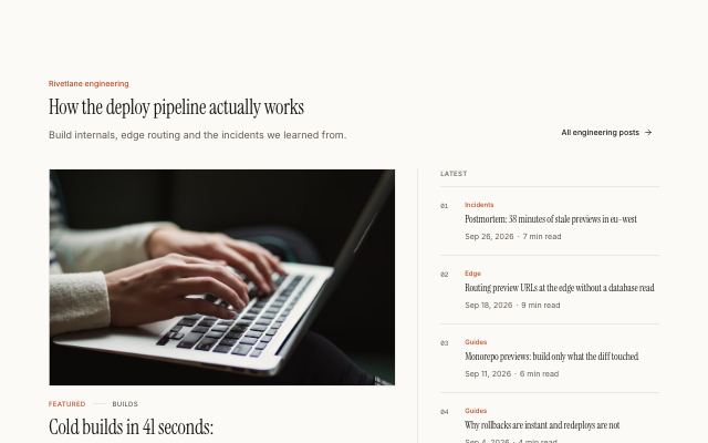
Featured post beside a recent-posts list
editorialOne large featured post with cover, title, excerpt and byline, set beside a numbered list of the four most recent posts with date and read time.
In Halftone Atelier

Blog index with category filter
productA blog heading with a category filter over a three-column grid of post cards: cover photo, category, title, excerpt and author byline with date and read time.
In Tessaly
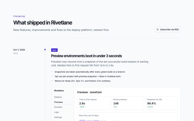
content · 2

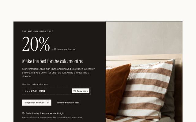
Full-bleed photo and quote band
editorialA colour band split edge to edge: a full-bleed captioned photograph on one side, a large pull quote with its author and a short note on the other. Without a photo it centres the quote.
In Marrow & Pine
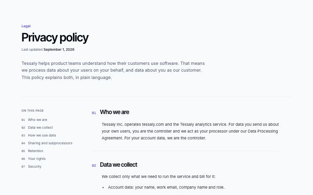
Legal page with table of contents
productA policy or terms page: title and last-updated date, a sticky numbered table of contents linking to each section, sections of typed paragraphs and lists, and a contact note.
In Tessaly
contact · 2
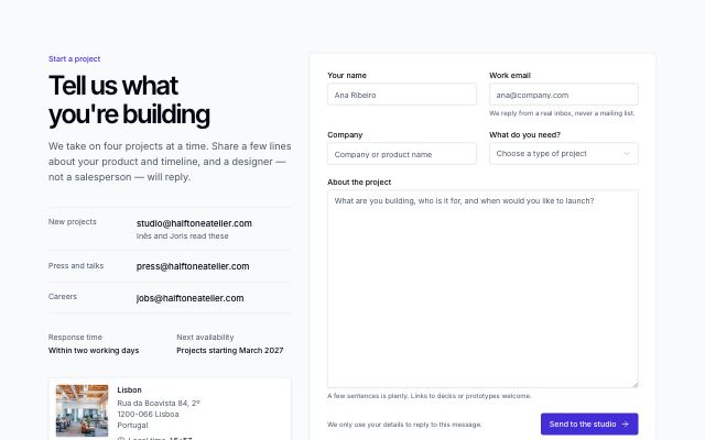
Contact details beside a form
productEmail channels, response time and the main office with its local time beside a labelled contact form with a topic select, message and helper text.
In Tessaly, Halftone Atelier
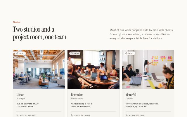
Office cards with local time
editorialTwo to four offices, each with a photo, live local time, address, phone and email, above a row of contact channels.
In Halftone Atelier
cta · 4
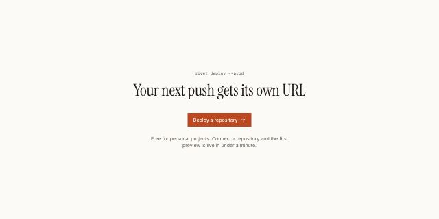
Quiet centered call to action
editorialA centered headline, a single action and one muted line on the page background with generous whitespace; for calm closes and documentation pages.
In Halftone Atelier

Closing call-to-action panel
productA full-width band on the primary color with a large headline, two actions and a row of trust facts, made to close a landing page.
In Tessaly

Inline newsletter call to action
productA headline and one line of copy beside an inline email signup, set between hairlines instead of a full band; falls back to the actions without a form.
In Tessaly

Call to action beside a photo
editorialA panel with headline, actions and short reassurances on one side and a full-height photo on the other; stacks with the photo below on small screens.
In Halftone Atelier
footer · 4
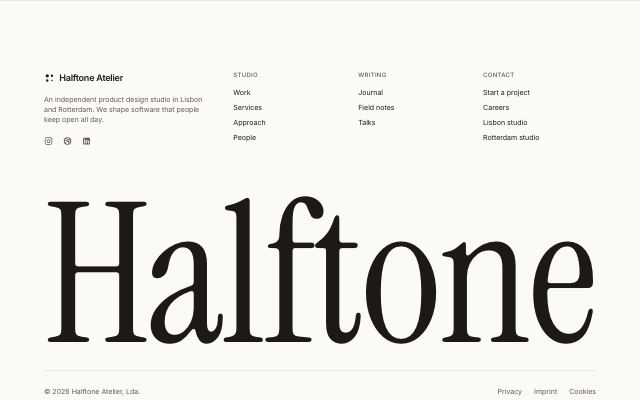
Footer with an oversized wordmark
editorialBrand, pitch and link columns above the brand name set in the display face across the full container width, with copyright and legal links below.
In Halftone Atelier
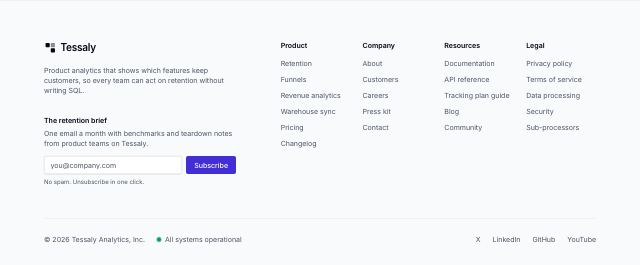
Footer with link columns and a newsletter
productBrand, one-line pitch and an email signup beside up to five link columns, over a bottom row with copyright, live status and social links.
In Tessaly, Marrow & Pine
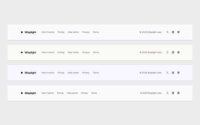
Minimal one-row footer
monoLogo, a handful of links, copyright and social icons on a single row that stacks on small screens; for simple sites and single-product pages.
In Rivetlane docs, Wisplight, Tallybird
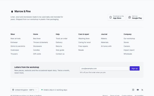
Sitemap footer for large sites
productBrand and app download links over five or six headed link columns, a newsletter strip, a locale and status row, and copyright with legal links.
product-grid · 2
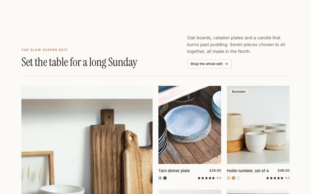
Editorial product mosaic with a story tile
editorialA curated edit: one lead product at double size, smaller companions around it and a maker's story tile on the emphasis band, set under a magazine-style header.
In Marrow & Pine
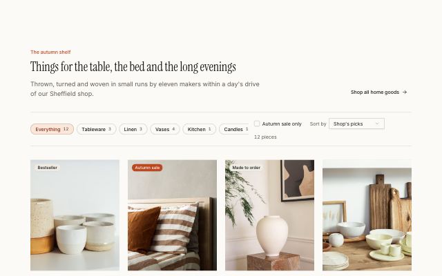
Product grid with a filter and sort bar
editorialShelf chips with counts, a sale-only toggle and a sort menu above a responsive four-column product grid; filtering and sorting run live, with an empty state.
In Marrow & Pine
product-detail · 2
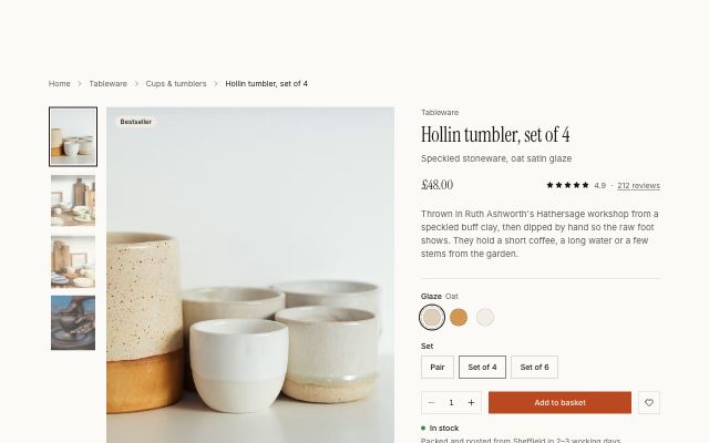
Product gallery with a sticky buy box
editorialA photo gallery with thumbnails beside a sticky buy box: rating, live price, colour swatches, set size, quantity, add to basket, delivery promises and expandable details.
In Marrow & Pine
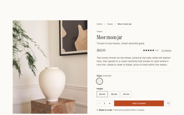
Product page with the making story
editorialA sticky photo beside the buy box, followed by numbered making steps in alternating photo rows, a maker's quote on the emphasis band and a materials spec list.
In Marrow & Pine
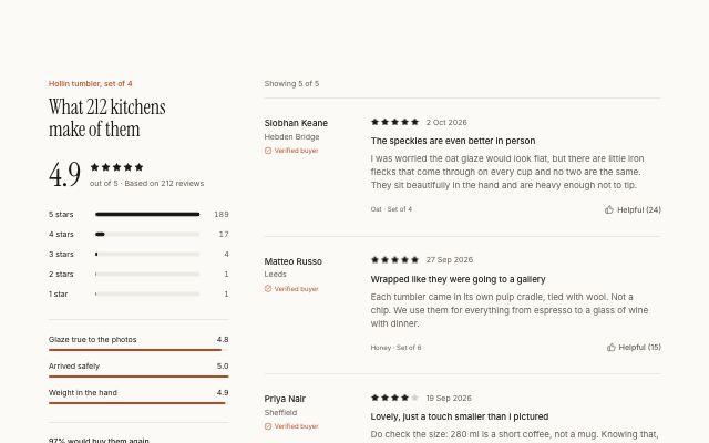
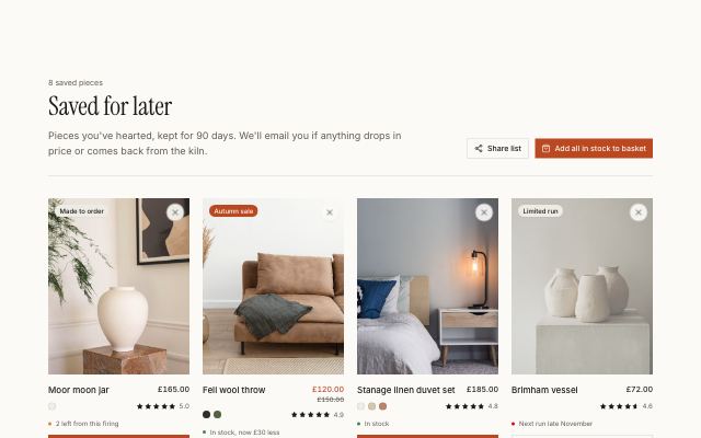
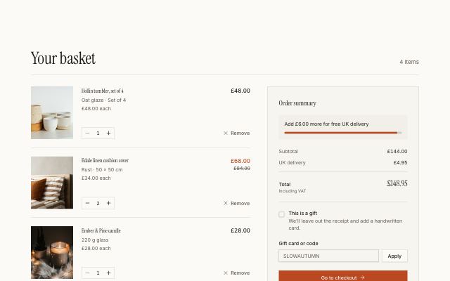
auth · 5
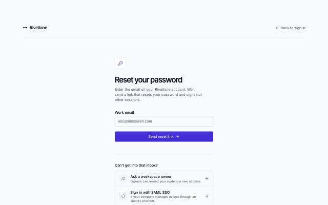
Forgot password request
productNarrow reset form under a brand bar with a back link; submitting swaps in a check-your-inbox state with tips, and recovery options sit below.
In Rivetlane app
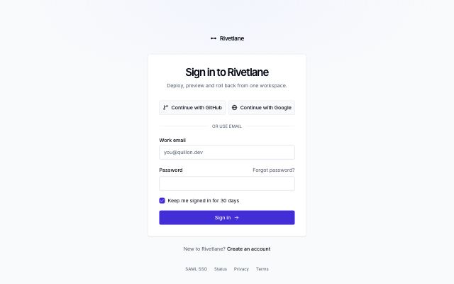
Sign-in card
productCentered card with SSO provider buttons, email and password, a remember-me checkbox, a forgot-password link and a sign-up line.
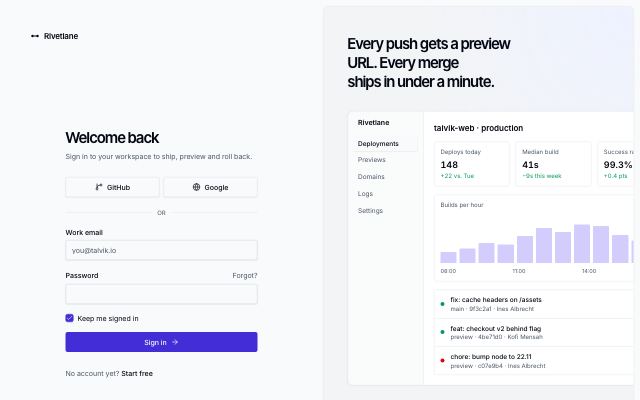
Split sign-in with brand panel
productSign-in form on the left; on the right a tinted brand panel with a headline, a live product screen and a customer quote.
In Rivetlane app
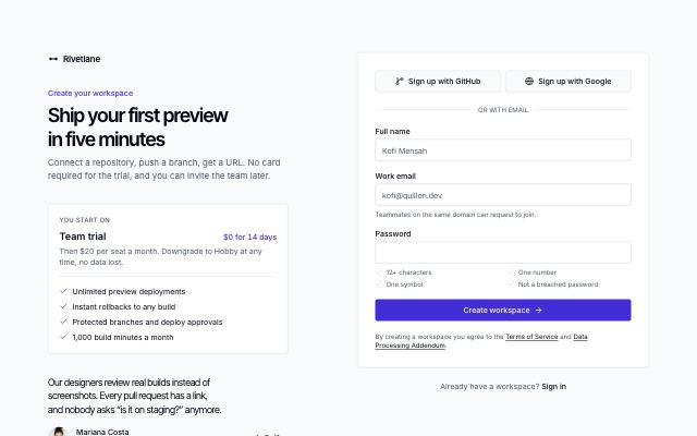
Sign-up form with plan hint
productHeadline and the plan a new account starts on beside a sign-up card with SSO, name, email and a password with requirement hints, plus a terms line.
In Rivetlane app

Two-factor code
productCard with the signed-in account, a 6-digit one-time code input and a trust-this-device option, over a tray of recovery options.
In Rivetlane app
app-shell · 2
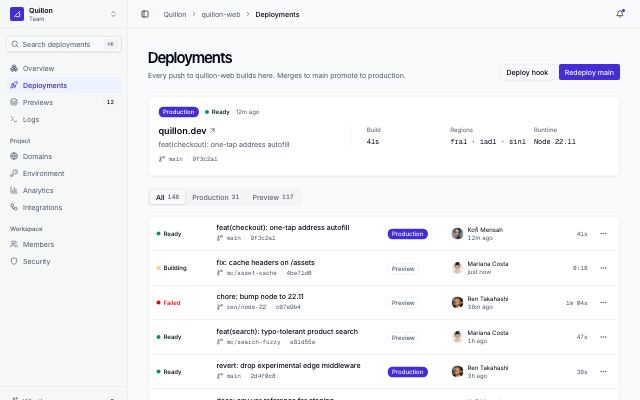
App shell with collapsible sidebar
productCollapsible sidebar with workspace switcher, search, sectioned nav and user menu; a top bar with breadcrumbs; and a page header over a deployments view.
In Rivetlane app
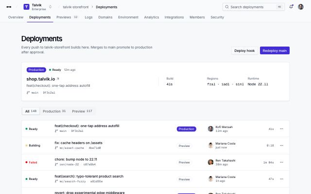
App shell with top navigation
productTop bar with logo, workspace switcher, breadcrumbs, search and user menu over a row of nav tabs; the page header and a deployments view sit below.
dashboard · 2
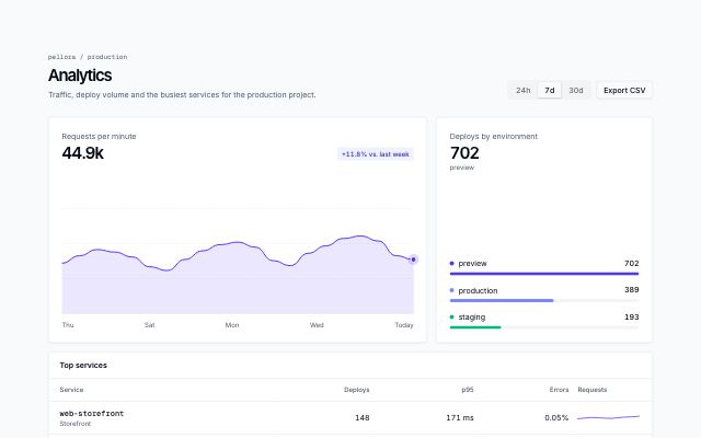
Analytics with period switcher
productAn analytics view: a period switcher in the page header drives a main area chart, a breakdown of bars and a top-services table with inline trends.
In Rivetlane app
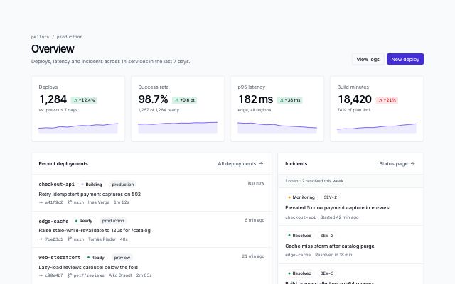
Overview with KPIs and activity
productA dashboard home: page header with actions, KPI cards with deltas and sparklines, a recent-deployments feed and an incidents panel.
In Rivetlane app
data-table · 2
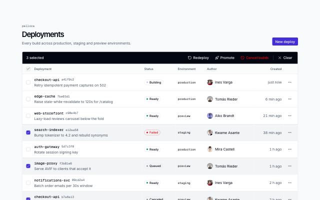
Data table with bulk actions
productA records page with row selection: per-row and select-page checkboxes, a bulk action bar that replaces the toolbar while rows are selected, row menus and pagination.
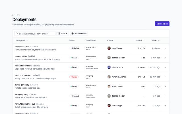
Filterable data table
productA records page: search, faceted multi-select filters with counts, sortable headers, status badges, row action menus and pagination. Scrolls sideways inside its card on small screens.
In Rivetlane app
settings · 3
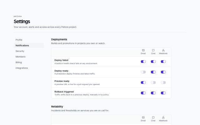
Notification settings matrix
productNotification preferences as a matrix: grouped events down the side, one switch per delivery channel across, plus a digest frequency and quiet hours.
In Rivetlane app
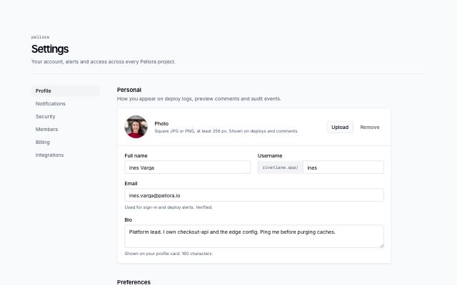
Profile settings
productAccount settings with a section nav: photo with upload and remove, personal fields, preferences with selects, and a save bar.
In Rivetlane app
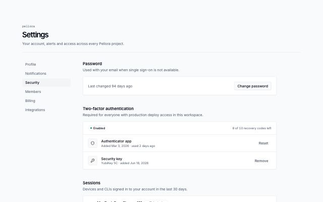
Security settings
productAccount security with a section nav: password, two-factor status and methods, signed-in sessions, masked API tokens in a table, and a danger zone.
In Rivetlane app
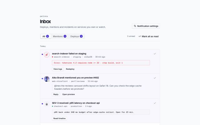
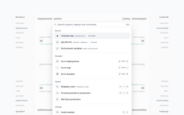
ai-chat · 2
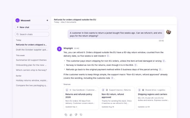
AI chat conversation with citations
studioAssistant console: recent threads in a sidebar (a sheet on mobile), a question and a cited answer whose numbered markers link to source cards, feedback actions, follow-up suggestions and a composer with attach and model select.
In Wisplight
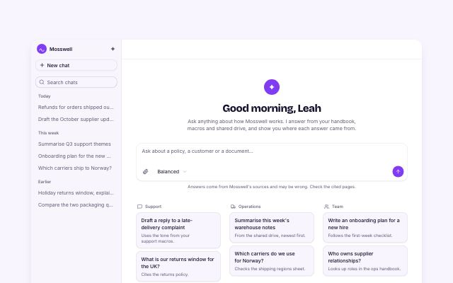
AI chat new-chat prompts
studioNew-chat state of the assistant console: greeting, composer with attach and model select, prompt starter cards grouped by use case that fill the composer, and connected sources with sync status.
In Wisplight