Features
Feature grids, tabs, bento layouts, product showcases, step-by-step flows and comparison tables that explain what a product does.
37 blocks in 4 groups, each in 8 styles, light and dark, LTR and RTL.
37 blocks
Feature sections · 21
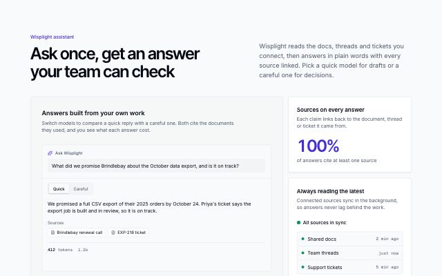
AI prompt bento
productAn AI product's bento led by a live prompt tile — the request, a model picker and each model's answer with its sources, token count and time — beside four proof tiles.
In Wisplight
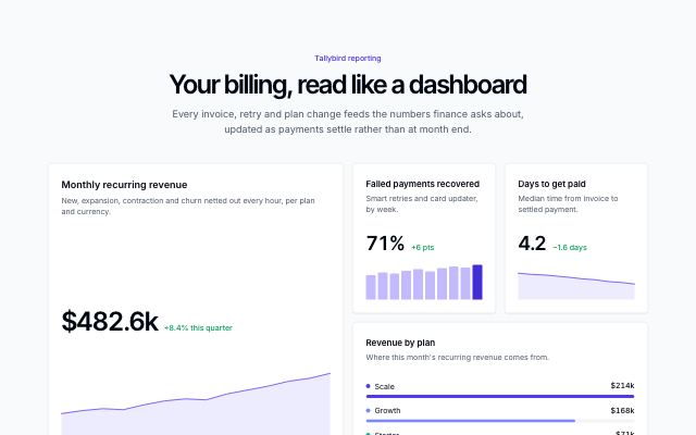
Bento with live mini charts
productA dashboard-like bento: a large headline chart, small trend tiles with deltas, a ranked breakdown and a full-width live status band.
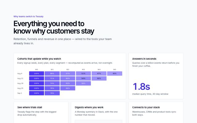
Feature bento with live visuals
productFive capability tiles, each proven by a live visual — a cohort heatmap, a funnel, a Slack digest, integrations and a headline metric — instead of icons.
In Tessaly, Hexmoor
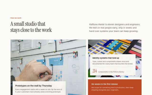
Feature bento as a photo mosaic
productFive tiles in an asymmetric mosaic: cells with a photo fill their tile and carry a caption card with their proof, the others show a metric, funnel or logos on a solid tile.
In Halftone Atelier, Lanternfold, Commonfold, Sunfallow
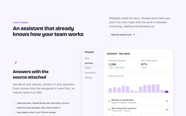
Alternating feature rows
productA section heading over two to four feature rows, each with its own heading, text, bullet points and a product screen or photo, alternating sides.
In Brassfinch, Rookbarrow Coffee, Sunfallow, Pebbleloft
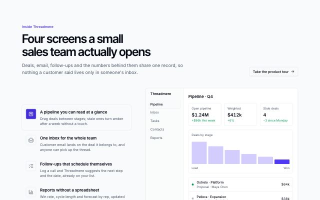
Icon list with swapping screen
productAn icon-led feature list beside one framed visual that crossfades to each feature's own screen or photo as you hover, focus or arrow through the list.
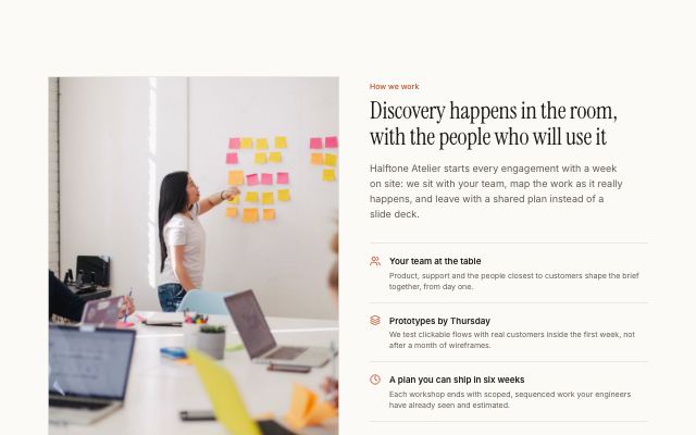
Capability list beside a photograph
productA headline and a ruled list of two to four icon-led capabilities next to a tall captioned photograph; the photo can sit on either side.
In Halftone Atelier, Cindermoss, Selvira Clinic, Calvenna, Rookbarrow Coffee, Pebbleloft, Tumblepaw
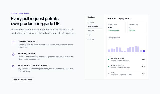
Feature list beside a product screen
productA headline and two to four icon-led capabilities next to a live product screen; the screen can sit on either side.
In Tessaly, Brassfinch, Lodestrand

Sticky visual with scrolling features
productNumbered features scroll past a pinned photo or product screen that swaps to match the one in view; on small screens and without scripts it reads as a stacked list.
In Calvenna, Hexmoor, Quietfern
Feature card carousel
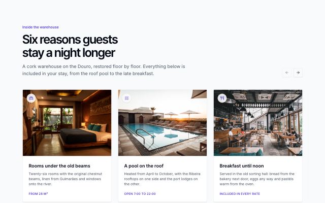
productPhoto-led feature cards in a horizontally scrolling, snapping track with previous / next buttons and progress dots; swipeable on touch, keyboard scrollable and mirrored right-to-left.
Capability checklist
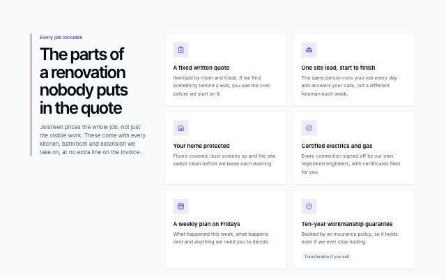
productA pinned intro with an accent rule and optional link beside the main capabilities as icon-tile cards, with an optional band of further checked one-liners in up to three columns underneath.
In Hexmoor, Brassfinch, Lodestrand, Quietfern, Arbitrel
Before and with the product
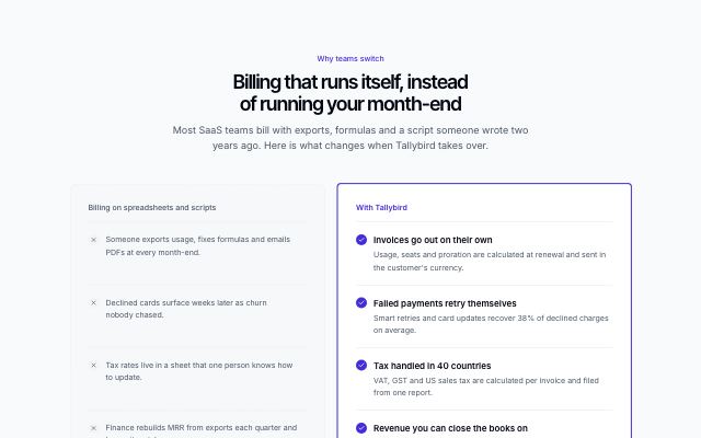
productTwo aligned columns: the old way in a recessed dashed panel with neutral marks, and the same jobs done with the product on a highlighted surface.
In Tallybird, Hexmoor, Brassfinch, Sunfallow
Capability grid with icons
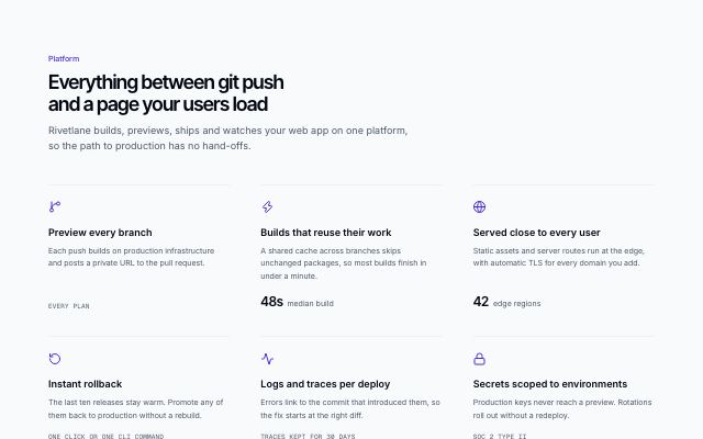
productA headline over three to six capabilities in a three-column grid, each under a hairline with an icon, a line of copy and an optional figure.
In Ampwick, Ovelle Trust, Pulsewright, Joistwell, Calvenna, Commonfold, Hexmoor, Brassfinch, Rookbarrow Coffee, Pebbleloft, Quietfern, Tumblepaw, Harbor & Vale Logistics, Okafor & Lind Law
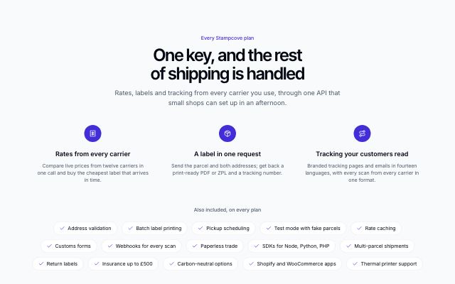
Features with a capability marquee
productThree to six headline features over rows of capability chips drifting in opposite directions — an "everything included" list that pauses on hover and settles into a wrapped list with reduced motion.
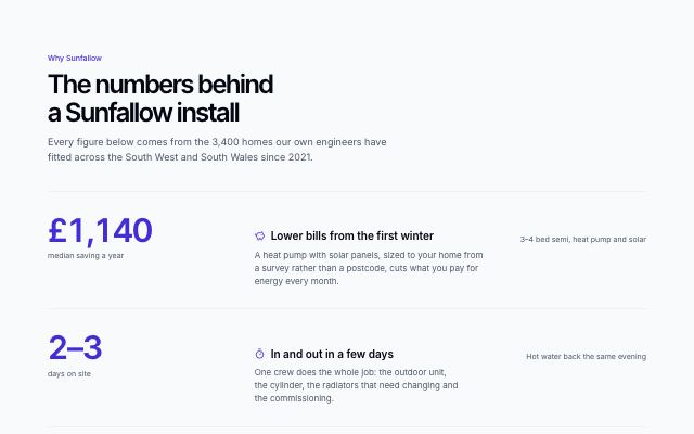
Metric-led feature rows
productFull-width ruled rows where each feature leads with the figure that proves it — a large counting number and its label — then the claim, the detail and the fine print.
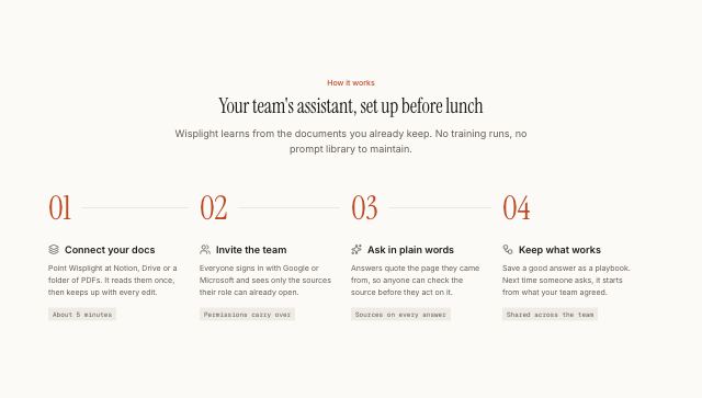
How it works in numbered steps
productA centered headline over three to six steps read as a sequence: numbered nodes on one rail (across the row on desktop, down the side on phones), each step a card with an icon tile and its meta chip aligned at the bottom.
In Halftone Atelier, Wisplight, Ovelle Trust, Kaltmark, Ondessa, Brassfinch, Sunfallow, Patinyard, Pebbleloft, Quietfern, Quarlume, Arbitrel, Okafor & Lind Law
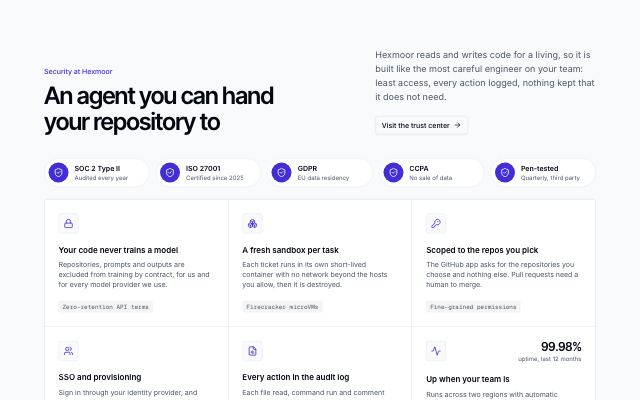
Security and compliance grid
productA row of certification badges (SOC 2, ISO 27001, GDPR…) over a ruled grid of security controls, each with its specifics and an optional figure such as uptime, plus a trust-center link.
In Lodestrand
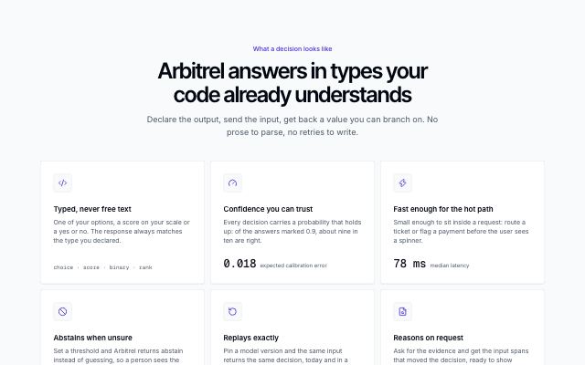
Spotlight feature cards
productFeature cards lit by a soft glow that follows the pointer across the grid, lighting each card's border and surface, with a mono figure or detail at the foot of each card.
In Arbitrel
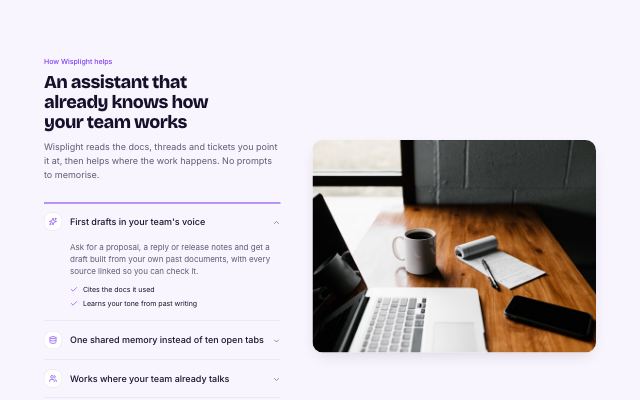
Capabilities accordion with media
productAn accordion of capabilities on one side; the open item's photo or product visual fills the other. On small screens the visual opens inside the item.
In Wisplight, Mirela Lab
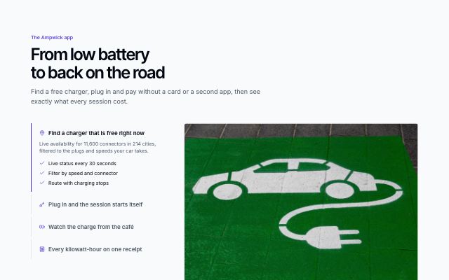
Autoplay tabs that fold into an accordion
productVertical feature tabs that advance on their own — a progress rail fills on the active tab, pausing on hover and stopping once you choose — beside a crossfading visual; below desktop width they become an accordion with each visual inside.
In Ampwick
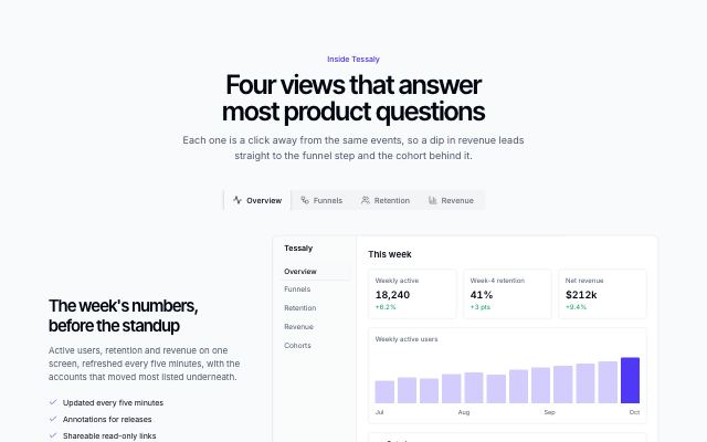
Capabilities in tabs with a product visual
productA tab strip switches between three or four capabilities; each shows its own copy beside a product screen, chart, funnel or cohort panel.
In Brassfinch, Lodestrand
Product showcase · 8
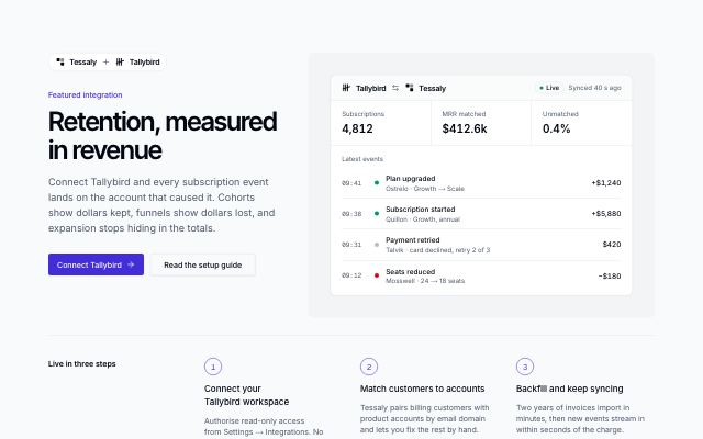
Featured integration story
productOne integration told as a story: paired brand marks, headline and actions beside a live sync panel, numbered setup steps and related connectors from the same category.
In Hexmoor
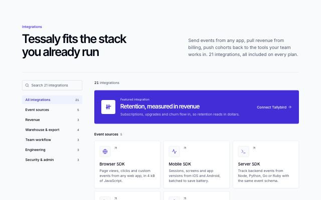
Searchable integrations directory
productEvery integration as a mark tile with a one-line summary, grouped by category, with a search field and category filter in a sticky sidebar and the featured integration on top.
In Hexmoor, Harbor & Vale Logistics
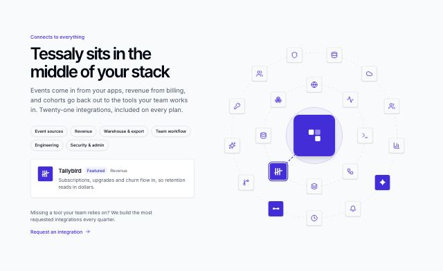
Integrations orbit
productThe product at the centre of two slowly turning rings of integrations; hover, focus or tap a mark to read what it does, and filter the rings by category.
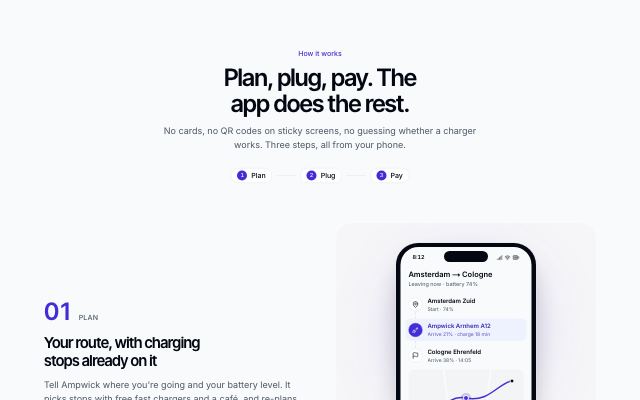
App steps with phone screens
productA mobile app explained as two to four steps — plan, plug, pay — each beside the phone screen that does it, alternating sides and arriving in sequence as you scroll.
In Ampwick, Brassfinch
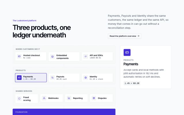
Platform map of modules
productA platform drawn as stacked layers of modules — what customers see, the products, the shared services — on one foundation band; hover, focus or tap a module to read about it in the side panel.
In Lodestrand
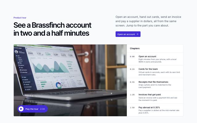
Product video with chapters
productA large inline product-tour player beside a chapter list: pick a chapter to jump there, and the playing chapter stays highlighted. Embed-only videos open in a dialog.
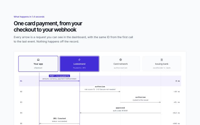
Sequence diagram of a request between systems
productThe parties of a flow across the top with lifelines, and each message as a labelled arrow from one to another in time order — endpoint or event name in mono, what it carries and the elapsed time — with the product's own lane highlighted. Each step is selectable (click, hover, arrow keys): its arrow and both parties light up and its detail shows under the diagram; a play button draws the arrows in order (final state only with reduced motion). On phones it becomes a numbered list of from → to steps.
In Lodestrand, Arbitrel
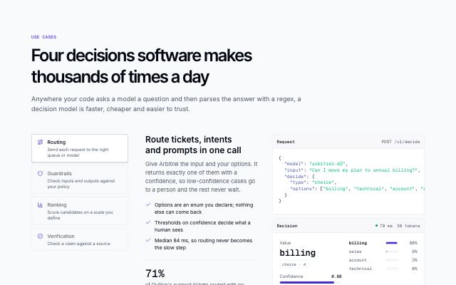
Use cases with a worked example call
productA picker of jobs (routing, guardrails, ranking, verification); each opens a short pitch with points and a figure beside one example call — the request and the typed decision it returns.
In Arbitrel
Process & steps · 6
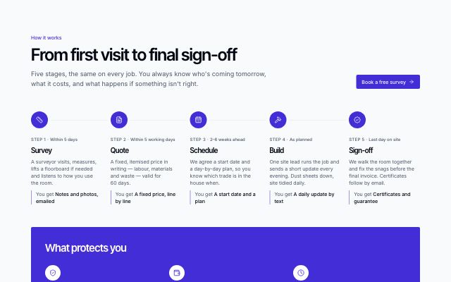
How a job runs, with guarantees
productSurvey → quote → schedule → build → sign-off on a track (vertical on phones, horizontal from desktop), each with timing and what you get, then a band of guarantees and insurance badges.
In Joistwell, Sunfallow
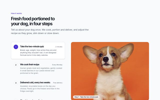
Numbered steps with media
productA numbered list of steps beside a large photo or screenshot that follows the chosen step; on small screens each step carries its own picture.
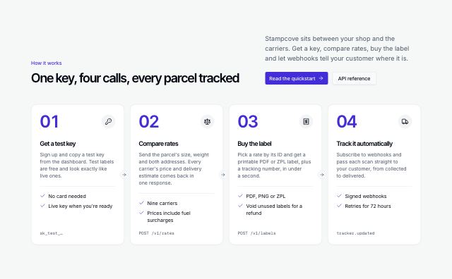
Step cards with connectors
productThree to five cards in a row joined by arrows, each with a big step number, an icon, what you do and what you get, and a closing pair of actions.
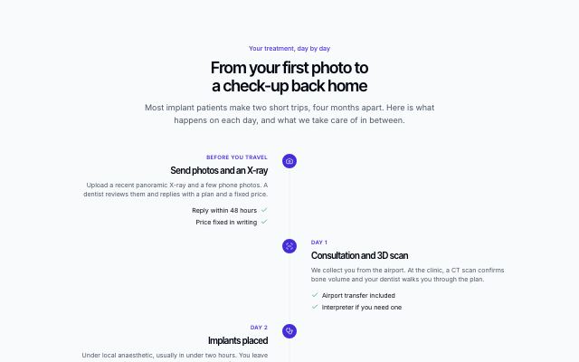
Process timeline
productSteps on a vertical timeline with the day or duration of each on the rail, alternating sides on wide screens, each with a short list of what happens.

Learning path with milestones and certificate
productA path across courses from beginner to job-ready: a numbered timeline of steps with level meter, length, skills and a milestone each, ending in a finish line, beside a sticky certificate, path summary and start button.
In Kestrella
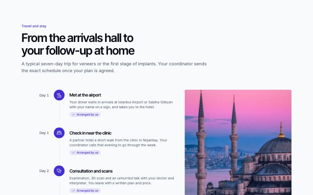
Travel journey timeline
productA patient's or guest's trip as an icon timeline from airport pickup through hotel, appointments and free days to departure and follow-up, marking what is arranged — beside a photo and practical facts. Map-free.
In Selvira Clinic
Comparisons · 2
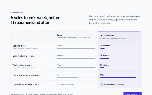
Before and after comparison
productLife without the product and with it, side by side: each row puts the old way's number against the new one, with paired bars that show the difference at a glance.
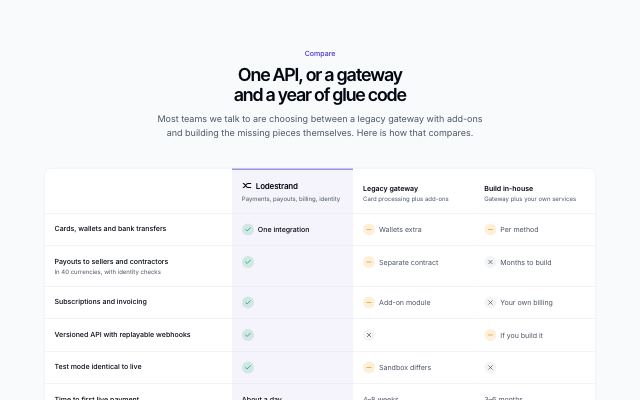
Us vs them comparison table
productThe product beside two or three alternatives people weigh it against, row by row, with yes / no / partly marks and short values; the product's column is highlighted and the table scrolls sideways on small screens.
In Lodestrand