Blocks
401 finished page sections in 13 categories. Each one works in 8 styles, every palette, light and dark, left-to-right and right-to-left: use “Preview as” to see the whole shelf in one look.
401 blocks
Navbars · 10
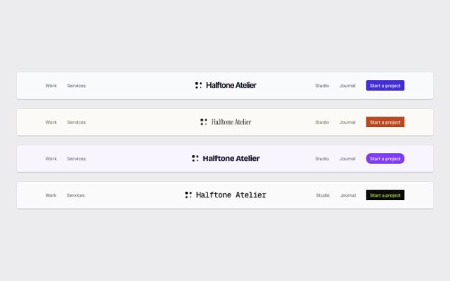
Navbar with a centered wordmark
productAn editorial masthead: a display-type wordmark on the center axis, links split either side and the actions pinned to the far right.
In Halftone Atelier, Cindermoss, Calvenna, Ondessa, Quietfern, Fırın Kuzguncuk, June Halloway Photography
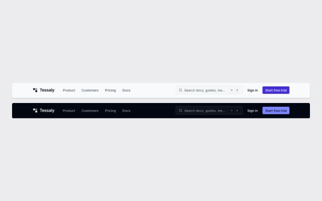
Navbar with ⌘K search
productLogo and links, then a search field that opens a command panel of suggested pages (⌘K / Ctrl+K from anywhere), sign-in and one primary action; a magnifier and sheet menu on phones.
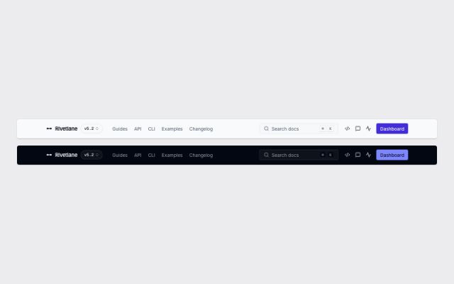
Docs navbar with version switcher and search
productLogo with a version switcher, section links, a ⌘K search field, icon links to source, community and status, and one action; for documentation sites.
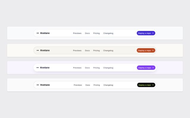
Floating pill navbar
productA rounded bar inset from the page edges on the style's surface, with the logo, compact centered links and a single action.
In Rivetlane docs, Tidewire Summit, Ampwick, Lanternfold, Commonfold, Hexmoor, Rookbarrow Coffee, Pebbleloft, Tumblepaw, Arbitrel
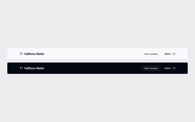
Navbar with a full-screen menu
productA quiet bar (logo, one action, a Menu button at every width) that opens a full-screen menu of large numbered links, their sub-pages, contact lines and languages; for studios and portfolios.
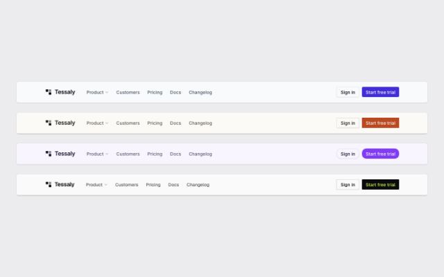
Navbar with a product mega menu
productA product menu that opens a wide panel of grouped links with icons and one-line descriptions beside a featured story, next to plain links and two actions.
In Tessaly, Lodestrand, Harbor & Vale Logistics
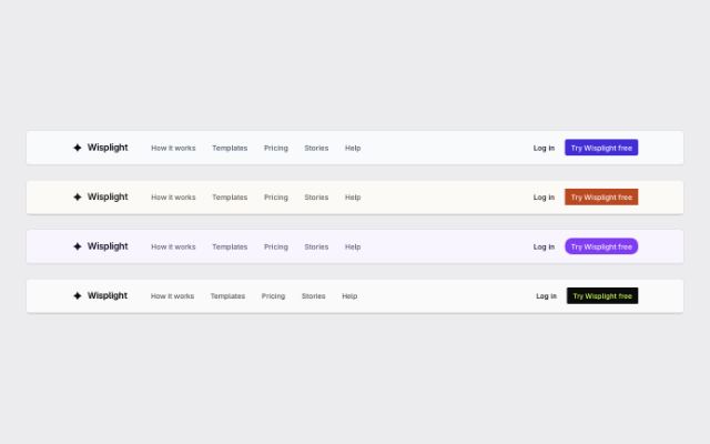
Navbar with simple links
productLogo and a short row of links on the left, sign-in and a primary action on the right; folds into a sheet menu on small screens.
In Wisplight, Tallybird, Noor Halvorsen, Lantorra, Ovelle Trust, Selvira Clinic, Pulsewright, Kestrella, Static Orchard, Joistwell, Kaltmark, Velvet Quarry, Brassfinch, Sunfallow, Okafor & Lind Law, Mirela Lab
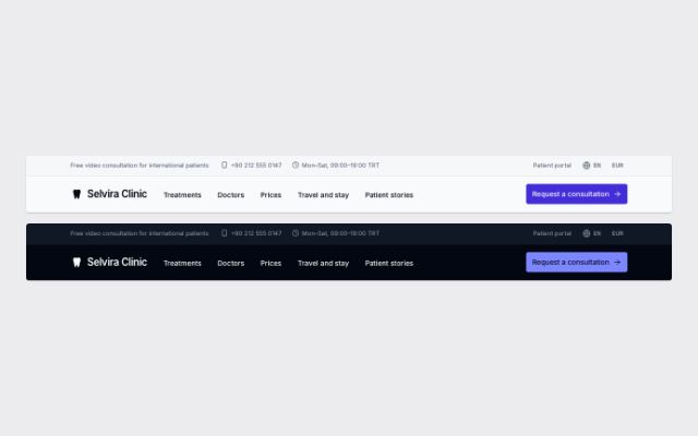
Two-row navbar with a utility bar
productA slim utility bar (note, phone and hours, secondary links, language and currency) above the main row of logo, links and one primary action; for stores and clinics.
In Patinyard
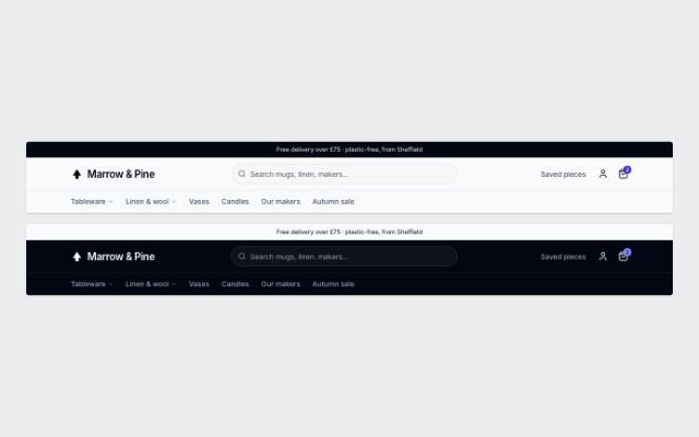
E-commerce navbar with search, account and bag
productLogo, a wide product search, account and a bag button whose count opens the mini-cart drawer; below it a category row whose shelves open mega panels with a featured story.
In Marrow & Pine
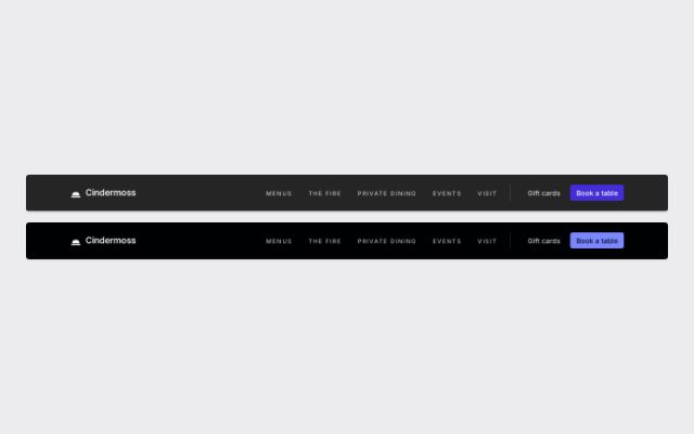
Transparent navbar over a hero
productLight-on-dark bar with spaced uppercase links for photo-led sites. Solid in a page flow; inside a `.navbar-overlay` wrapper (absolute or sticky) it turns transparent over the hero and solid again once the page scrolls.
In Halvane, Quarlume
Footers · 10
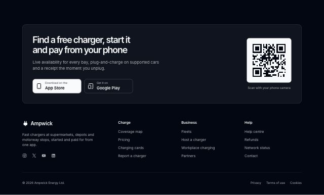
Dark footer led by an app download
productAn inverted footer that opens with the app: a pitch, store links and a scannable code, then link columns, socials and legal — for products that live on the phone.
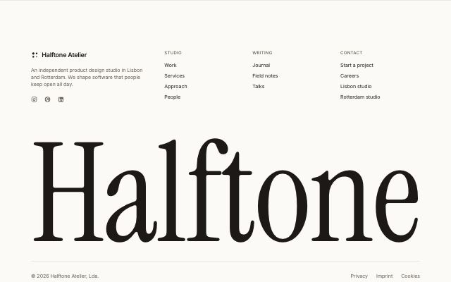
Footer with an oversized wordmark
productBrand, pitch and link columns above the brand name set in the display face across the full container width, with copyright and legal links below.
In Halftone Atelier, Cindermoss, Tidewire Summit, Noor Halvorsen, Static Orchard, Calvenna, Lanternfold, Ondessa, Halvane, Quarlume, Fırın Kuzguncuk, June Halloway Photography

Centered compact footer
productEverything on one centered axis: logo and one line about the site, a single row of links, social icons, then copyright and legal links; for small and personal sites.
In Quietfern
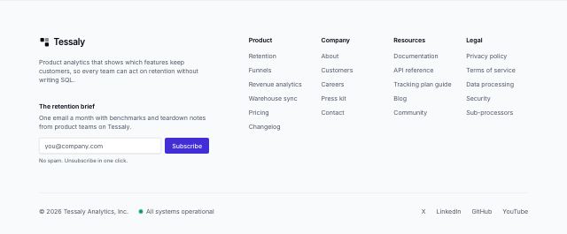
Footer with link columns and a newsletter
productBrand, one-line pitch and an email signup beside up to five link columns, over a bottom row with copyright, live status and social links.
In Tessaly, Marrow & Pine, Ampwick, Lantorra, Ovelle Trust, Selvira Clinic, Pulsewright, Kestrella, Joistwell, Velvet Quarry, Commonfold, Rookbarrow Coffee, Lodestrand, Sunfallow, Patinyard, Pebbleloft, Tumblepaw, Arbitrel, Harbor & Vale Logistics, Okafor & Lind Law
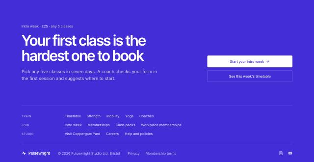
Footer with a closing CTA band
productThe page's last call to action and the footer as one band: a large headline with stacked actions, then each link column folded into a compact row, then the legal line.
In Hexmoor
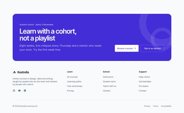
Footer topped with a call-to-action card
productA rounded primary card with the page's closing call to action sits on top of a light footer with brand, socials, link columns and legal — the close without turning the whole footer into a band.
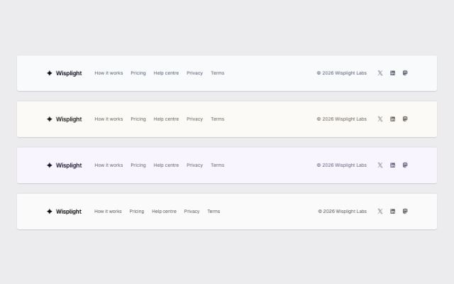
Minimal one-row footer
productLogo, a handful of links, copyright and social icons on a single row that stacks on small screens; for simple sites and single-product pages.
In Rivetlane docs, Wisplight, Tallybird, Kaltmark, Stampcove API docs, Mirela Lab
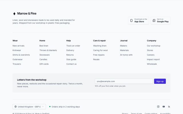
Sitemap footer for large sites
productBrand and app download links over five or six headed link columns, a newsletter strip, a locale and status row, and copyright with legal links.
In Brassfinch
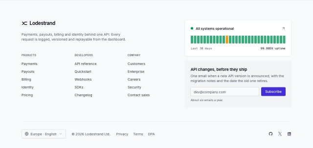
Developer footer with live status
productLink columns beside a status card with daily uptime bars and a compact newsletter, over a locale switcher, legal links and socials — for APIs and platforms where reliability is part of the pitch.
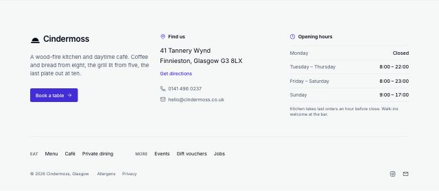
Local business footer with address and hours
productAddress with a directions link, opening hours, phone and email and a booking button up front, then short link columns, socials and legal — for restaurants, cafés, studios and shops people visit.
Banners · 4
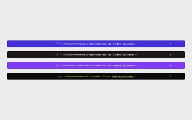
Announcement bar
productA slim full-width bar on the style's emphasis band: an optional tag, a one-line message, a link, and an optional dismiss button.
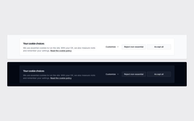
Cookie consent bar with category switches
productA cookie notice with a policy link and equal-weight Accept all / Reject non-essential buttons; Customize opens per-category switches with essential cookies locked on. Renders in flow; on a live site wrap it in `fixed inset-x-0 bottom-0 z-50`.
In Tessaly

Cookie consent card with preferences dialog
productA compact corner card with equal-weight Reject all / Accept all and a Manage preferences button that opens a dialog of categories with switches, each listing its cookies (name, purpose, duration), with reject, accept and save. Renders in flow; on a live site wrap it in `fixed inset-x-0 bottom-0 z-50`.
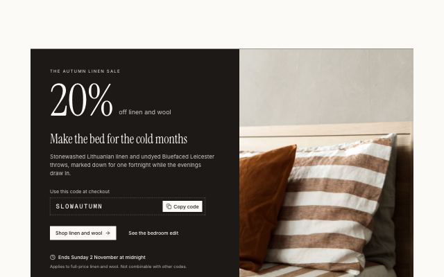
Seasonal promo with a code and photo
productAn emphasis-band panel with an oversized offer figure, headline, a copyable discount code, actions and the deadline, beside a full-height photograph.
In Marrow & Pine
Heroes · 22
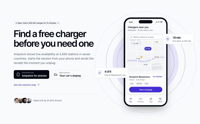
App hero with a live phone
productHeadline, store-style download badges and a rating line beside a phone drawing the app from content — a map, a session or a receipt — with two live facts floating at its edges.
In Ampwick

Hero with a fan of payment cards
productBig headline, actions and three counting figures beside a fan of drawn payment cards — debit, virtual, team — with a payment and a paid-invoice notice floating over the corners. For banks, cards and fintech.
In Brassfinch

Centered hero with a bleeding product screen
productLarge centered headline over a wide, slightly tilted product screen that runs into the next section, with a logo row beneath.
In Tessaly
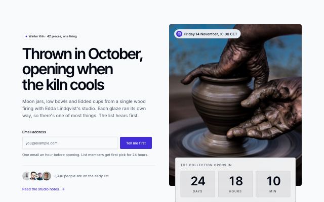
Coming-soon launch hero with countdown
productA pre-launch page: headline and story beside a teaser photo tagged with the launch date, a live countdown to the launch, an inline waitlist form, and an avatar stack with a sign-up count.
In Marrow & Pine
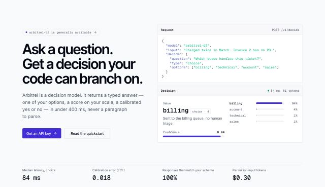
Hero with a typed request and its decision
productA code-forward hero for model APIs: headline and actions beside one call — the JSON request and the typed decision it returned, with calibrated confidence, the probability of each option, latency and tokens — over a faint grid, with proof figures in a ruled row.
In Arbitrel

Editorial hero with oversized type
productA display headline that spans the whole container, with the description and actions set off-center beneath a hairline rule and an optional client row.
In Halftone Atelier, Ovelle Trust, Kaltmark, Rookbarrow Coffee, Lodestrand, Mirela Lab
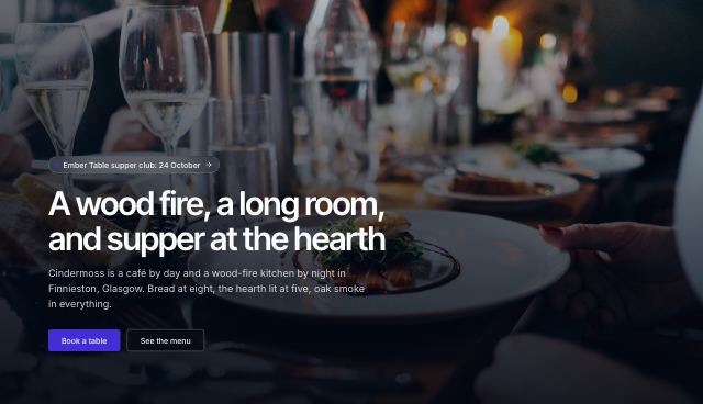
Full-bleed photo hero
productAn edge-to-edge photograph with the headline, copy and actions on a panel cut into its lower edge, so the copy stays legible over any photo.
In Cindermoss, Ovelle Trust, Joistwell, Ondessa, Fırın Kuzguncuk

Immersive photo hero with copy on the image
productAn edge-to-edge photograph with the headline set low on the image over a bottom scrim, and an optional strip of facts along its lower edge — for places that sell on atmosphere.
In Calvenna, Halvane
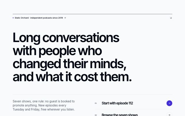
Minimal type-only hero
productOne oversized statement with the eyebrow hung in its first-line indent, a short line of copy and a single underlined link, set in generous whitespace; no buttons, no media.
In Hexmoor, Ondessa, Lodestrand
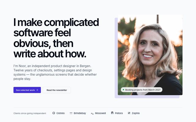
Personal intro with portrait and availability
productA first-person statement set large beside a portrait, with an availability badge above it and a selected-clients line beneath a hairline rule.
In Noor Halvorsen, June Halloway Photography

Split hero with a bleeding photo
productHeadline, copy and actions on the left; a large photograph filling the right half of the section to its edges, with an optional avatar proof line.
In Marrow & Pine, Ovelle Trust, Selvira Clinic, Pulsewright, Kestrella, Static Orchard, Rookbarrow Coffee, Sunfallow, Patinyard, Pebbleloft, Quietfern, Tumblepaw, Okafor & Lind Law
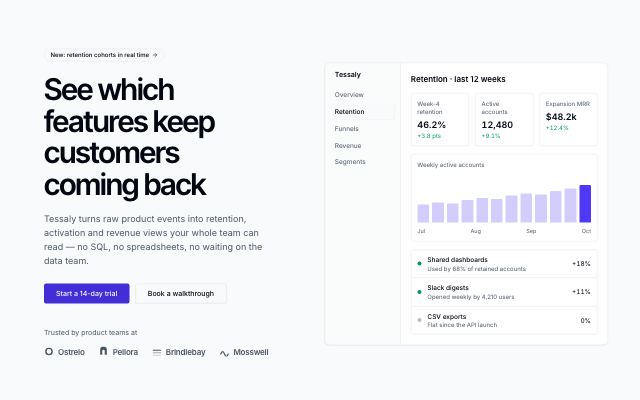
Hero with product screen
productHeadline, supporting copy and two actions beside a live product screen, with a customer proof row.
In Lodestrand, Harbor & Vale Logistics

Search-led hero
productHeadline on the emphasis band with a large search field straddling its edge as the main action, suggestion chips under it and customer logos below; for docs, catalogs and marketplaces.
In Hexmoor, Patinyard
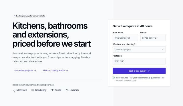
Hero with an inline lead form
productHeadline, copy and customer logos beside a short lead form (quote or demo request) with a trust line under the button; falls back to an email signup or the hero media.
In Lodestrand, Quietfern
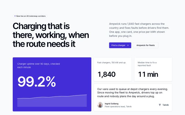
Hero with a bento of proof
productHeadline and actions over a bento of evidence: a lead figure with its trend on the emphasis band, smaller counting figures, and a customer quote with its company logo.
In Commonfold
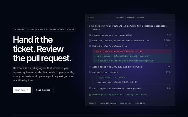
Dark hero with an agent run in a terminal
productA dark-first hero: headline, actions and a customer row beside a terminal transcript of one agent run — the task as typed, each step with its diff or test output, the pull request it ended in and a status bar of totals — over a soft glow.
In Hexmoor

Testimonial-led hero
productA customer's tall portrait and their words in display type lead the page; the product's headline, copy and actions follow, quieter, under a rule. For clinics, services and studios.
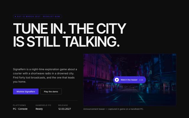
Launch hero with a trailer and kinetic marquee
productA hero that stays dark in every mode: an oversized title, the trailer as a poster with a play control, store actions and release facts, and the taglines running in two opposing kinetic bands (still under reduced motion). Made for game and album launches.
In Lanternfold, Velvet Quarry, Quarlume

Hero with a video poster
productHeadline and copy set side by side above a wide video poster with a play control and caption, followed by a customer logo row.
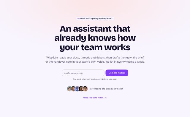
Waitlist hero with inline email form
productCentered headline with an inline email field and submit button, a privacy note, and an avatar stack with a waitlist count.
In Wisplight, Arbitrel

Event hero with a countdown
productEvent name, dates and venue beside a live countdown to doors opening, two ticket and agenda actions, then a wide stage photo with headline figures that count up.
In Tidewire Summit
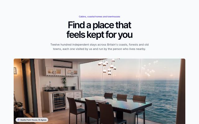
Stay search hero with a floating search bar
productA centred headline over a wide photo, with a search bar floating on its lower edge: destination suggestions, a check-in and check-out range calendar and a guest picker, then three reassurances.
In Lantorra
Feature sections · 21
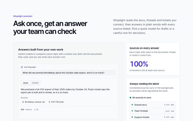
AI prompt bento
productAn AI product's bento led by a live prompt tile — the request, a model picker and each model's answer with its sources, token count and time — beside four proof tiles.
In Wisplight
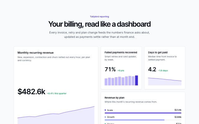
Bento with live mini charts
productA dashboard-like bento: a large headline chart, small trend tiles with deltas, a ranked breakdown and a full-width live status band.
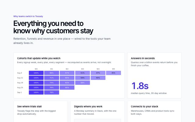
Feature bento with live visuals
productFive capability tiles, each proven by a live visual — a cohort heatmap, a funnel, a Slack digest, integrations and a headline metric — instead of icons.
In Tessaly, Hexmoor
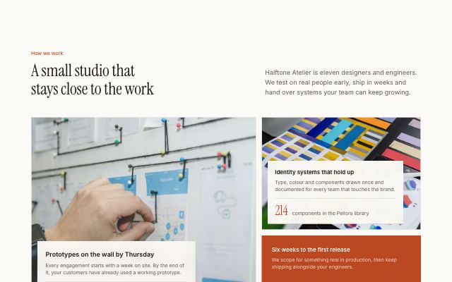
Feature bento as a photo mosaic
productFive tiles in an asymmetric mosaic: cells with a photo fill their tile and carry a caption card with their proof, the others show a metric, funnel or logos on a solid tile.
In Halftone Atelier, Lanternfold, Commonfold, Sunfallow
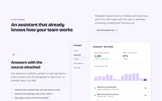
Alternating feature rows
productA section heading over two to four feature rows, each with its own heading, text, bullet points and a product screen or photo, alternating sides.
In Brassfinch, Rookbarrow Coffee, Sunfallow, Pebbleloft
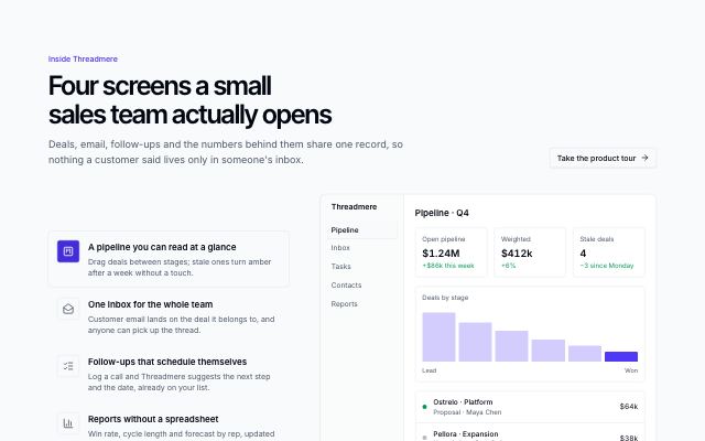
Icon list with swapping screen
productAn icon-led feature list beside one framed visual that crossfades to each feature's own screen or photo as you hover, focus or arrow through the list.
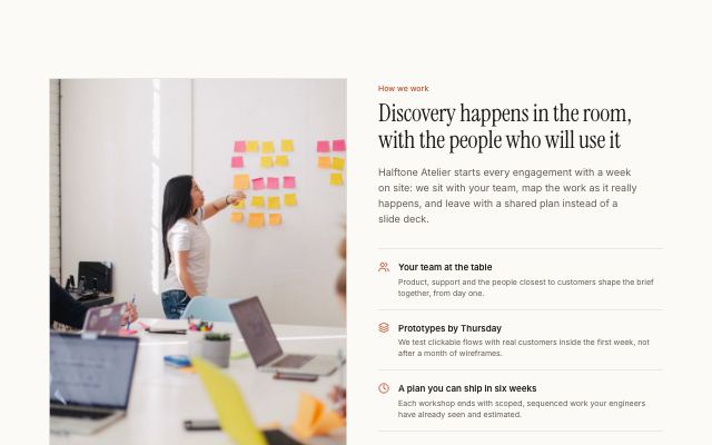
Capability list beside a photograph
productA headline and a ruled list of two to four icon-led capabilities next to a tall captioned photograph; the photo can sit on either side.
In Halftone Atelier, Cindermoss, Selvira Clinic, Calvenna, Rookbarrow Coffee, Pebbleloft, Tumblepaw
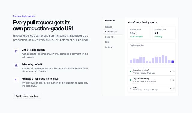
Feature list beside a product screen
productA headline and two to four icon-led capabilities next to a live product screen; the screen can sit on either side.
In Tessaly, Brassfinch, Lodestrand

Sticky visual with scrolling features
productNumbered features scroll past a pinned photo or product screen that swaps to match the one in view; on small screens and without scripts it reads as a stacked list.
In Calvenna, Hexmoor, Quietfern
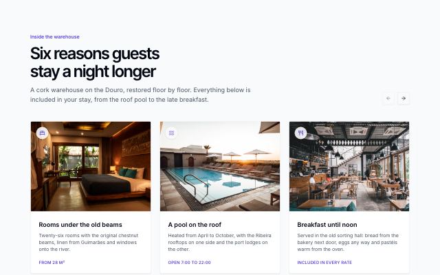
Feature card carousel
productPhoto-led feature cards in a horizontally scrolling, snapping track with previous / next buttons and progress dots; swipeable on touch, keyboard scrollable and mirrored right-to-left.
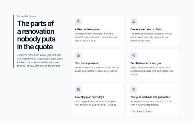
Capability checklist
productA pinned intro with an accent rule and optional link beside the main capabilities as icon-tile cards, with an optional band of further checked one-liners in up to three columns underneath.
In Hexmoor, Brassfinch, Lodestrand, Quietfern, Arbitrel
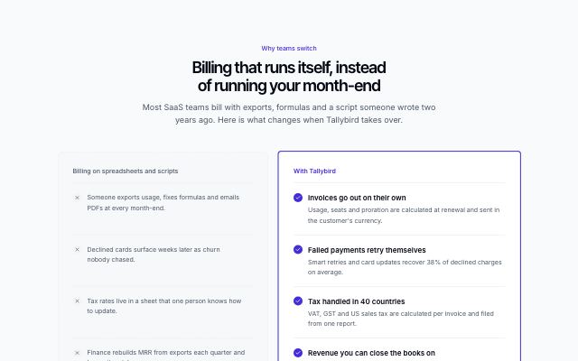
Before and with the product
productTwo aligned columns: the old way in a recessed dashed panel with neutral marks, and the same jobs done with the product on a highlighted surface.
In Tallybird, Hexmoor, Brassfinch, Sunfallow
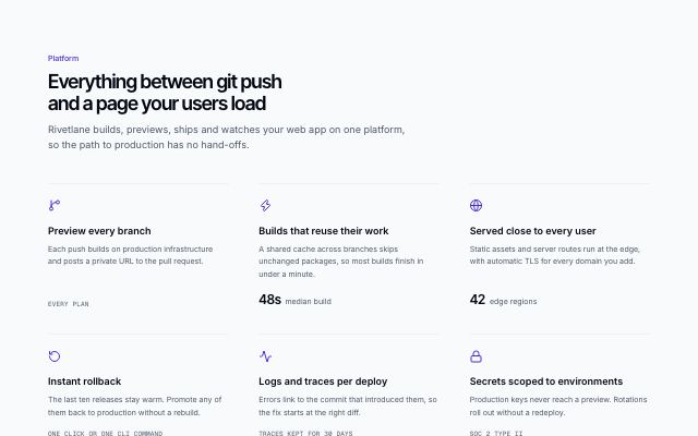
Capability grid with icons
productA headline over three to six capabilities in a three-column grid, each under a hairline with an icon, a line of copy and an optional figure.
In Ampwick, Ovelle Trust, Pulsewright, Joistwell, Calvenna, Commonfold, Hexmoor, Brassfinch, Rookbarrow Coffee, Pebbleloft, Quietfern, Tumblepaw, Harbor & Vale Logistics, Okafor & Lind Law
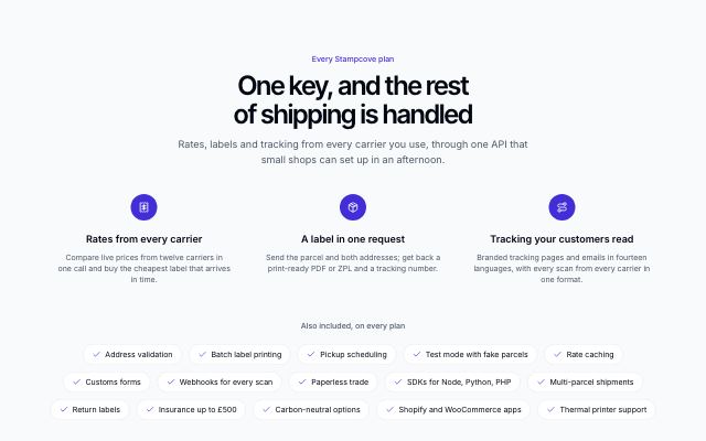
Features with a capability marquee
productThree to six headline features over rows of capability chips drifting in opposite directions — an "everything included" list that pauses on hover and settles into a wrapped list with reduced motion.
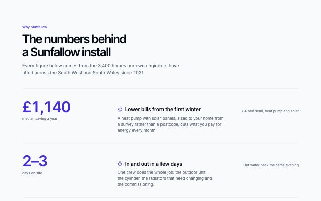
Metric-led feature rows
productFull-width ruled rows where each feature leads with the figure that proves it — a large counting number and its label — then the claim, the detail and the fine print.
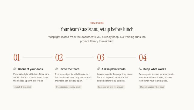
How it works in numbered steps
productA centered headline over three to six steps read as a sequence: numbered nodes on one rail (across the row on desktop, down the side on phones), each step a card with an icon tile and its meta chip aligned at the bottom.
In Halftone Atelier, Wisplight, Ovelle Trust, Kaltmark, Ondessa, Brassfinch, Sunfallow, Patinyard, Pebbleloft, Quietfern, Quarlume, Arbitrel, Okafor & Lind Law
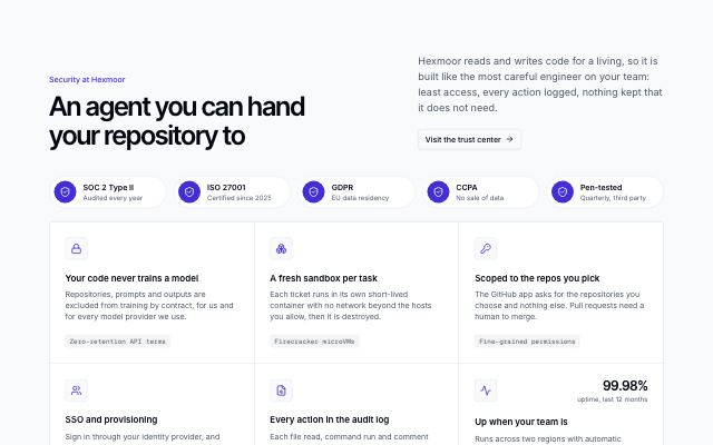
Security and compliance grid
productA row of certification badges (SOC 2, ISO 27001, GDPR…) over a ruled grid of security controls, each with its specifics and an optional figure such as uptime, plus a trust-center link.
In Lodestrand
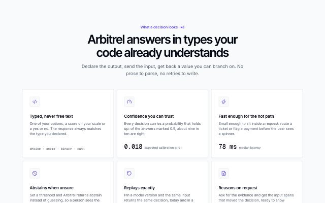
Spotlight feature cards
productFeature cards lit by a soft glow that follows the pointer across the grid, lighting each card's border and surface, with a mono figure or detail at the foot of each card.
In Arbitrel
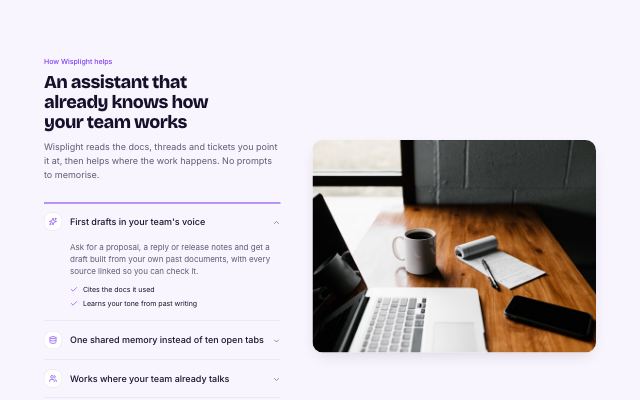
Capabilities accordion with media
productAn accordion of capabilities on one side; the open item's photo or product visual fills the other. On small screens the visual opens inside the item.
In Wisplight, Mirela Lab
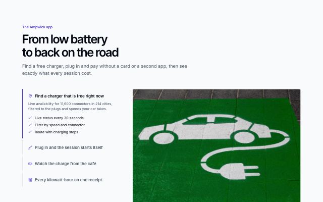
Autoplay tabs that fold into an accordion
productVertical feature tabs that advance on their own — a progress rail fills on the active tab, pausing on hover and stopping once you choose — beside a crossfading visual; below desktop width they become an accordion with each visual inside.
In Ampwick
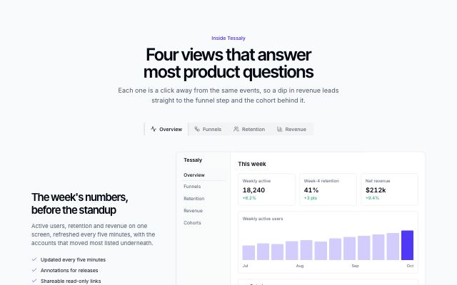
Capabilities in tabs with a product visual
productA tab strip switches between three or four capabilities; each shows its own copy beside a product screen, chart, funnel or cohort panel.
In Brassfinch, Lodestrand
Product showcase · 8
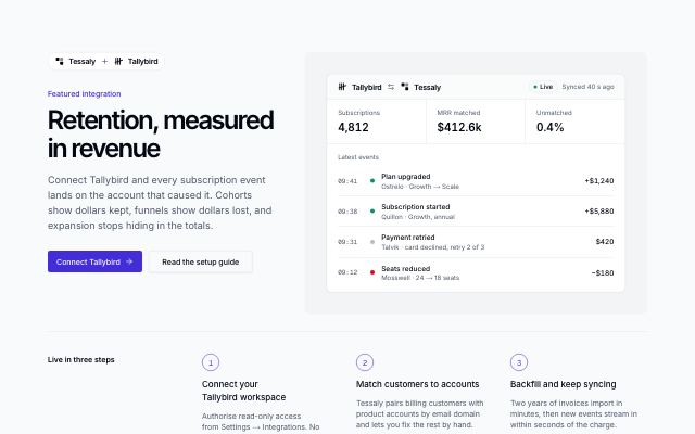
Featured integration story
productOne integration told as a story: paired brand marks, headline and actions beside a live sync panel, numbered setup steps and related connectors from the same category.
In Hexmoor
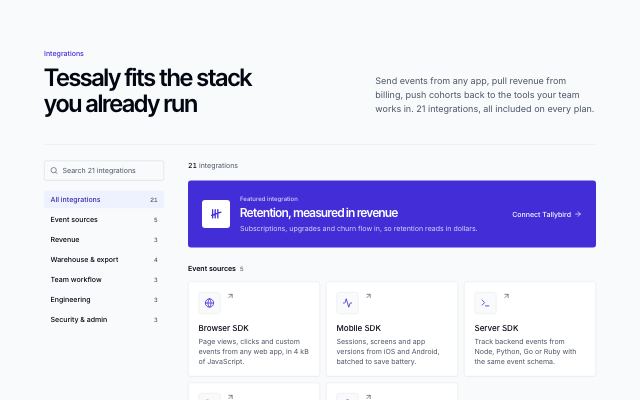
Searchable integrations directory
productEvery integration as a mark tile with a one-line summary, grouped by category, with a search field and category filter in a sticky sidebar and the featured integration on top.
In Hexmoor, Harbor & Vale Logistics
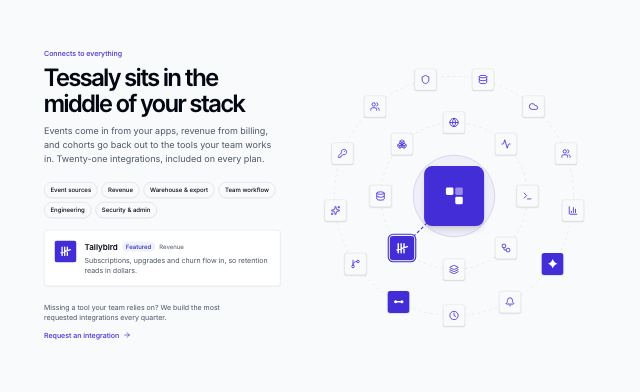
Integrations orbit
productThe product at the centre of two slowly turning rings of integrations; hover, focus or tap a mark to read what it does, and filter the rings by category.
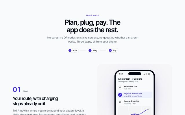
App steps with phone screens
productA mobile app explained as two to four steps — plan, plug, pay — each beside the phone screen that does it, alternating sides and arriving in sequence as you scroll.
In Ampwick, Brassfinch
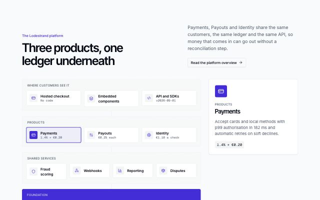
Platform map of modules
productA platform drawn as stacked layers of modules — what customers see, the products, the shared services — on one foundation band; hover, focus or tap a module to read about it in the side panel.
In Lodestrand
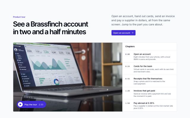
Product video with chapters
productA large inline product-tour player beside a chapter list: pick a chapter to jump there, and the playing chapter stays highlighted. Embed-only videos open in a dialog.
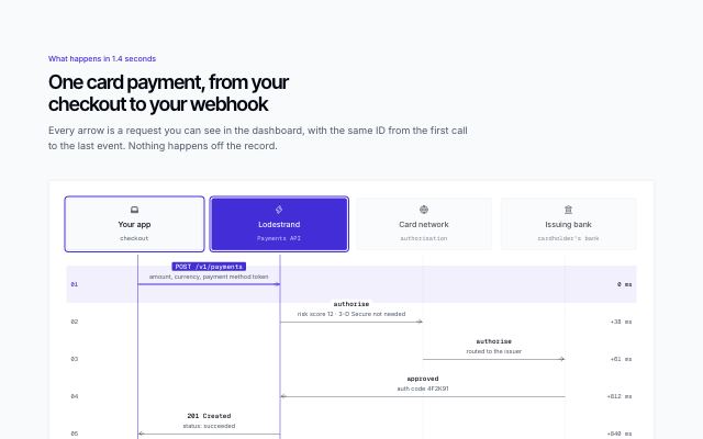
Sequence diagram of a request between systems
productThe parties of a flow across the top with lifelines, and each message as a labelled arrow from one to another in time order — endpoint or event name in mono, what it carries and the elapsed time — with the product's own lane highlighted. Each step is selectable (click, hover, arrow keys): its arrow and both parties light up and its detail shows under the diagram; a play button draws the arrows in order (final state only with reduced motion). On phones it becomes a numbered list of from → to steps.
In Lodestrand, Arbitrel
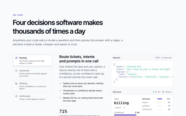
Use cases with a worked example call
productA picker of jobs (routing, guardrails, ranking, verification); each opens a short pitch with points and a figure beside one example call — the request and the typed decision it returns.
In Arbitrel
Process & steps · 6
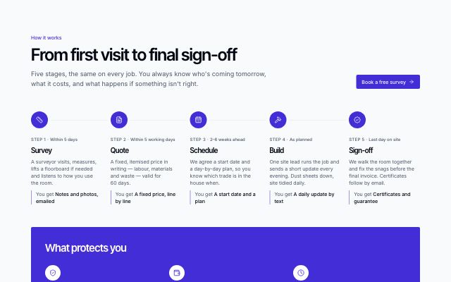
How a job runs, with guarantees
productSurvey → quote → schedule → build → sign-off on a track (vertical on phones, horizontal from desktop), each with timing and what you get, then a band of guarantees and insurance badges.
In Joistwell, Sunfallow
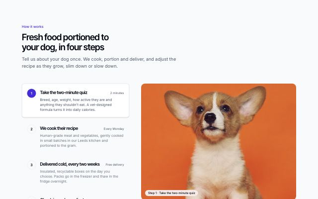
Numbered steps with media
productA numbered list of steps beside a large photo or screenshot that follows the chosen step; on small screens each step carries its own picture.
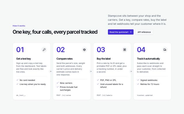
Step cards with connectors
productThree to five cards in a row joined by arrows, each with a big step number, an icon, what you do and what you get, and a closing pair of actions.
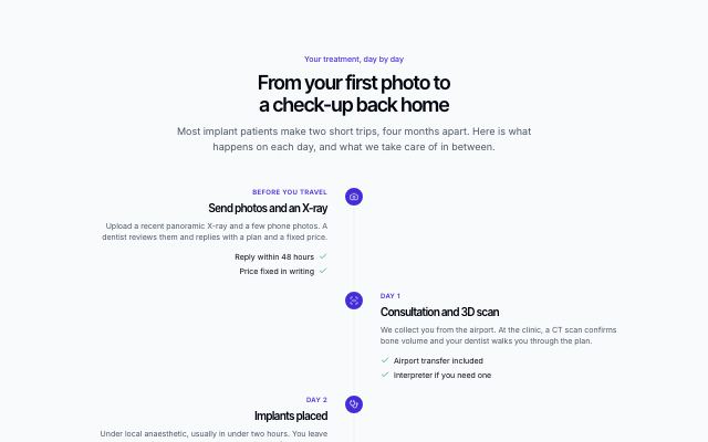
Process timeline
productSteps on a vertical timeline with the day or duration of each on the rail, alternating sides on wide screens, each with a short list of what happens.

Learning path with milestones and certificate
productA path across courses from beginner to job-ready: a numbered timeline of steps with level meter, length, skills and a milestone each, ending in a finish line, beside a sticky certificate, path summary and start button.
In Kestrella

Travel journey timeline
productA patient's or guest's trip as an icon timeline from airport pickup through hotel, appointments and free days to departure and follow-up, marking what is arranged — beside a photo and practical facts. Map-free.
In Selvira Clinic
Comparisons · 2
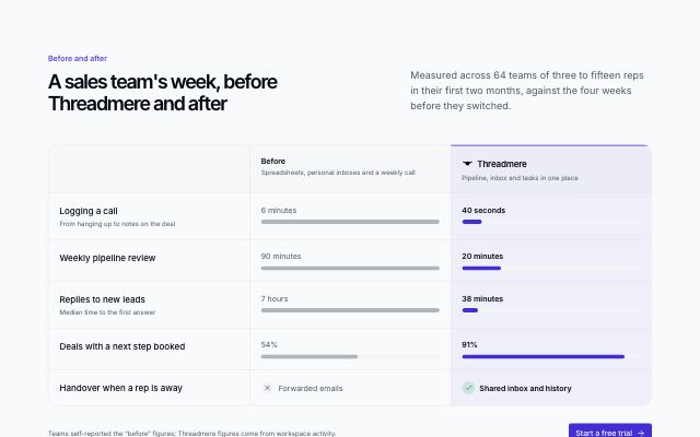
Before and after comparison
productLife without the product and with it, side by side: each row puts the old way's number against the new one, with paired bars that show the difference at a glance.
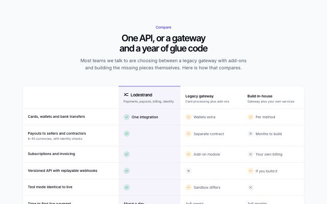
Us vs them comparison table
productThe product beside two or three alternatives people weigh it against, row by row, with yes / no / partly marks and short values; the product's column is highlighted and the table scrolls sideways on small screens.
In Lodestrand
Testimonials · 15
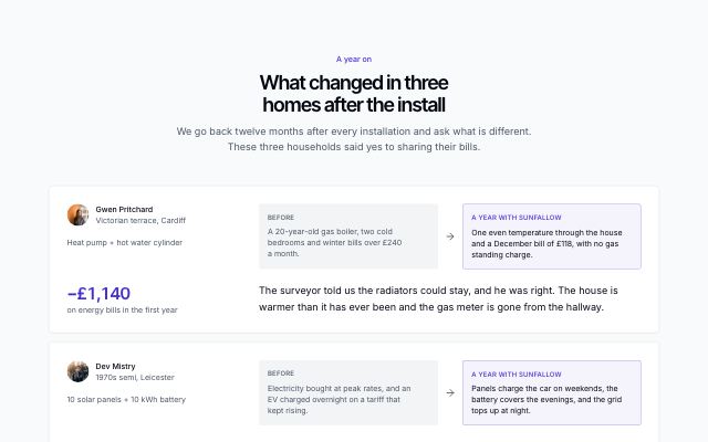
Before and after, in the customer's words
productTwo to four customer rows: who they are and the outcome figure on one side, and on the other a muted 'before' panel, an arrow to a highlighted 'after' panel, and their quote underneath.
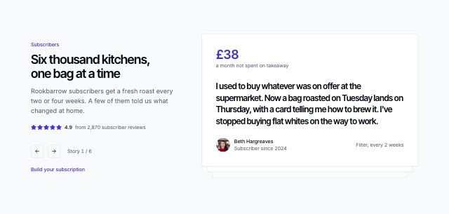
Stacked quote cards with previous and next
productOne large quote card on top of a stack of the next ones, offset and scaled behind it; previous and next controls deal the cards beside a heading, rating and position counter.
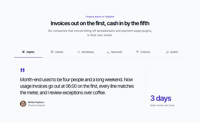
Customer quotes switched by logo
productA row of three to six customer logos acting as tabs over one large quote at a time, with the person and an optional outcome metric; arrow keys move between customers and nothing advances on its own.
In Tallybird, Lodestrand
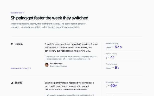
Customer stories with before-and-after metrics
productTwo or three customer stories as ruled rows: company logo, a short narrative with a pull quote, two or three before/after metrics and a link to the full story.
In Brassfinch, Lodestrand, Quietfern, Harbor & Vale Logistics
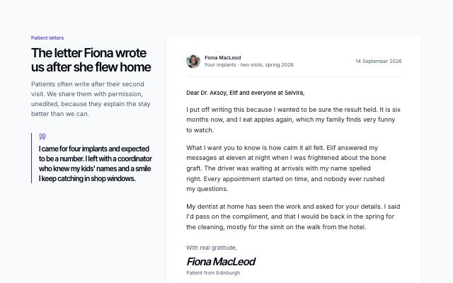
A customer's letter, in full
productOne customer's letter set on a paper card — greeting, paragraphs, sign-off and a display-type signature — beside a sticky heading and pull line, with a row of shorter notes from others underneath.
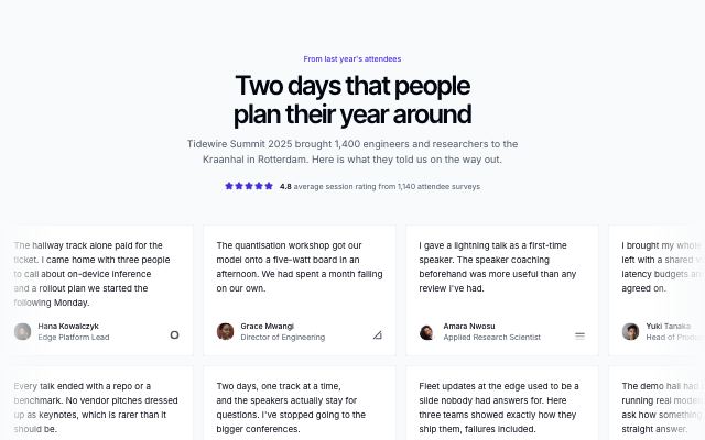
Two rows of drifting quotes
productA centered heading with an optional rating over two full-width rows of quote cards drifting slowly in opposite directions; a row pauses on hover and becomes a still, scrollable row with reduced motion.
In Lanternfold, Hexmoor

Portrait wall of people and their words
productA heading beside one large quote, then a wall of portrait-led cards in one even grid — the same portrait frame for everyone, the person's name and context, their quote and, when they have one, an outcome as a stat line at the foot of the card — for products whose customers are people, not logos.
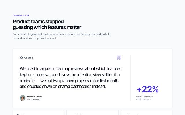
Featured customer quote over a quote grid
productA large featured quote with the customer's logo, photo and an outcome metric, followed by two or three shorter quotes in cards.
In Tessaly, Tidewire Summit, Ampwick, Pulsewright, Kestrella, Brassfinch, Rookbarrow Coffee, Patinyard, Tumblepaw, Arbitrel
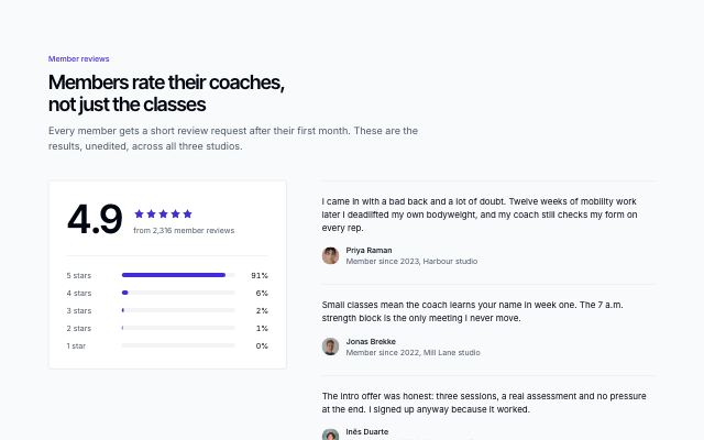
Rating summary with short quotes
productAn aggregate score with stars and an optional five-level distribution chart in a panel, beside three short customer quotes.
In Sunfallow
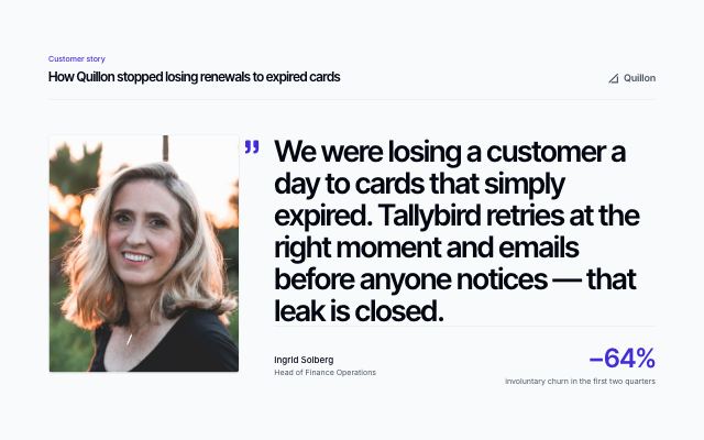
Single customer quote in display type
productOne customer quote set very large beside a tall portrait, with the customer's name, role, company logo and an outcome metric.
In Ampwick, Noor Halvorsen, Pulsewright, Kestrella, Calvenna, Hexmoor, Ondessa, Patinyard, Pebbleloft, Quietfern, Quarlume, Arbitrel
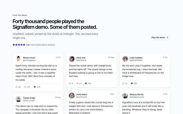
Wall of public posts
productCustomer quotes set as public posts — avatar, name, handle, date and reply, repost and like counts — flowing in a three-column wall under a heading with a rating line and one link.
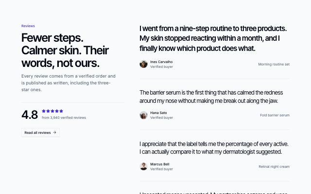
Sticky summary beside a scrolling column of quotes
productHeading, overall rating and a link stay pinned on the left while a long column of large-type quotes scrolls past on the right, each with its author and the product or company it is about.

Customer story led by a video
productOne customer story: a wide video poster with a play link, running time and captions note, a quote card overlapping its lower edge and an outcome metric beside it.
In Halftone Atelier
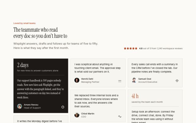
Wall of customer quotes
productA heading with an aggregate rating over six to ten customer quotes of mixed length in masonry columns; quotes can lead with an outcome metric.
In Halftone Atelier, Wisplight, Commonfold, Rookbarrow Coffee, Sunfallow, Pebbleloft, Tumblepaw
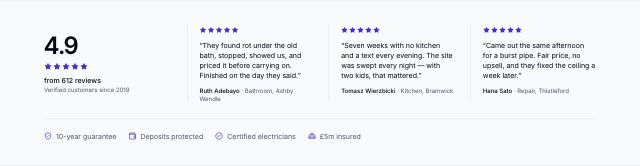
Reviews and credentials strip
productA compact band for under a hero: the overall rating, three short reviews with the job and town, and a line of guarantees and accreditations.
In Joistwell
Logos & sponsors · 8
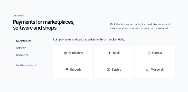
Customer logos by segment, in tabs
productA split heading over two to four customer segments: a segment rail beside a full-width hairline grid of that segment's customer marks under one line of proof, with the link to the stories under the rail. On phones the rail becomes a scrolling tab row.
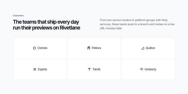
Customer logos in a tile grid
productA short heading and note above five to eight customer marks, each centered in its own tile of a hairline grid.
In Lodestrand, Quarlume
Scrolling customer logos
productA centered label over a slowly drifting row of customer marks with faded edges; it pauses on hover and stays still for reduced motion.
In Arbitrel
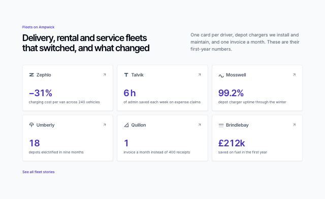
Customer logos with their outcomes
productA split heading over tiles that pair each customer's mark with one counting result and a short line; each tile can link to that customer's story.
Logo wall with headline counts
productA heading and two or three counting figures beside a hairline wall of customer marks that closes on a '+ more' tile, for showing scale as well as names.
Customer logo strip
productA short label beside a single row of five to eight monochrome customer marks, framed by hairlines as a thin band between sections.
In Tessaly, Ovelle Trust, Quarlume, Harbor & Vale Logistics
Customer logos with a featured quote
productOne short customer quote with its logo and author beside a loose grid of five to eight customer marks, with a link to the full customer list.
Sponsors by tier
productSponsor logos grouped by tier — headline partners drawn large, gold and community tiers progressively smaller — closed by a become-a-sponsor panel.
In Tidewire Summit
Stats · 13
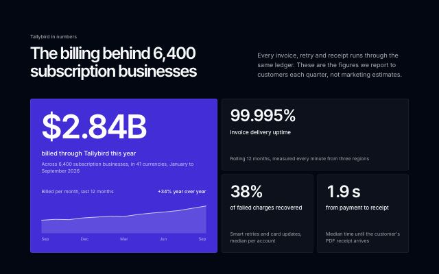
Inverted bento with a hero metric
productA dark band with one large hero figure and its trend line in a filled tile, beside two or three supporting figures in a bento grid.
In Tallybird, Hexmoor, Lodestrand
Inline proof band under a hero
productA compact single row of three or four figures, each attributed to the customer it was measured at with a logo or a short source note.
In Sunfallow, Pebbleloft
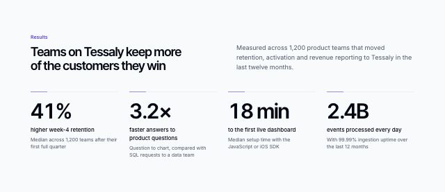
Metric band with sourced numbers
productA short headline over three or four large figures, each on a hairline with its label and a line saying where the number comes from.
In Tessaly, Tidewire Summit, Ampwick, Selvira Clinic, Pulsewright, Kestrella, Static Orchard, Joistwell, Kaltmark, Brassfinch, Rookbarrow Coffee, Lodestrand, Sunfallow, Patinyard, Quietfern, Tumblepaw
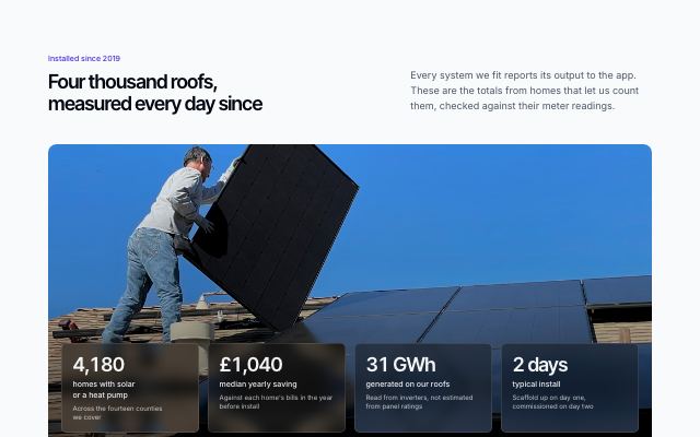
Figures over a full-bleed photo
productA wide photo of the work itself with the headline and three or four figures set on translucent tiles across its lower edge.
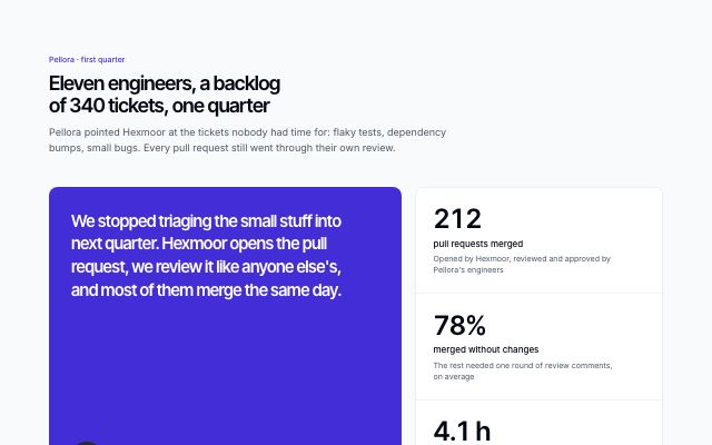
Metrics beside a customer quote
productA customer's quote with portrait and logo on one side, the figures it is about stacked on the other — the numbers and the person who lived them.
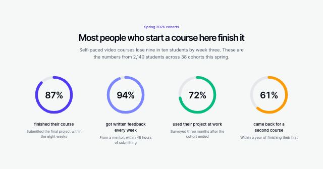
Metrics as progress rings
productThree or four percentages drawn as rings that fill to their value, each with a label and its source — for completion, satisfaction and coverage figures.
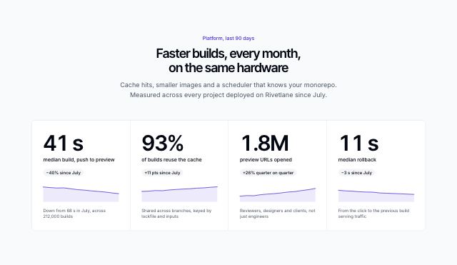
Big numbers with sparklines
productThree or four oversized figures in a ruled band, each with its change over the period and a sparkline of the trend behind it.
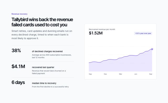
Metrics beside a trend chart
productA headline and three or four sourced figures in a ledger beside an area chart of the trend behind them.
In Ampwick, Lodestrand
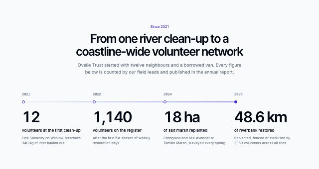
Growth milestones on a timeline
productThree or four figures as milestones along one line, each dated above its marker and counting up when it scrolls into view; the line runs down the side on phones.
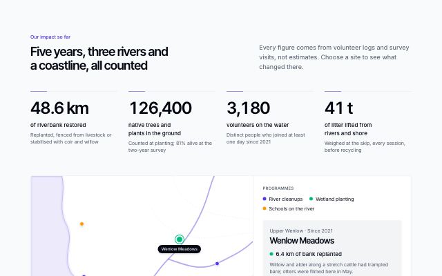
Impact figures with a map of project sites
productHeadline impact figures that count up, each with how it was counted, above a stylised catchment map of project sites coloured by programme, with a legend, a selected-site card and a site list that works without the map.
In Ovelle Trust
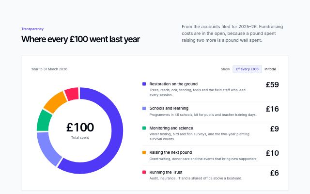
Where the money goes
productA year's spending as a large ring with the total in its hole, beside a legend of categories with what each covers and aligned amounts (hovering one lights its arc), switchable between per-100 shares and totals; below, the year's key figures and a download card for the annual report.
In Ovelle Trust, Rookbarrow Coffee
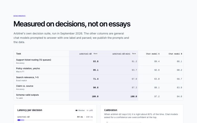
Model benchmarks with latency and calibration
productA published evaluation: task scores per model with the product's own columns highlighted and the best score bold, median and p95 latency bars, a calibration (reliability) chart with ECE per model, and the methodology underneath.
In Arbitrel
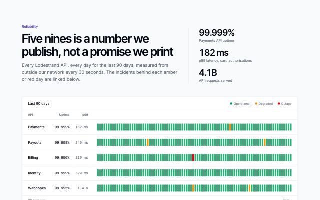
Reliability ledger with daily uptime bars
productHeadline uptime, latency and volume figures over a ledger of services, each with its uptime, p99 latency and one bar per day for 90 days (30 on phones) in operational, degraded or outage tones, then the incidents behind the coloured days and a link to the live status page.
In Lodestrand
Case studies · 4
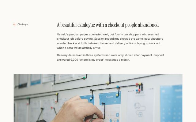
Case study story with gallery and pull quote
productThe body of a case study: numbered challenge, approach and result sections in editorial rows, broken up by a wide photo, a captioned image grid and a large client pull quote.
In Halftone Atelier, Noor Halvorsen, Kaltmark, Quarlume
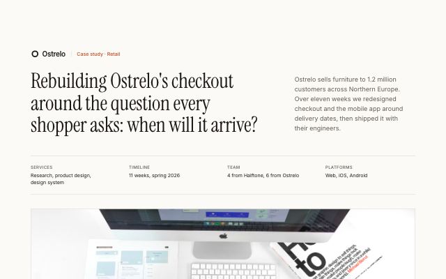
Case study header with outcome metrics
productThe top of a case study: client mark, a long headline beside the summary, engagement facts, then a wide cover photo with three or four outcome metrics as one even band beneath it.
In Halftone Atelier, Noor Halvorsen, Kaltmark, Quarlume
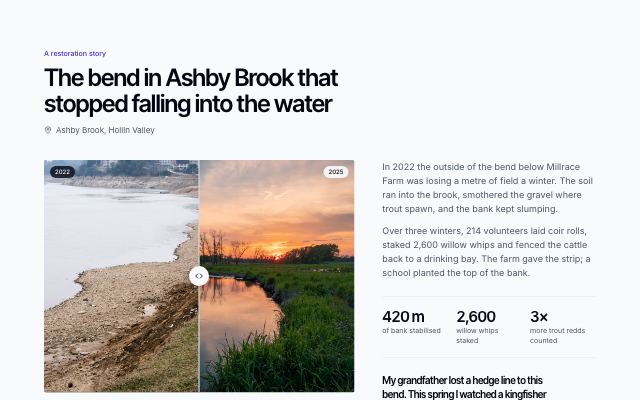
Restoration story with before and after
productOne place's story: an accessible before/after photo comparison with captions for both, what was done, the figures that changed, and a quote from someone who lives with the result.
In Ovelle Trust
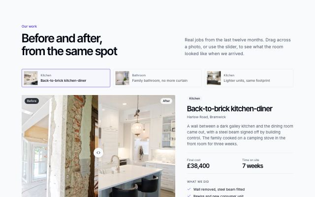
Before and after gallery
productPick a project, then drag or use the keyboard slider to compare before and after photos, with the cost, time on site and the work done beside it.
In Joistwell
Credentials · 2

Credentials with drawn seals
productLicences, certifications, memberships and languages spoken, each group under a drawn seal with the issuer and year beside every entry — as a section with its own heading, or as a compact row under a hero.
In Hexmoor, Brassfinch, Okafor & Lind Law
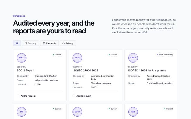
Compliance wall with report requests
productAudits, licences and privacy terms as badge cards — a drawn mark, status (current or audit under way), who checked it, scope and last audit — filtered by area, with a tick on each report and a sticky bar that requests the picked reports together.
In Lodestrand
Awards & press · 3
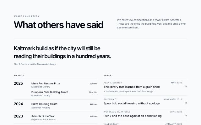
Awards ledger beside press coverage
productRecognition as two ruled ledgers: awards and prizes grouped by year (prize, work, result) beside press pieces (outlet, headline, date, an optional quoted line), under an optional pull quote, with the press contact at the foot.
In Kaltmark, Quarlume
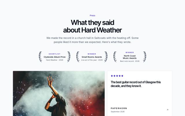
Laurels and a wall of review quotes
productRecognition as a review page: awards drawn as laurel wreaths in a row, then a featured review with a photo, score and pull quote beside a wall of quoted lines, each under its outlet's typeset masthead with stars and a link to the piece, and the press contact at the foot.
In Velvet Quarry
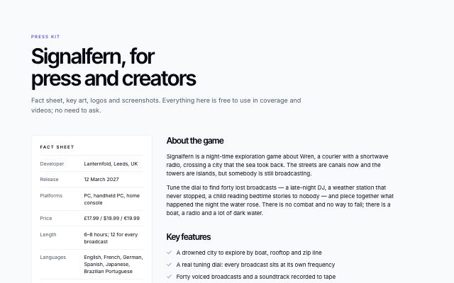
Press kit with a fact sheet and downloads
productA press page for a game, album or product launch: a sticky fact sheet and download list beside the description, key features, screenshots with captions, press quotes and the press contact.
In Lanternfold, Velvet Quarry
Plans · 16
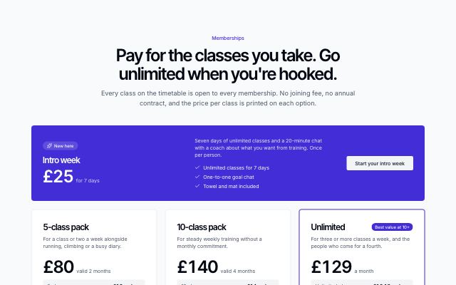
Studio memberships
productAn intro offer band over class packs and an unlimited plan, each with its price per class; a slider prices your month on every option and the freeze, cancel and late-cancel terms sit alongside.
In Pulsewright, Commonfold, Pebbleloft
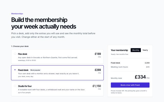
Plan and add-ons builder with a live total
productPick a base plan from selectable rows, tick the add-ons you need from a card grid, and a sticky summary itemises the choice with a monthly/annual switch, a running total and one action.
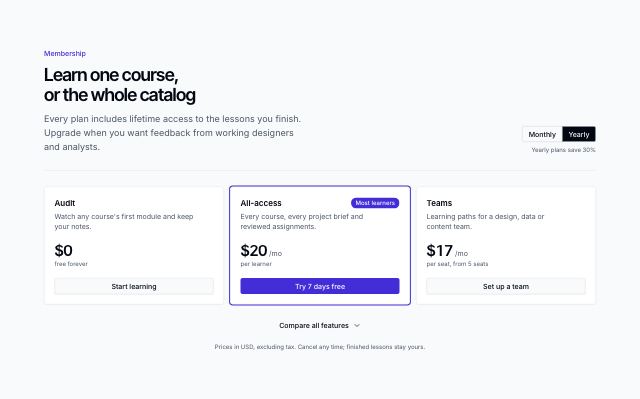
Compact plan cards with compare all
productDense plan cards that lead with price and action under a monthly/annual toggle; one compare-all control opens every plan's full checklist at once.
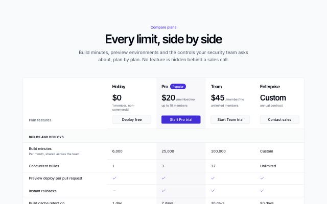
Plan comparison table
productEvery plan in one table: a header row with prices and actions, grouped feature rows with checks, dashes and values, and actions again at the foot. Scrolls sideways with a pinned feature column on small screens.
In Tallybird, Hexmoor, Brassfinch
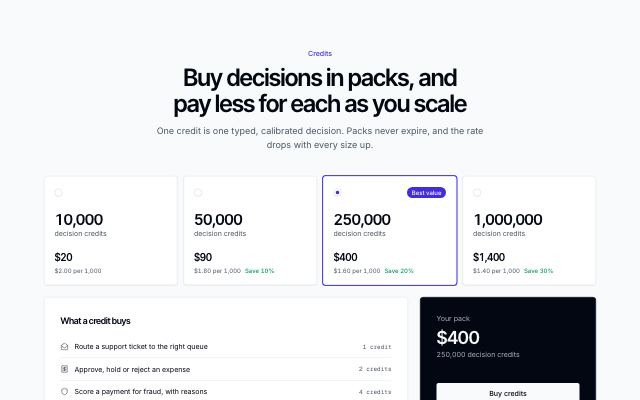
Prepaid credit packs with what a credit buys
productSelectable credit packs with per-unit rates and savings against the smallest pack, a list of what one credit buys beside a dark checkout summary, and subscription plans as a ruled list below.
Self-serve plans beside an enterprise panel
productSelf-serve plans as stacked rows with price, key features and a direct action, beside a dark talk-to-sales panel with assurance points and customer logos.
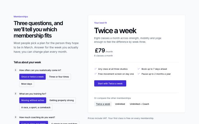
Plan finder that recommends a tier
productTwo or three short questions with tap-to-answer options beside one large result card that names the recommended plan, its price and features, with the other plans one tap away.
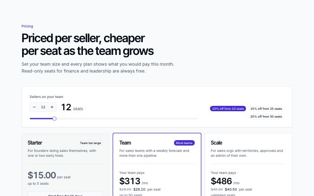
Per-seat plans with a team-size picker
productA team-size stepper and slider over the plans: every card shows its total for that many seats, volume discounts light up as the team passes them, and plans the team has outgrown step back.
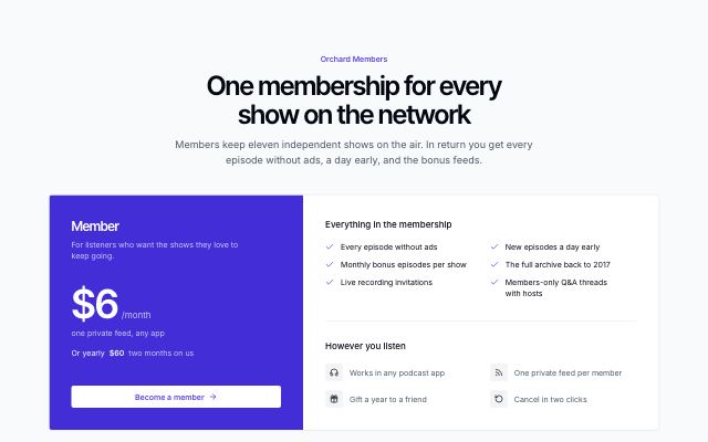
One plan, everything included
productA single plan for a simple product: one large price on a colour band beside everything it includes, then a short row of billing questions.
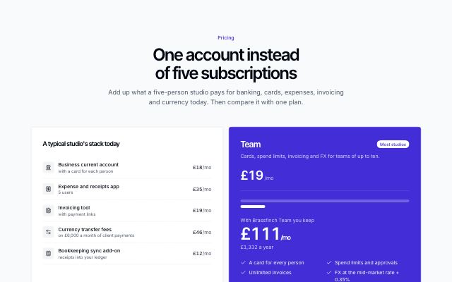
Replace-your-stack savings
productAn itemised receipt of the tools a plan replaces, totalled and struck through, beside the recommended plan on a colour band with the monthly and yearly saving and a bar comparison; the other plans follow as small cards.
In Brassfinch
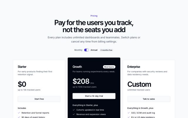
Pricing tiers with a highlighted plan
productTwo to four plans with a monthly/annual switch; the recommended plan inverts the palette and rises above its neighbours.
In Tessaly, Kestrella, Brassfinch, Quietfern, Tumblepaw
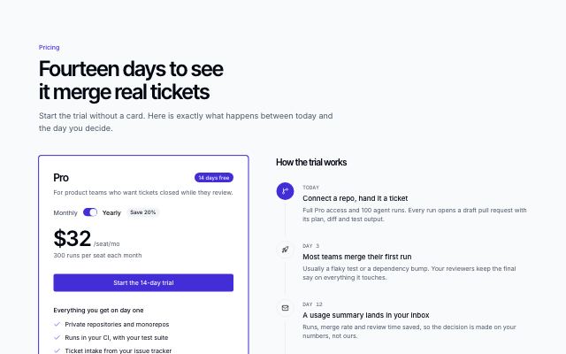
Trial plan with a day-by-day timeline
productThe recommended plan as one card with a billing switch, beside a vertical timeline of what happens during the free trial — from today to the day you decide — with the other plans as a link row below.
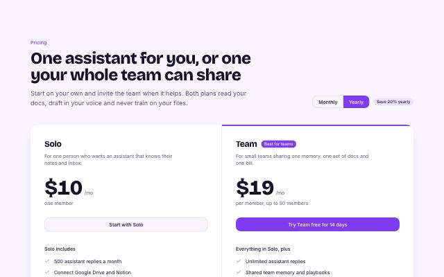
Two plans side by side
productA personal and a team plan share one panel with a monthly/yearly toggle; a strip underneath lists what both plans include.
In Wisplight, Patinyard
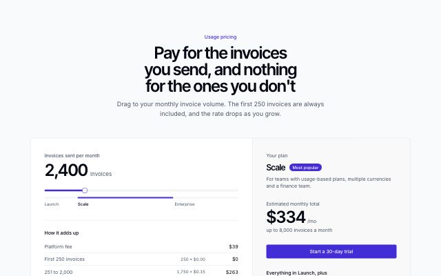
Usage slider with a live estimate
productA slider sets monthly usage; graduated rates from content recompute the price live, show the band breakdown and name the plan it lands on.
In Tallybird, Hexmoor, Arbitrel, Harbor & Vale Logistics
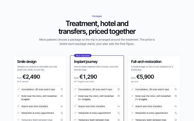
Package comparison cards
productTwo or three bundled packages side by side with rows aligned across cards: who each suits, a localized “from” price, what is included (treatment, hotel nights, transfers, interpreter, follow-ups) and an action, with a note on what no package covers.
In Selvira Clinic, Calvenna, Lanternfold, Sunfallow
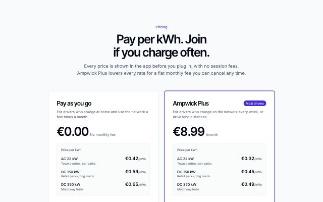
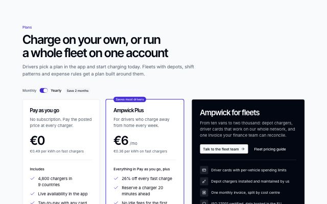
Membership plans with per-kWh rates
productPay-as-you-go beside a membership: monthly fee, a rate per charger speed and what's included, then a slider that prices your month on each plan, marks the cheaper one and names the break-even point.
In Ampwick
Calculators · 4
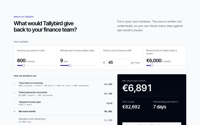
ROI calculator with a written-out ledger
productA row of the buyer's own numbers — sliders or exact fields — feeding a formula set in content as named terms, written out as a ledger of gains and costs, with the monthly and yearly return and the payback period beside it.
In Brassfinch, Harbor & Vale Logistics
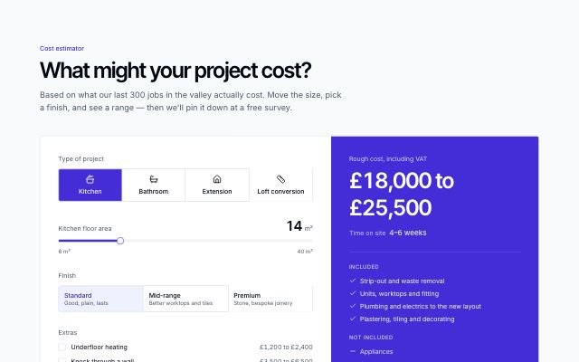
Project cost estimator
productPick a project, set its size, finish and extras, and see a rounded cost range and time on site, with what's included, what isn't, and a plain “estimate only” note.
In Joistwell
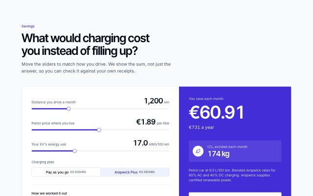
Savings calculator with the math shown
productThree sliders — distance, fuel price, energy use — and a plan switch recompute monthly savings and CO₂ avoided live, with every multiplication written out beside the result.
In Ampwick
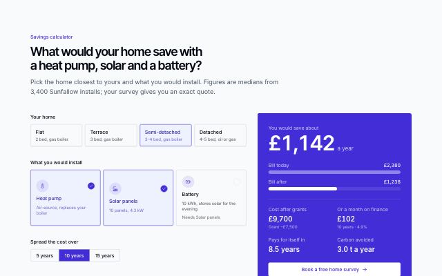
Home energy savings planner
productPick a kind of home, the systems to install (heat pump, solar, battery — a battery waits for solar) and a finance term; a result panel shows the yearly saving, today's bill against the bill after as bars, cost after grants, payback, the monthly payment and carbon avoided.
In Sunfallow
Sponsor rates · 1
Tickets · 2
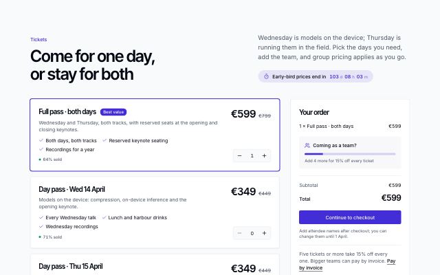
Ticket picker with an order summary
productDay passes, a full pass and add-ons as rows with price, perks, availability and a quantity stepper, beside a sticky order summary that totals the lines, tracks progress to the group discount and applies it, under a live early-bird countdown.
In Tidewire Summit
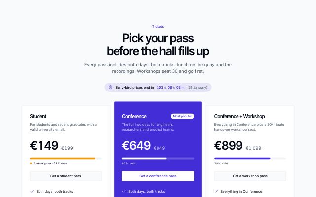
Ticket tiers with availability
productTicket types side by side with price, struck-through regular price, an availability bar that turns to the warning tone when nearly sold out, perks and a buy action, under a live early-bird countdown and over a group-discount panel.
Blog & writing · 10
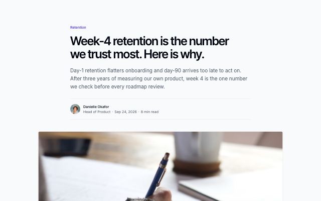
Article with typed prose body and related posts
productA long-form article: category, title, lead, author byline and cover, then a readable prose column built from typed blocks (paragraphs, headings, quotes, images, code, callouts, lists) and a related-posts strip.
In Tessaly, Lanternfold, Quietfern, Tumblepaw
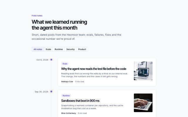
Posts on a dated timeline
productPosts in a changelog-style timeline: dates on a rail, a dot per post, and each entry as a card with category, excerpt and thumbnail, filterable by category.
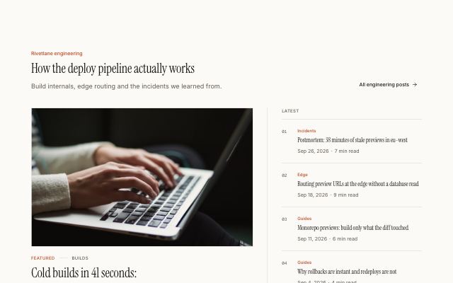
Featured post beside a recent-posts list
productOne large featured post with cover, title, excerpt and byline, set beside a numbered list of the four most recent posts with date and read time.
In Halftone Atelier, Noor Halvorsen, Lanternfold, Mirela Lab
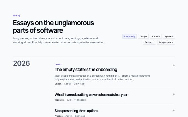
Writing index grouped by year
productA minimal list of essays grouped under large year numerals, with topic filters, dates and reading times; the latest essay carries its excerpt.
In Noor Halvorsen
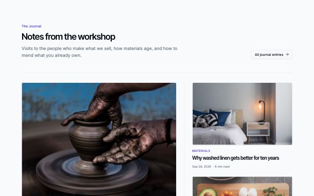
Magazine front page
productAn editorial front page: a large lead story, two stories with thumbnails beside it, and a row of text-only headlines underneath.

Blog index with category filter
productA blog heading with a category filter over a three-column grid of post cards: cover photo, category, title, excerpt and author byline with date and read time.
In Tessaly, Quietfern, Tumblepaw
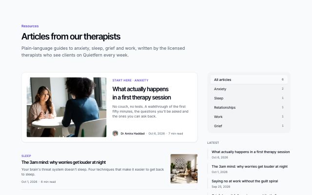
Posts with a category sidebar
productA featured post and a filtered list of posts beside a sticky sidebar of categories with post counts and the most recent titles.
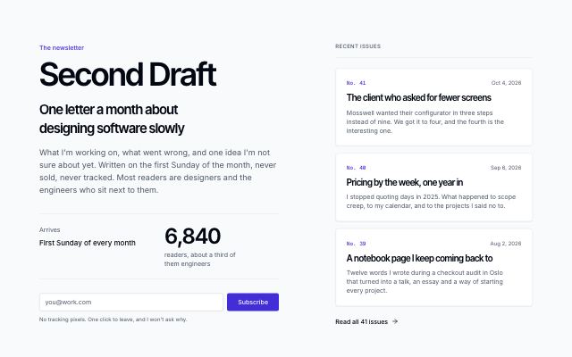
Newsletter feature with recent issues
productA newsletter's masthead, pitch, cadence and counting subscriber figure beside an email signup, with the last issues stacked as letters and a link to the archive.
In Noor Halvorsen, Ovelle Trust, Static Orchard, Velvet Quarry
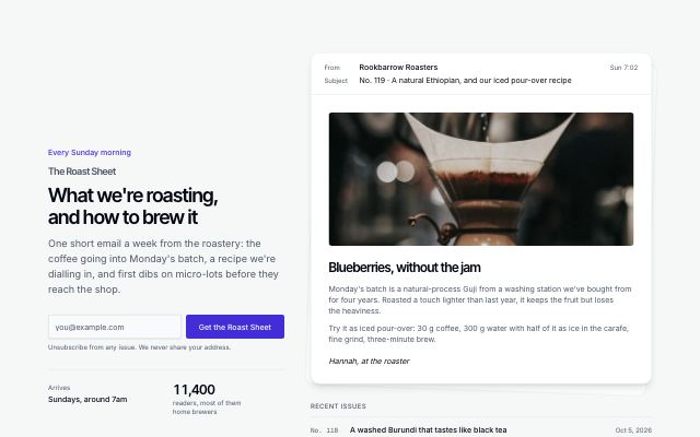
Newsletter with a rendered issue
productThe pitch and signup beside the latest issue drawn as an email — sender, subject, photo and opening lines — with recent issue titles underneath.
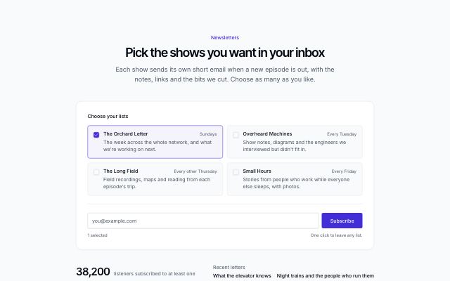
Newsletter signup with list picker
productReaders tick the lists they want — each with what it covers and how often it arrives — then subscribe once; a live count and the reader total sit beside the button.
Changelog · 3
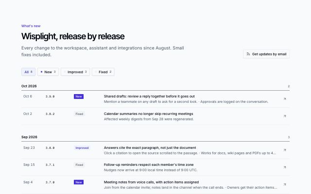
Compact release list by month
productA dense, scannable list of releases grouped by month: date, version, new / improved / fixed tag, a one-line title and notes per row, with a tag filter showing counts.
In Wisplight, Lodestrand, Stampcove API docs
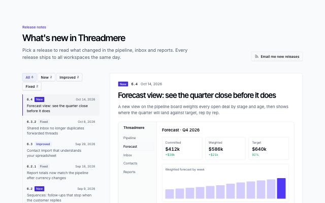
Release notes reader with a version list
productRelease notes read one release at a time: a list of versions with date, new / improved / fixed tag and title beside a reading pane with the summary, a product screen or photo, the notes and newer / older paging, filterable by tag; below desktop the list folds into a version picker.
In Threadmere
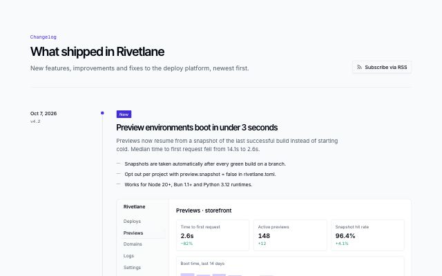
Release timeline with a date rail
productReleases on a vertical timeline with a sticky date and version rail on desktop: a new / improved / fixed tag, title, summary, short notes and an optional product screen or photo.
In Tessaly, Rivetlane docs, Hexmoor
Publications · 2
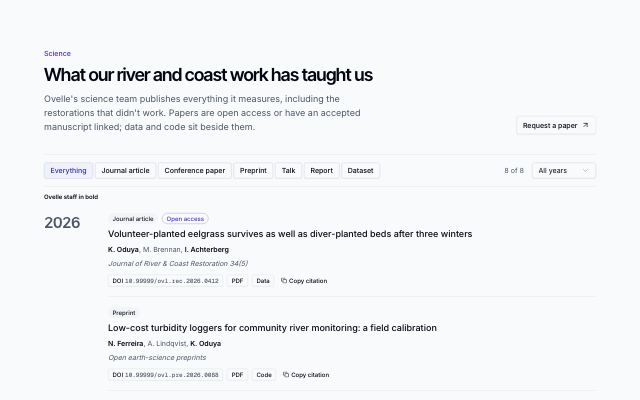
Publications by year with filters
productPapers, preprints, talks and datasets grouped under large year markers, filterable by type and year, with the group's own people in bold in every author list, DOI, PDF, code and data links and a one-click citation copy.
In Mirela Lab
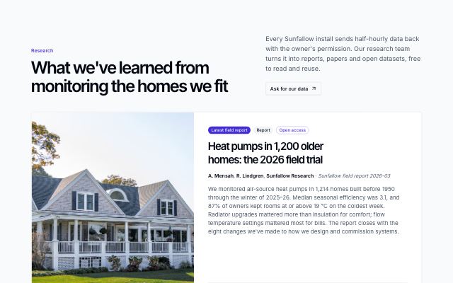
Report library with covers and citations
productA research library: the latest report featured large with its cover and full abstract, then a grid of reports, papers and datasets as cover cards, filterable by type and year, each with authors, an expandable abstract preview, download and data links and a citation popover to copy.
In Sunfallow
Long-form · 1
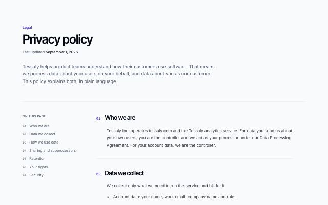
FAQ · 11
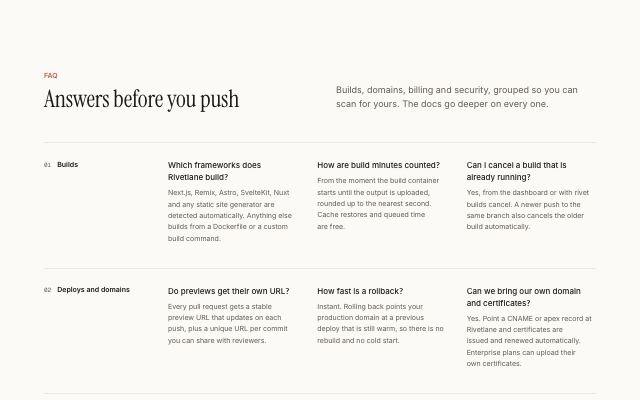
FAQ grouped by category
productEvery answer visible at once: numbered category headings, each with its questions in a two- or three-column grid, and a contact panel below.
In Halftone Atelier, Lanternfold, Rookbarrow Coffee, Sunfallow, Pebbleloft, Tumblepaw, Arbitrel
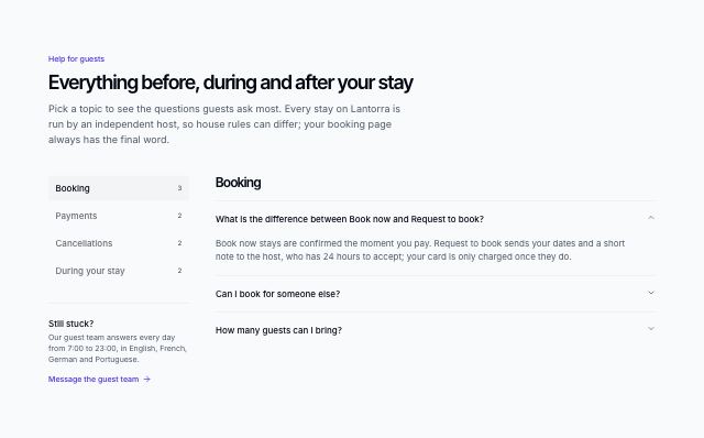
FAQ with a category rail
productA vertical rail of categories with question counts and a contact note on the left; the chosen category's questions open one at a time on the right. The rail turns into a sideways-scrolling row on small screens.
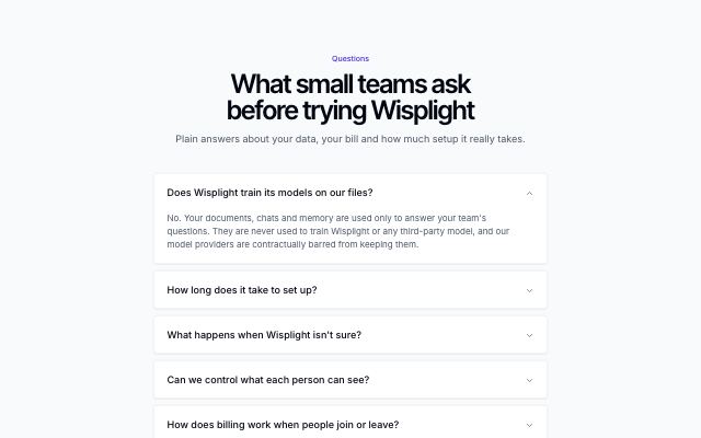
Centered FAQ accordion
productA centered heading over a single column of questions on separate surfaces, with a one-line contact prompt underneath.
In Tessaly, Wisplight, Tidewire Summit, Ampwick, Ovelle Trust, Pulsewright, Ondessa, Brassfinch, Lodestrand, Pebbleloft, June Halloway Photography
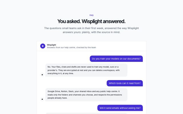
FAQ as a chat conversation
productQuestions and answers set as a chat thread in one window — the visitor's question on the end side, the product's answer with its mark on the start side — closed by an ask-a-question bar.
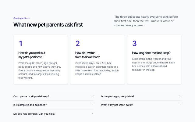
Top questions first, the rest below
productThe three most-asked questions as large numbered cards with their full answers, then every other question in a two-column accordion, closed by a contact strip.
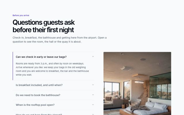
FAQ with a picture for every answer
productQuestions open one at a time beside a large panel that crossfades to the open answer's photo or product visual, with its caption. On small screens the picture moves inside the open answer.
In Calvenna
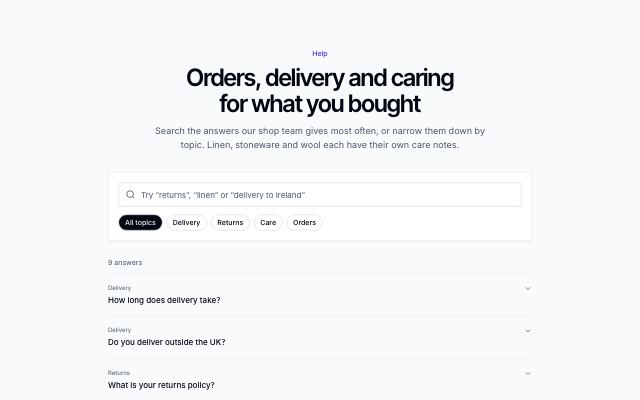
Searchable FAQ with categories
productA search field and category chips that filter the questions as you type, a live result count, an expandable list and an empty state that points to a person.
In Hexmoor, Quietfern
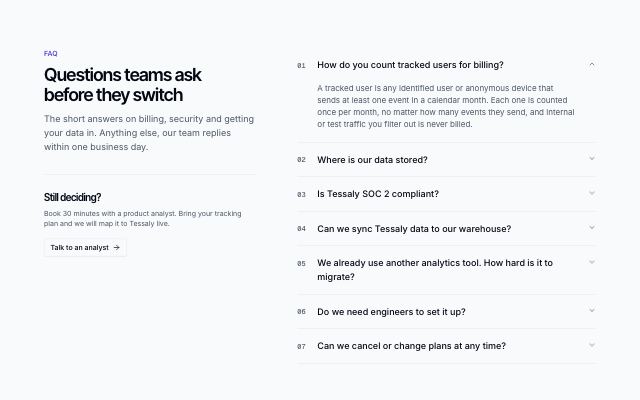
FAQ with a sticky intro and an accordion
productHeading, summary and a contact prompt stay pinned on the left while numbered questions open one at a time on the right.
In Tessaly, Tallybird, Tidewire Summit, Ampwick, Noor Halvorsen, Ovelle Trust, Selvira Clinic, Pulsewright, Kestrella, Static Orchard, Joistwell, Calvenna, Commonfold, Hexmoor, Ondessa, Brassfinch, Lodestrand, Sunfallow, Patinyard, Pebbleloft, Quietfern, Tumblepaw, Quarlume, Arbitrel, Okafor & Lind Law
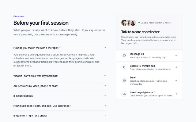
FAQ beside a support desk
productQuestions open one at a time beside a sticky support card: the faces of the people who answer, how quickly they reply, and a list of channels — message, call, email, urgent help — each a link.
In Quietfern
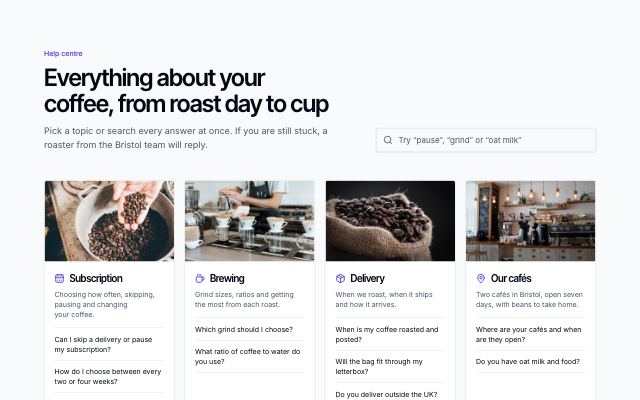
FAQ by topic with illustrated cards
productA search across every answer beside the heading, then one card per topic with a photo or product visual, its top questions and a button that opens the whole topic. Ends with a help strip.
In Rookbarrow Coffee
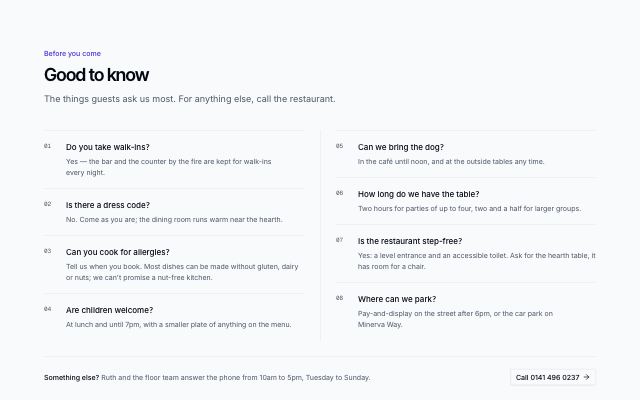
Compact FAQ in two columns
productShort questions and answers, all visible at once, numbered and flowing down two ruled columns, with a one-line contact prompt below.
In Cindermoss, Selvira Clinic, Joistwell, Calvenna, Velvet Quarry, Commonfold, Hexmoor, Brassfinch, Rookbarrow Coffee, Lodestrand, Halvane, Sunfallow, Patinyard, Pebbleloft, Tumblepaw, Quarlume, Arbitrel, Harbor & Vale Logistics
Media & talks · 4
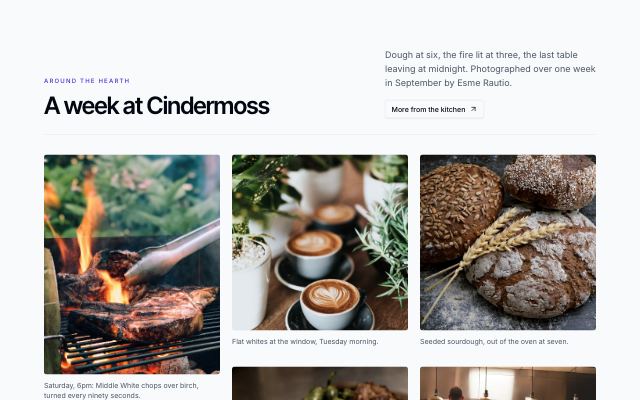
Captioned photo masonry
productA run of photographs in tall, wide and square frames, set in masonry columns with a caption under each, arriving one after another as they scroll in.
In Cindermoss, Pulsewright, Calvenna, Commonfold, Rookbarrow Coffee, Sunfallow, Pebbleloft, Tumblepaw, Quarlume
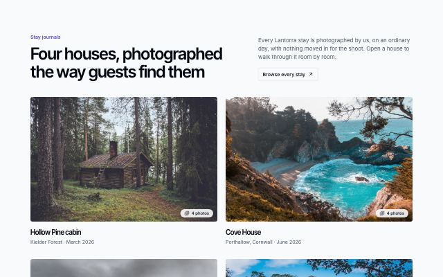
Project albums with a lightbox
productProjects — a wedding, a house, a commission — shown as cover photos with title, place and photo count; opening one pages through its photos in a keyboard-friendly lightbox with captions, a counter and thumbnails.
In June Halloway Photography
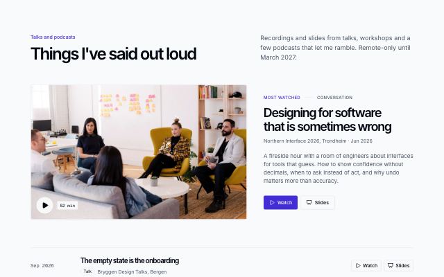
Talks with a featured recording
productA featured talk as a large still with its running time, abstract and links, followed by a dated list of talks, podcasts and workshops with watch, slides and listen links.
In Noor Halvorsen, Velvet Quarry
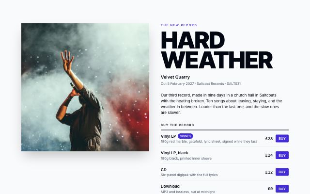
Album release with formats and tracklist
productA record's page: a large square cover beside the title set like a poster, release date and imprint, formats to buy (vinyl, CD, download) with prices, where to listen, then the numbered tracklist with singles marked, total running time and credits.
In Velvet Quarry
Podcasts & shows · 5
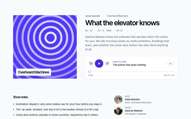
Featured episode with player
productAn episode led by its generated show cover and a working player — play and pause, 15-second skips, speed, a scrubber marked with chapters and the chapter now playing — followed by show notes, links mentioned on air, host, guests and the sponsor.
In Static Orchard
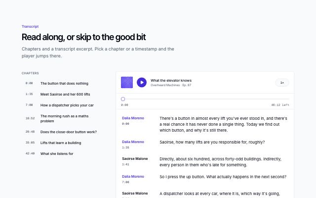
Episode chapters and transcript
productAn episode's chapters as a timestamped list beside its transcript, with speaker labels and a compact player: pick a chapter or a timestamp and playback jumps there while the line being read stays highlighted and in view.
In Static Orchard
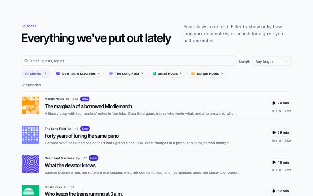
Episode list with filters
productA network's episodes as a list with show covers, numbers, guests, dates and running times, a new badge and a play button per row, filtered by show chips, a length menu and search, with a result count, an empty state and show more.
In Static Orchard
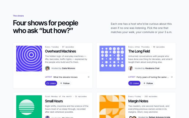
Shows grid with generated covers
productA network's shows as cards with generated cover art, cadence and episode count, a one-line pitch, hosts, the latest episode, and listen and follow buttons.
In Static Orchard
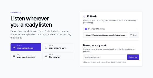
Subscribe via apps, RSS and email
productWays to follow a podcast: generic app buttons (no platform names or marks), a show picker with its RSS address and a copy button, and new episodes by email with a confirmation.
In Static Orchard
Courses · 5
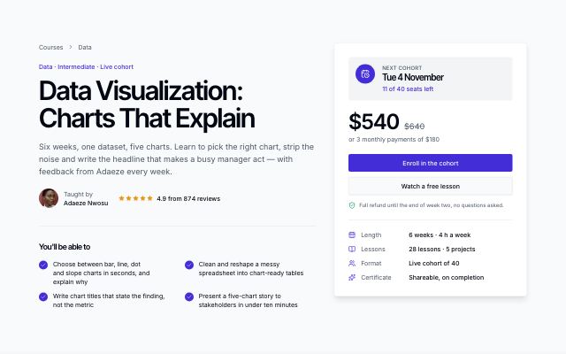
Course header with enroll card
productA course page header: breadcrumb, title, instructor and rating, an outcomes checklist and a sticky enroll card with next cohort date, price, payment terms and refund promise — then a band showing what learners build.
In Kestrella

Course catalog with topic, level and format filters
productThree rows of filter chips (topic, level, format) with live counts above a three-column grid of course cards — cover, level, lessons, next cohort, rating, instructor and price or free — with an empty state.
In Kestrella
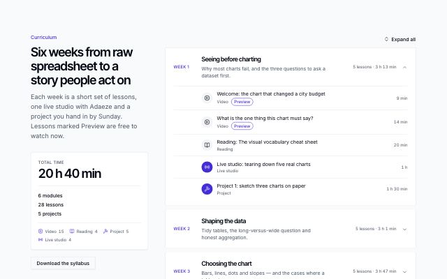
Curriculum with module accordion
productA course syllabus: a sticky summary with total time, module, lesson and project counts beside an expandable list of modules, each listing its lessons with type, length and free-preview badges.
In Kestrella

Instructor profile
productA teacher's page: large portrait with rating, bio, credentials, social links and office hours, a band of counting figures (learners taught, cohorts, completion, rating) and the courses they teach beside a learner's quote.
In Kestrella
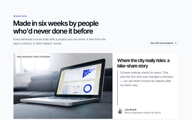
Student projects gallery
productLearner work from a school's courses: one featured project across the full width, then a three-column grid — each with its image, course, the maker's quote and where they are now.
In Kestrella
Portfolio · 4
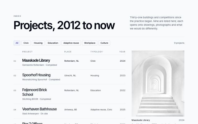
Project index as a ruled table
productEvery project as one ruled line — number, name, client and stage, place, typology, year — filterable by typology, with the hovered project's photograph held in a sticky frame beside the list. Built for architects and studios with long archives.
In Kaltmark
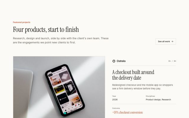
Project showcase in alternating rows
productEach project as a large photograph beside its client, numbered title, summary, year, disciplines and headline outcome, alternating sides down the page.
In Halftone Atelier, Noor Halvorsen, Kaltmark, Quarlume
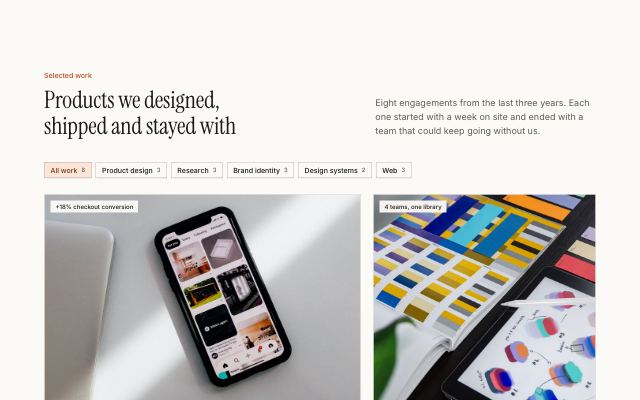
Selected work grid with discipline filters
productA studio's projects in a staggered wide/narrow image grid with outcome tags, client marks and meta, filtered by discipline, with a closing call to action.
In Halftone Atelier, Noor Halvorsen, Quarlume
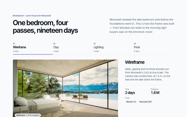
Render breakdown stages
productOne CG scene taken apart: a numbered stepper through wireframe, clay, lighting and final passes with notes, tools and time per stage, then a drag slider comparing two passes.
In Quarlume
About · 5
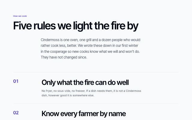
Manifesto with numbered statements
productA large-type manifesto: a headline and lead, four to six numbered principles set in display type, closed by a signature.
In Cindermoss, Kaltmark, Halvane, Quarlume
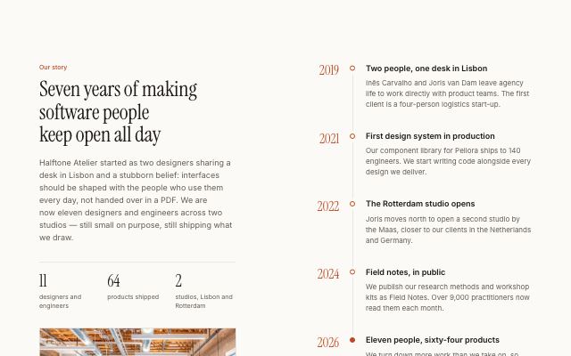
Company story with a milestone timeline
productThe company's story, key facts and a studio photo held in view beside a vertical timeline of four to six dated milestones.
In Halftone Atelier, Kaltmark, Arbitrel, Fırın Kuzguncuk
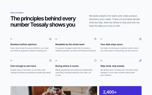
Company values in a numbered grid
productA headline and intro over four to six numbered principles, closed by a team photo beside a panel of company facts.
In Tessaly, Lanternfold
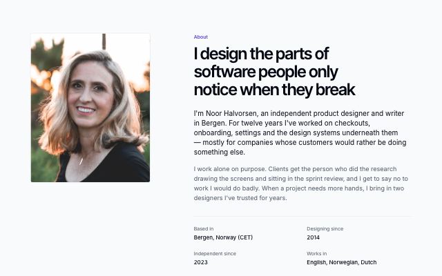
Personal profile with now, experience and principles
productA person's about page: portrait beside a short bio and facts, a dated “now” note, an experience timeline, and how they work with the tools on their desk.
In Noor Halvorsen

Full-bleed photo and quote band
productA colour band split edge to edge: a full-bleed captioned photograph on one side, a large pull quote with its author and a short note on the other. Without a photo it centres the quote.
In Marrow & Pine, Cindermoss, Calvenna, Velvet Quarry, Ondessa, Halvane, June Halloway Photography
Team · 8

Coaches grid
productCoaches as tall portrait cards with their signature class, specialties and qualifications; hovering or focusing a card reveals a short bio over the photo.
In Pulsewright
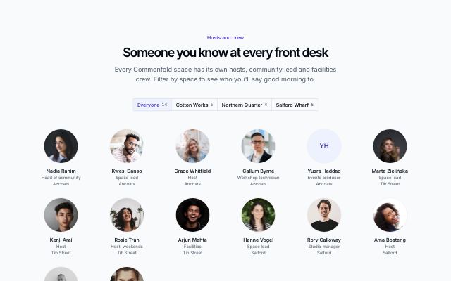
Avatar wall with a team filter
productEveryone as a wall of round avatars with name and role, filtered by team or location with a segmented control and a live count.

Team directory grouped by department
productA dense directory for larger teams: everyone in rows with a small avatar, role, location and profile links, grouped by department with a sticky department index.
In Kaltmark, Mirela Lab

Founders with large portraits and bios
productAn intro and hiring note held beside two or three founders, each with a large portrait, role, bio and profile links.
In Tessaly, Kaltmark, Quarlume, Okafor & Lind Law

Portrait grid with bios on hover
productTall portraits with name and role; hovering or focusing a card slides up the person's bio and profile links over the photo.
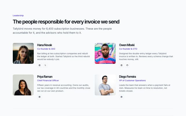
Leadership and advisors
productThe leadership team as large portrait cards with bios, then advisors and board members in a lighter list with their affiliations.

Team grid with portraits
productA headline over a grid of up to nine people with portrait photos, name, role and a short line, closed by an optional hiring tile.
In Halftone Atelier, Ovelle Trust, Static Orchard, Joistwell, Lanternfold, Commonfold, Ondessa, Sunfallow, Patinyard, Pebbleloft, Tumblepaw, Arbitrel

Doctors with credentials
productPractitioner cards: portrait, specialty, years in practice, focus, the languages each speaks as native-name chips and a credentials list, closed by a tile for the interpreting team.
In Selvira Clinic
Careers · 3
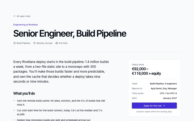
Job detail with a sticky summary card
productA single role page: title, team, location and type, the role in sections, the hiring process, and a sticky card with the salary band, key facts, benefits and the apply action.
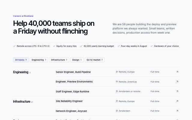
Open roles grouped by team
productAn intro and benefits line over open roles grouped by team, each with location and type, filterable by team, with an open-application note.
In Lanternfold, Arbitrel, Mirela Lab
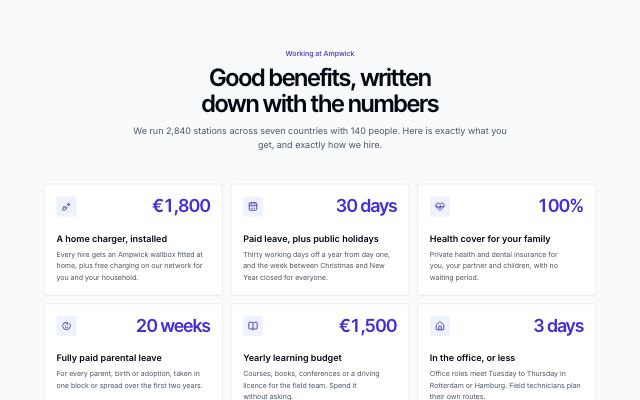
Benefits with numbers and the hiring process
productA centered intro over a grid of benefits, each with an icon and a concrete figure, followed by the hiring process as a numbered stepper with durations.
In Ampwick
Services · 4
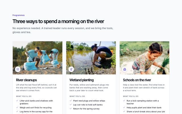
Programme cards
productProgrammes as photo cards: an icon, what the programme is, the tasks a volunteer does on the day, where it runs, the time it takes and who can join, with a join action per card and a line about starting a new group.
In Ovelle Trust
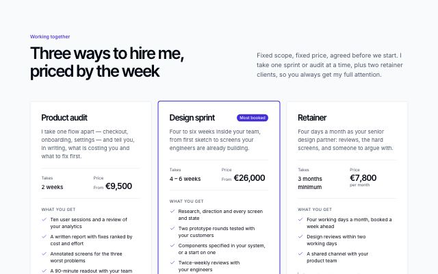
Engagement types with booking
productFixed engagements side by side — scope, duration, starting price, what the client gets and when it fits — with the most booked one marked and a booking band showing current availability.
In Noor Halvorsen, Joistwell, Quarlume, Okafor & Lind Law, June Halloway Photography
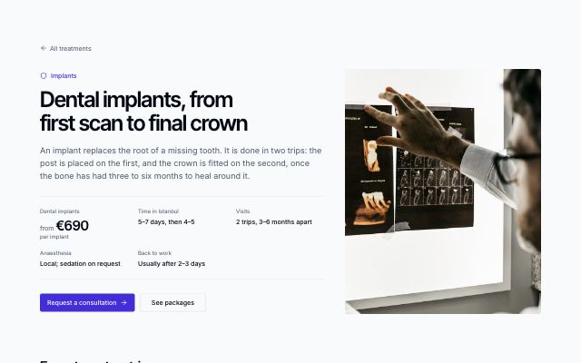
Treatment detail with steps
productOne treatment in full: headline, “from” price and key facts beside a photo, a consultation → planning → procedure → aftercare timeline, what's included, recovery advice, a short FAQ and a medical note.
In Selvira Clinic
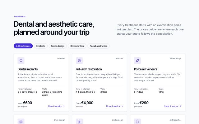
Treatment grid with prices
productTreatments as cards filtered by category chips: icon, name, a short description, time in the city, visits and a localized “from” price, with a note on how quotes are set.
In Selvira Clinic, Calvenna
Calls to action · 12
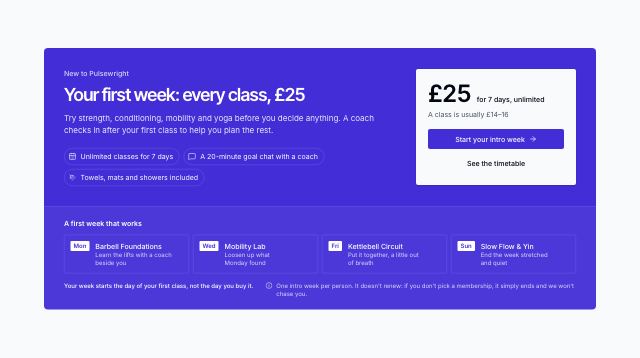
Intro offer band
productA compact first-week offer band: headline and included chips beside a price card with the booking call to action, then the sample week as a row of class tiles, with honest timing and no-renewal terms instead of a countdown.
In Pulsewright
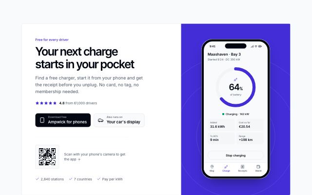
App download with a phone
productA closing panel for a mobile app: headline, rating line, store-style download badges and a scan-to-download code beside a phone mockup rising out of the panel's edge.
In Ampwick, Brassfinch
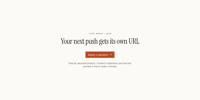
Quiet centered call to action
productA centered headline, a single action and one muted line on the page background with generous whitespace; for calm closes and documentation pages.
In Halftone Atelier, Cindermoss, Noor Halvorsen, Ovelle Trust, Pulsewright, Static Orchard, Calvenna, Kaltmark, Hexmoor, Lodestrand, Tumblepaw, Quarlume, Arbitrel
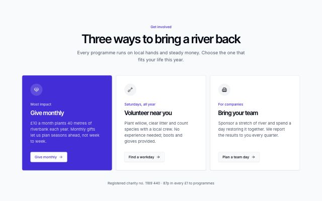
Choose-your-path cards
productA centred headline over two or three cards, each a different way forward with its icon, short pitch and own action; the primary path sits on the colour band. Ends with a line of trust facts.

Closing call-to-action panel
productA full-width band on the primary color with a large headline, two actions and a row of trust facts, made to close a landing page.
In Tessaly, Tidewire Summit, Ampwick, Ovelle Trust, Pulsewright, Kestrella, Lanternfold, Lodestrand, Pebbleloft, Arbitrel
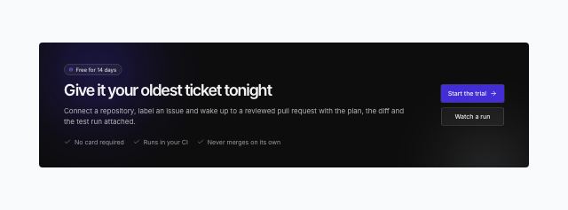
Dark glow panel
productA wide, compact closing panel that stays dark in every mode, lit from one corner by soft primary and accent glows over a faint grid: an eyebrow pill, headline, copy and checked reassurances on one side, the actions on the other.
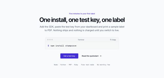
Install command close for developer products
productA centred headline over a terminal-style bar with a copyable install command, then a primary and a quiet docs action and a monospaced line of supported platforms.

Inline newsletter call to action
productAn inline newsletter panel: a mail tile, headline and promise with an optional readership proof row beside the email signup and a quiet link to past issues; falls back to the actions without a form.
In Tessaly, Lanternfold, Hexmoor, Ondessa, Rookbarrow Coffee, Halvane, Pebbleloft, Quietfern
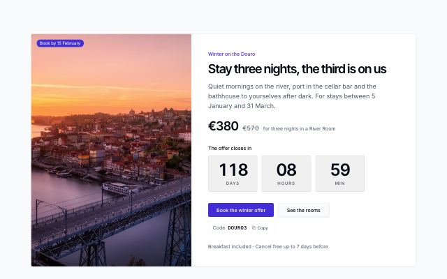
Limited offer with a countdown
productA photo beside a time-limited offer: headline, struck-through and offer price, a live countdown to the deadline, actions and a copyable promo code; reads without the photo as a single panel.
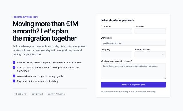
Closing pitch beside a lead form
productA headline, checked selling points and trust chips on one side, a short sales or enquiry form from content fields on the other; falls back to the actions when there is no form.

Call to action beside a photo
productA panel with headline, actions and short reassurances on one side and a full-height photo on the other; stacks with the photo below on small screens.
In Halftone Atelier, Cindermoss, Tidewire Summit, Ampwick, Lantorra, Ovelle Trust, Selvira Clinic, Pulsewright, Kestrella, Joistwell, Calvenna, Commonfold, Ondessa, Rookbarrow Coffee, Halvane, Sunfallow, Patinyard, Pebbleloft, Quietfern, Tumblepaw, Quarlume
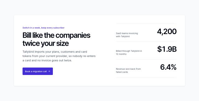
Call to action with proof figures
productA framed close with a headline, one line of copy and a single primary action beside three proof figures set as a ledger, label against counting figure; falls back to the trust facts.
Contact · 9
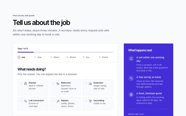
Quote request wizard
productSix steps — job, size, timing and budget, postcode with a coverage check and photo upload, contact, then a summary to check — with a named progress bar and a what-happens-next panel.
In Joistwell
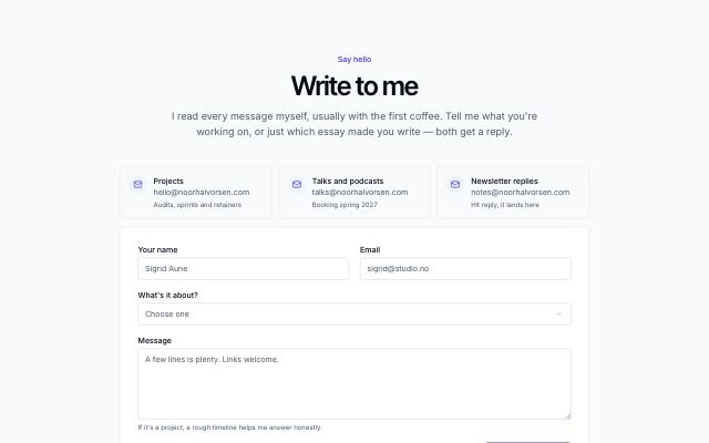
Centered contact form with email shortcuts
productFor small sites: a centered headline, one to four email shortcuts and a single labelled form, with response time underneath. No offices.
In Mirela Lab
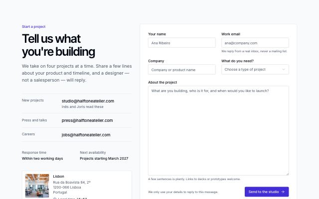
Contact details beside a form
productEmail channels, response time and the main office with its local time beside a labelled contact form with a topic select, message and helper text.
In Tessaly, Halftone Atelier, Ampwick, Pebbleloft, Quarlume, Harbor & Vale Logistics
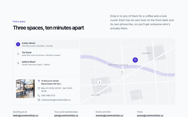
Locations on a map with contact details
productA drawn map with a pin per location beside a selectable list; the chosen location shows its photo, address, hours, phone and email, with the general inboxes underneath.
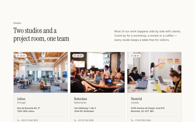
Office cards with local time
productTwo to four offices, each with a photo, live local time, address, phone and email, above a row of contact channels.
In Halftone Atelier, Kaltmark
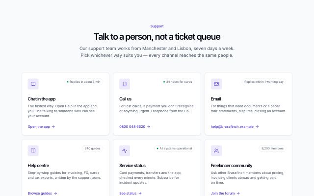
Support channels grid
productEvery way to reach support — chat, phone, email, help centre, status, community — as cards with what each is for, its hours or response time and a live dot when staffed.
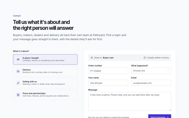
Contact form with topic routing
productPick what the message is about from icon cards; the form then says which team answers and how fast, and swaps in that topic's own questions above name, email and message.
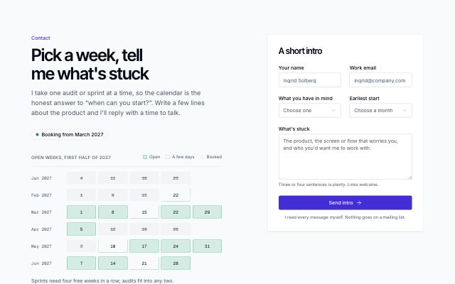
Availability calendar with intro form
productA freelancer's open, partly booked and booked weeks laid out by month with a legend, reply time and direct email, beside a short intro form.
In Noor Halvorsen, June Halloway Photography
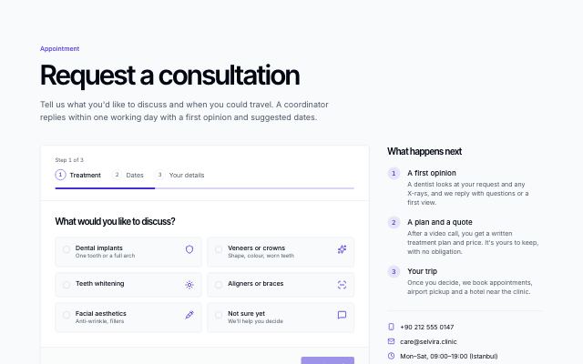
Multi-step appointment request
productA three-step request: choose a treatment, pick preferred travel dates on a localized calendar, then contact details with country dial code, optional X-ray upload, reply preference and consent — beside what happens next and direct contacts.
In Selvira Clinic
Donate & volunteer · 2
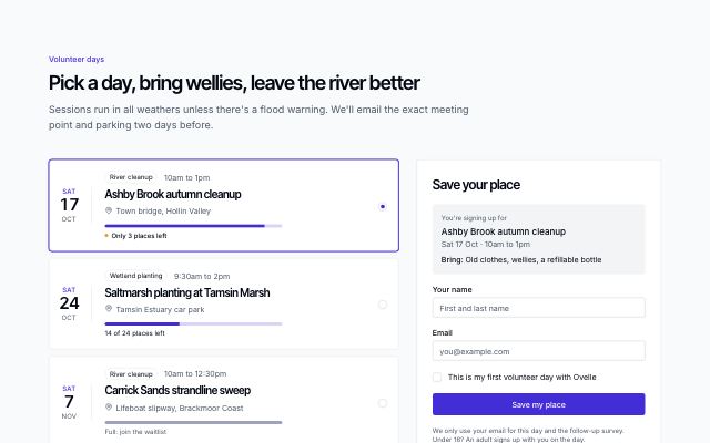
Volunteer days with sign-up
productUpcoming volunteer days as selectable dated rows with programme, place and a places-left bar that warns when few remain, beside a short sign-up form for the chosen day that turns into a waitlist when the day is full.
In Ovelle Trust
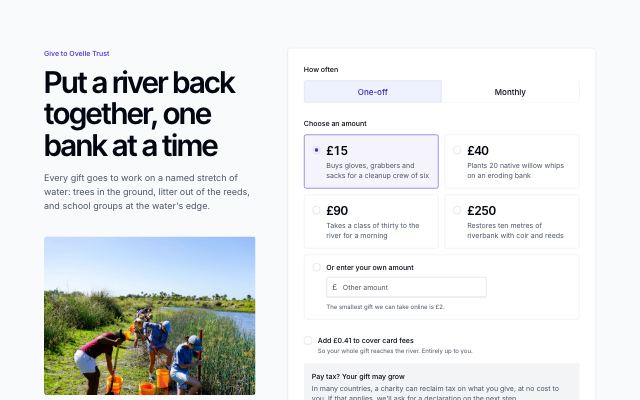
Donation form with preset amounts
productA donate page lead: the ask, a photo and why giving is safe beside a form with an equal-weight one-off or monthly choice, preset amounts that say what each funds, a custom amount, an opt-in to cover card fees, a tax-relief note, how payment works, and a live summary.
In Ovelle Trust
Locations & maps · 6
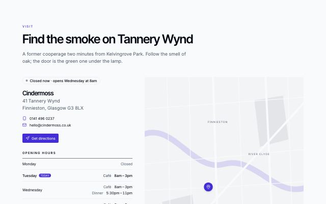
Visit us: hours and map
productWhere and when: a live open-now status in the place's own time zone, address and contacts, a weekly hours table with today marked, a stylised street map, and notes on transit, parking and access.
In Cindermoss, Pulsewright, Calvenna, Halvane, Pebbleloft, Fırın Kuzguncuk
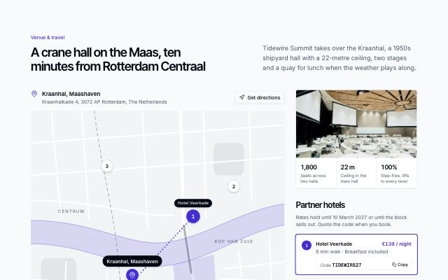
Venue, hotels and travel
productA large drawn map at the centre: the venue as a landmark and numbered partner-hotel pins that select (and are selected by) the hotel cards beside it, with copyable booking codes; the venue's address and directions above, and travel tips condensed into one row below.
In Tidewire Summit
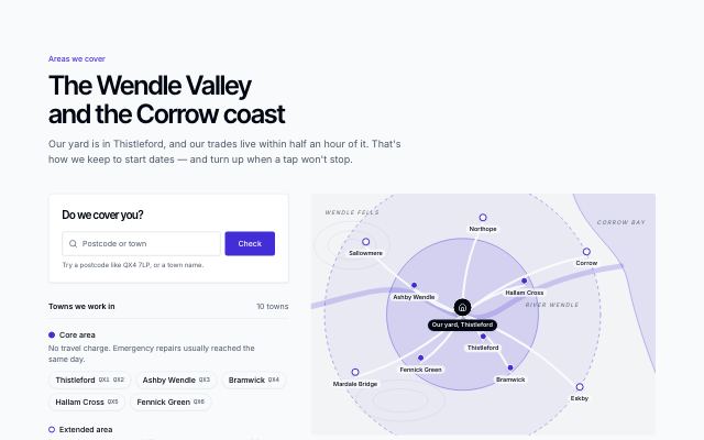
Areas we cover, with a postcode checker
productA postcode or town checker answers “do we cover you?” against the town list, beside zones of cover and a drawn valley map whose towns highlight as you pick them.
In Joistwell, Sunfallow
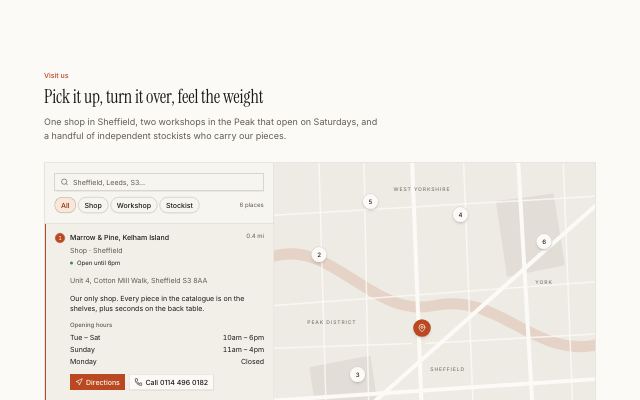
Store locator with a list and stylised map
productA searchable, filterable list of shops, workshops and stockists with open status, hours and directions, linked both ways to numbered pins on a stylised street map.
In Marrow & Pine, Commonfold, Rookbarrow Coffee
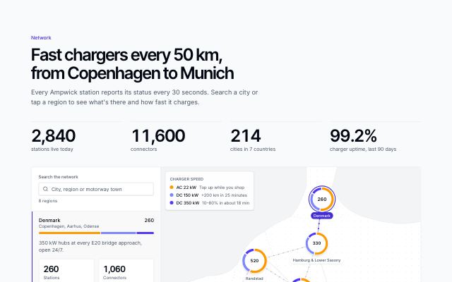
Coverage map with search and region stats
productNetwork totals that count up, a searchable region list and a stylised map of station clusters — each a ring split by charger speed — joined by fast-charge corridors, with a speed legend.
In Ampwick
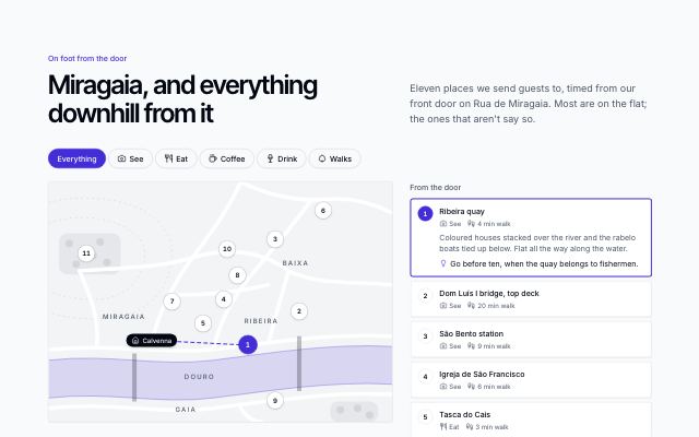
Neighbourhood guide
productA neighbourhood around one address: numbered places on a drawn river-quarter map (no tiles), a category filter, and a list with walking times; choosing a place raises its pin, draws a walking line from the door and opens its note and tip.
In Calvenna
Reservations · 4
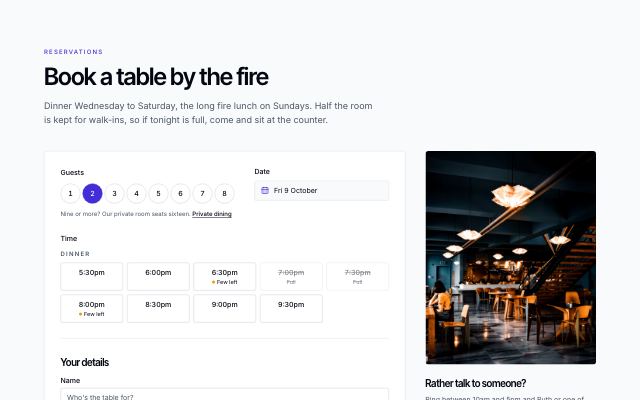
Table booking form
productBook a table: party size, a date picker that knows closed days and full dates, time slots per sitting with availability, contact details, occasion and notes, then a confirmation — beside a photo, phone line and the house policy.
In Cindermoss, Calvenna, Fırın Kuzguncuk, Okafor & Lind Law
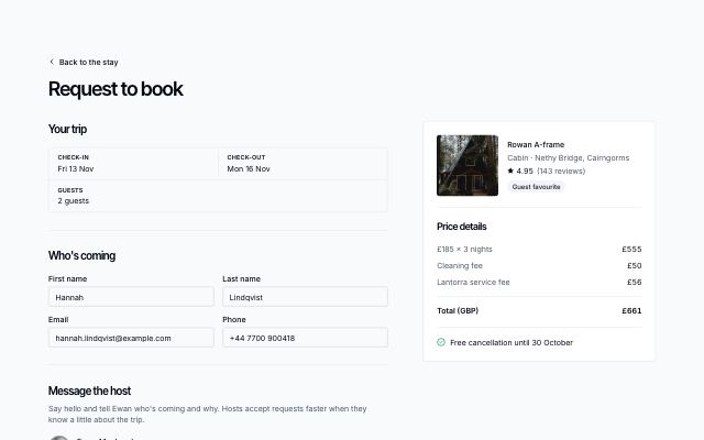
Request to book with a trip summary
productA request-to-book form — editable dates and guests, guest details, a message to the host, pay-in-full or in two parts, cancellation policy and ground rules — beside a sticky summary of the stay and its price, with a sent state.
In Lantorra
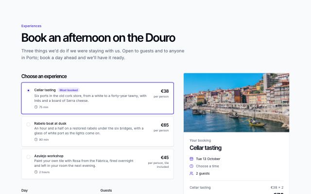
Experience booking
productGeneral booking for tours, day passes, parties and tastings: choose a ticket type or package, a day that knows closed and full dates, a time slot with availability, a guest count and contact fields, beside a sticky summary with the running total.
In Commonfold, Pebbleloft
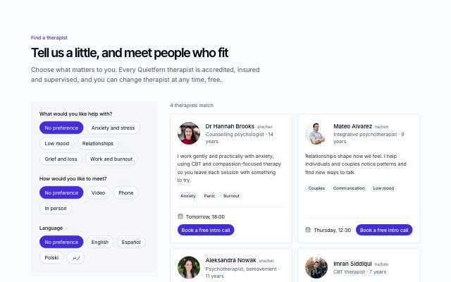
Practitioner matching directory
productA few plain questions as chips — what you want help with, how to meet, language — narrow a directory of practitioners live: portrait, pronouns, credentials, their approach in their own words, focus chips, next opening and a book action, with a match count, a clear control and a kind empty state.
In Quietfern
Menus · 3
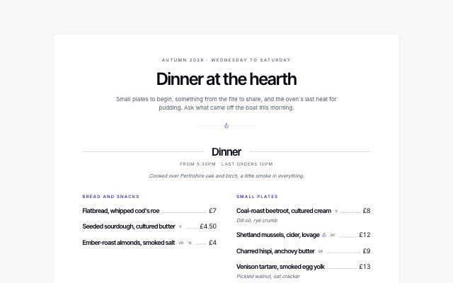
Printed menu card
productThe whole menu on one printed card: a titled header, courses divided by ruled headings, dishes in two columns with dotted leaders to the price, dietary marks and a key at the foot.
In Cindermoss, Calvenna, Fırın Kuzguncuk
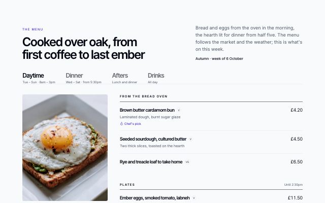
Menu with tabs by course
productA restaurant menu switched by course or time of day: each tab pairs a photo and serving hours with grouped dishes, prices, dietary marks and the chef's picks, over a legend and small print.
In Cindermoss, Pebbleloft
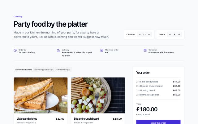
Catering platter planner
productCatering ordered by the platter: children and adults counters, ordering facts, platters by course in tabs with what each serves and a suggested quantity, and a sticky order with total and price a head that starts from a suggestion sized to the guest list.
In Pebbleloft
Family & play · 3
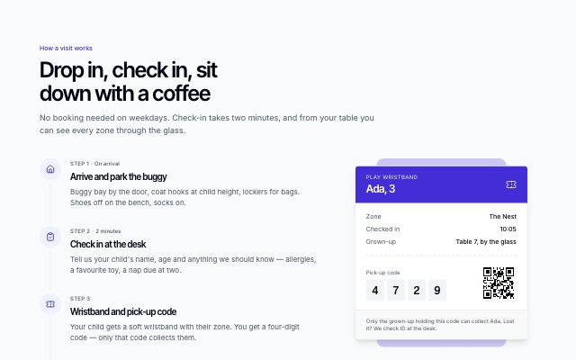
Check-in steps with wristband
productHow a supervised visit works, from the door to pick-up, as a numbered timeline beside the wristband the child wears — holder, zone, time in, a large pick-up code and a scannable pattern — and the rules to know before going in.
In Pebbleloft
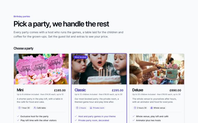
Party packages with add-ons
productParty packages as selectable photo cards — guests included, price per extra guest, length, room and what comes with it — then a guest counter and add-on checkboxes beside a sticky estimate that updates as you choose.
In Pebbleloft
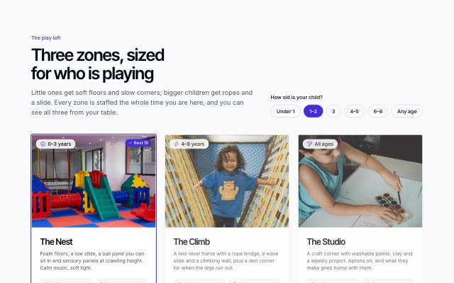
Play zones by age
productSupervised play zones as photo cards — age band, capacity, adult-to-child ratio and what is inside — with an age picker that marks the zone that fits, over a band of safety and hygiene promises.
In Pebbleloft
Classes · 3
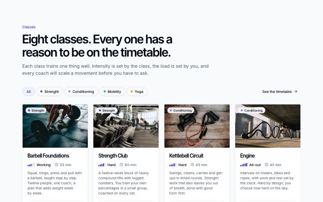
Class types grid
productEvery class type as a photo card with an intensity meter, length, what it trains, who it suits and what to bring; a filter narrows the grid by category.
In Pulsewright
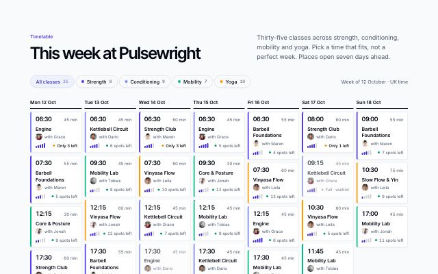
Weekly class timetable
productA studio's week as seven day columns (day tabs on small screens): each class with time, length, coach, intensity (or an age band) and places left, a warning when few remain, and a filter by class type.
In Pulsewright, Pebbleloft
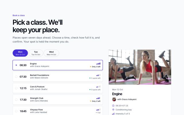
Book a class
productDay switcher over a list of class slots with coach, intensity and places left; the chosen slot shows a capacity bar and opens a confirm dialog that repeats the cancellation policy, or a waitlist when full.
In Pulsewright
Events · 7
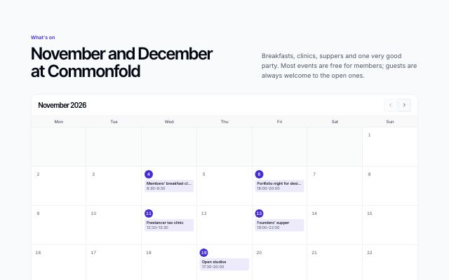
Events on a month calendar
productA community calendar: the month as a grid with each event on its day (a chip that jumps to its card), then the events as cards with time, host, tags, price or free, places left and a booking button.
In Commonfold, Pebbleloft
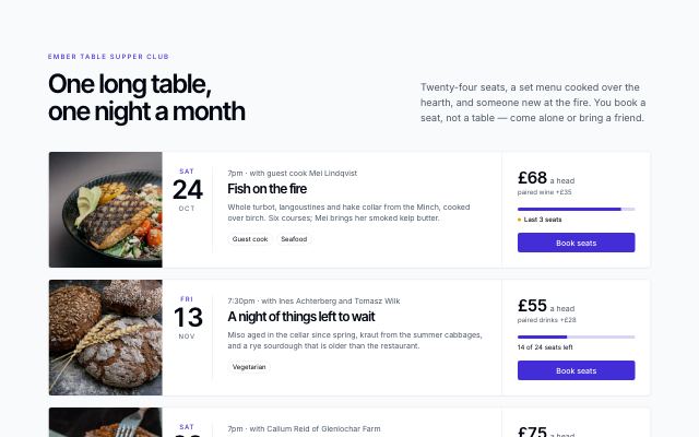
Upcoming events with seats left
productTicketed nights as dated rows: a photo, the date block, title, host and story, then price, a seats-taken bar with a last-seats warning, and a book or waitlist action — with a link to past events.
In Cindermoss
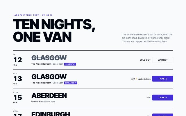
Tour dates as a gig poster
productUpcoming dates as heavy ruled lines, like a tour poster: the date stacked at the start, the city set huge with the venue under it, the price or last tickets, and a ticket button. Sold-out nights are struck through and point to the waitlist.
In Velvet Quarry
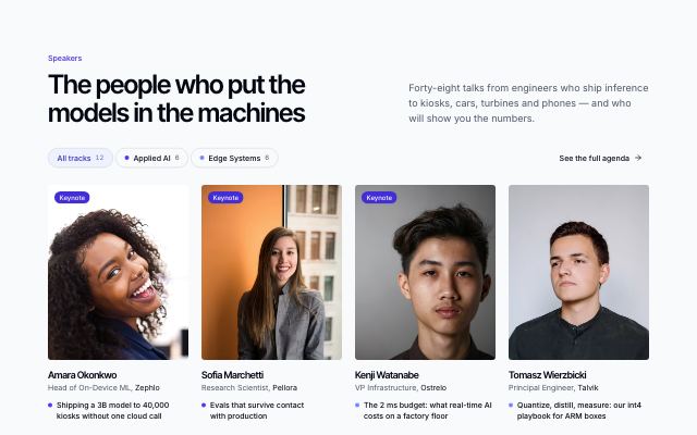
Speaker grid with track filter
productEvery speaker as a portrait card with name, role, company and talk title; a track filter narrows the grid and hover or focus reveals each bio.
In Tidewire Summit

Keynote spotlight
productAn inverted band featuring two or three keynotes large — portrait, talk title, abstract and time slot in alternating rows — closed by the rest of the line-up as avatars.
In Tidewire Summit
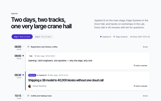
Agenda with day tabs
productOne tab per conference day over a vertical timeline: sessions that start together sit side by side with kind, track, room, speakers and an add-to-calendar link; breaks run as quiet dividers.
In Tidewire Summit
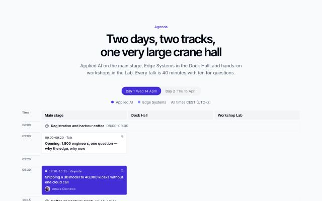
Agenda as a rooms × time grid
productA schedule grid per day with rooms as columns and time as rows; sessions span their slots, tinted by track, breaks run across every room, and the grid scrolls sideways on phones.
In Tidewire Summit
Stays · 7
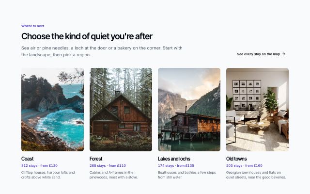
Destinations by landscape and region
productTall photo tiles for each kind of place with stay counts and starting prices, then a compact grid of regions with thumbnails; both arrive one after another as they scroll in.
In Lantorra
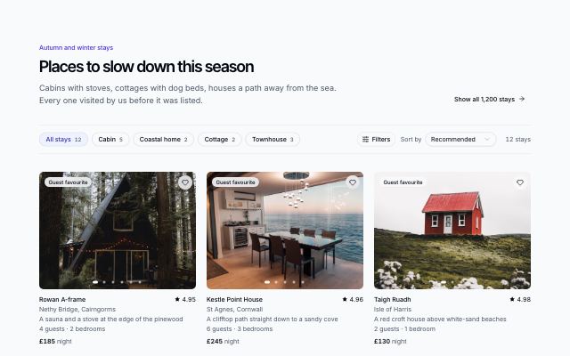
Stay listing with filters and a card grid
productType chips with counts, a filter panel (nightly price range, must-have amenities, guest favourites) and a sort menu above a grid of stay cards with photo carousels, ratings and nightly prices.
In Lantorra
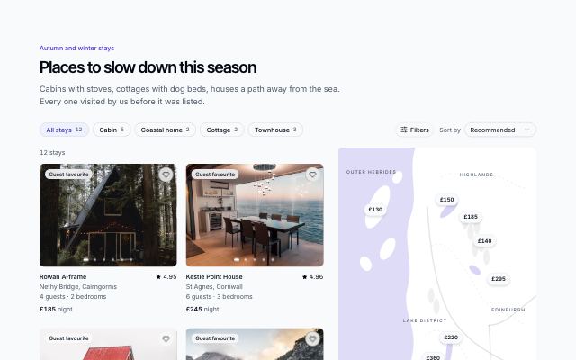
Stay listing beside a map with price pins
productFilterable stay cards beside a stylised regional map: every stay is a price pin, hovering a card lifts its pin and picking a pin highlights its card and opens a small preview.
In Lantorra
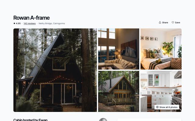
Stay page with a photo gallery and sticky booking card
productA five-photo gallery (swipeable on phones, all photos in a dialog), then the stay's story — host, highlights, rooms, amenities, house rules, cancellation and an approximate-location map — beside a sticky booking card with a range calendar, guests and a live price breakdown.
In Lantorra
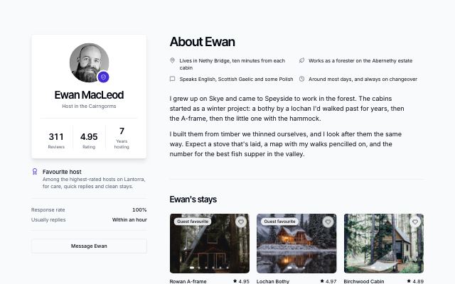
Host profile with stays and guest reviews
productA sticky profile card — portrait, verified mark, reviews, rating and years hosting counting up, response rate, contact — beside the host's own words, their stays and what guests say about them.
In Lantorra

Hotel room with rates and a booking card
productOne room type of a hotel: a full-bleed photograph and a row of details, the room's story, facts, amenities and house policies beside a sticky card to pick a rate plan, dates and guests, with the total including city tax.
In Calvenna
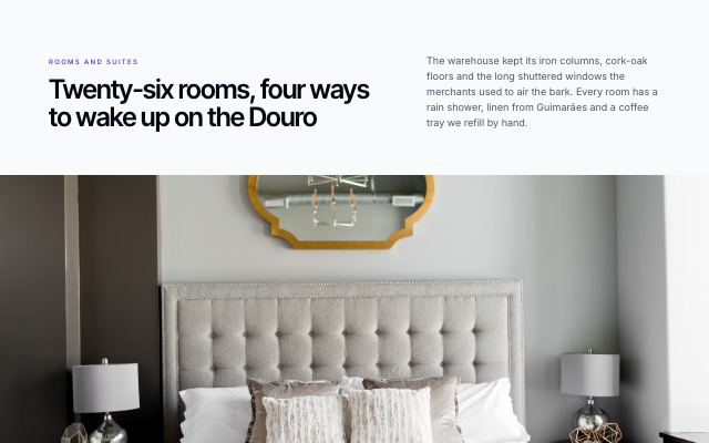
Rooms and suites as photo chapters
productA hotel's room types told one at a time: a full-bleed photograph, then the name, story, facts (size, view, bed, sleeps), the starting rate and a link to the room — slow, scroll-paced storytelling instead of a card grid.
In Calvenna
Catalog · 9
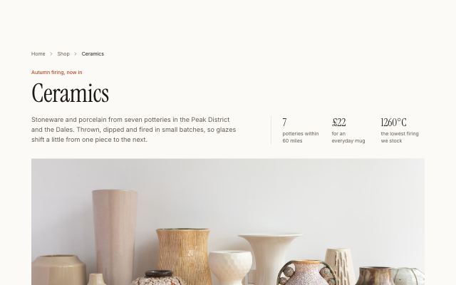
Category header with a banner and shelf chips
productBreadcrumbs, a large category title with three shelf facts, a wide banner photo carrying the piece count, and scrollable sub-shelf chips with thumbnails and counts.
In Ondessa, Halvane
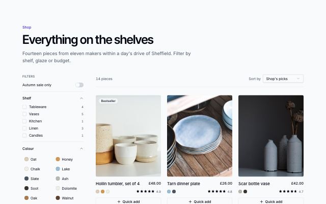
Category page with filter sidebar
productA store category page: a sidebar of facets drawn from the products (shelf, colour swatches, price bands, rating, sale), removable chips for active filters, sort and count, and the same filters in a sheet on phones.
In Marrow & Pine
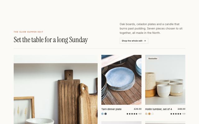
Editorial product mosaic with a story tile
productA curated edit: one lead product at double size, smaller companions around it and a maker's story tile on the emphasis band, set under a magazine-style header.
In Marrow & Pine, Velvet Quarry, Ondessa, Rookbarrow Coffee, Halvane
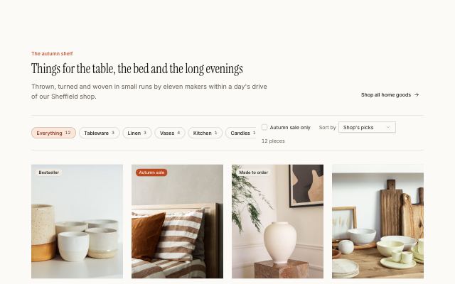
Product grid with a filter and sort bar
productShelf chips with counts, a sale-only toggle and a sort menu above a responsive four-column product grid; filtering and sorting run live, with an empty state.
In Velvet Quarry, Ondessa, Rookbarrow Coffee, Halvane, Tumblepaw
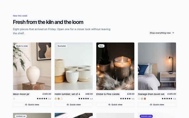
Product grid with quick-view dialog
productA four-up product grid where each card's Quick view opens a dialog with a photo gallery, colour, quantity and add to bag (opening the mini-cart), plus a link to the full product page.
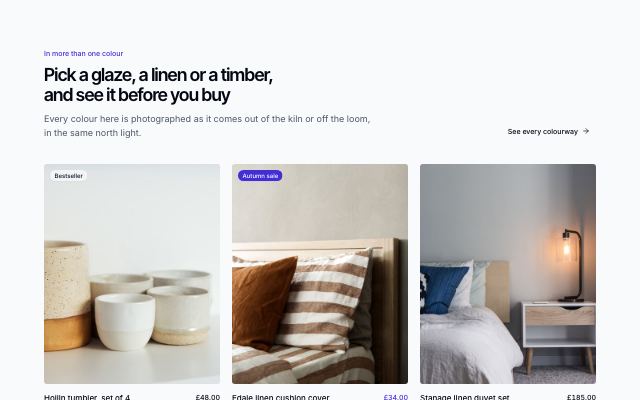
Product cards with colour swatches and hover photo
productLarge product cards where picking a colour swatch swaps the photo to that colour, hovering shows a second angle, and a quick-add button opens the mini-cart with the chosen colour.

Asset store with license toggle
productA store for digital assets: filter by type, switch between personal and commercial licenses to reprice every card, with formats and a technical spec on each.
In Quarlume
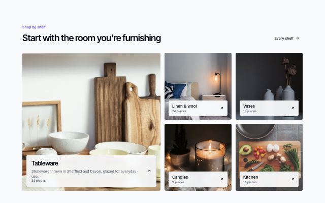
Shop-by-category photo tiles
productStore categories as photo tiles in a bento grid: a tall lead tile with a line of copy, smaller square tiles around it, each with a name, piece count and arrow on a label card.
In Marrow & Pine
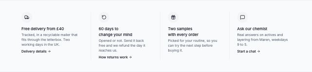
Store incentives strip
productA bordered band of three or four store promises (delivery, returns, samples, help), each an icon, a title, the terms in a line and a policy link; reflows to two columns, then a list.
Product · 6
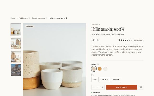
Product gallery with a sticky buy box
productA photo gallery with thumbnails beside a sticky buy box: rating, live price, colour swatches, set size, quantity, add to basket, delivery promises and expandable details.
In Marrow & Pine, Ondessa, Rookbarrow Coffee, Halvane, Tumblepaw
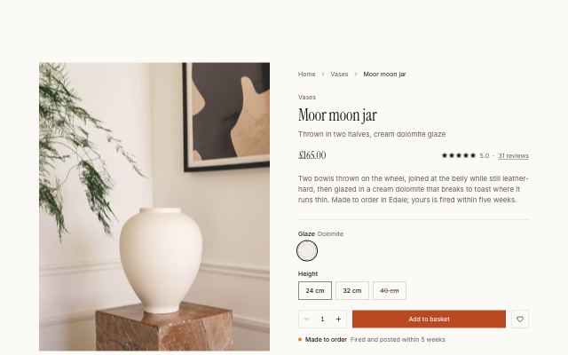
Product page with the making story
productA sticky photo beside the buy box, followed by numbered making steps in alternating photo rows, a maker's quote on the emphasis band and a materials spec list.
In Marrow & Pine, Rookbarrow Coffee

Reviews with customer photos
productA rating summary with a clickable star breakdown beside a strip of customer photos that open with their review, then filter chips (with photos, by stars) over a masonry wall of review cards.
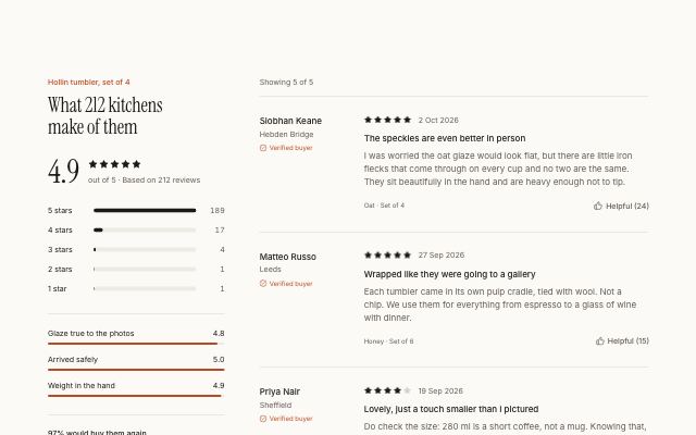
Review summary with a rating histogram
productA sticky summary with the average rating, a clickable star histogram that filters the list, quality highlights and a write-a-review action, beside reviews with verified badges and helpful votes.
In Marrow & Pine, Lantorra, Ondessa, Rookbarrow Coffee, Tumblepaw, Fırın Kuzguncuk
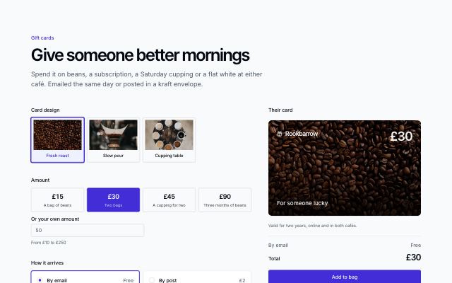
Gift card builder
productBuy a gift card: pick a design, a preset or custom amount, email or post and a send date, the recipient and a message — previewed live on the card beside the form, with the total and add to bag (opens the mini-cart when given).
In Pebbleloft
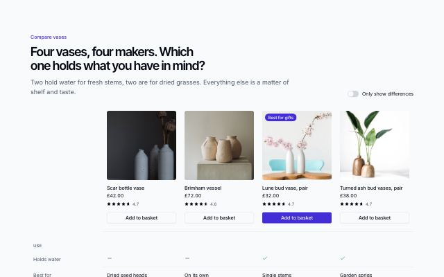
Product comparison table
productTwo to four products in columns (photo, price, rating, add to bag) over grouped spec rows with yes/no marks, a sticky label column, and a switch to show only the rows that differ.
Checkout · 3
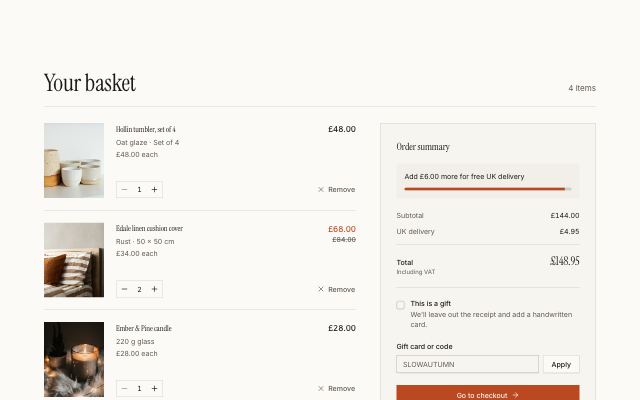
Basket page with an order summary
productEditable line items with quantity steppers and remove, beside a sticky summary with a free-delivery progress bar, live totals, gift option, promo code and checkout.
In Marrow & Pine, Ondessa, Pebbleloft
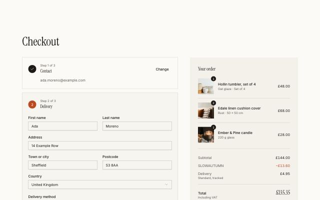
Three-step checkout with an order summary
productContact, delivery and payment as stacked steps that collapse to a summary with a change link once done; delivery and payment options as radio rows, beside a live order summary and place-order button.
In Marrow & Pine, Ondessa, Pebbleloft
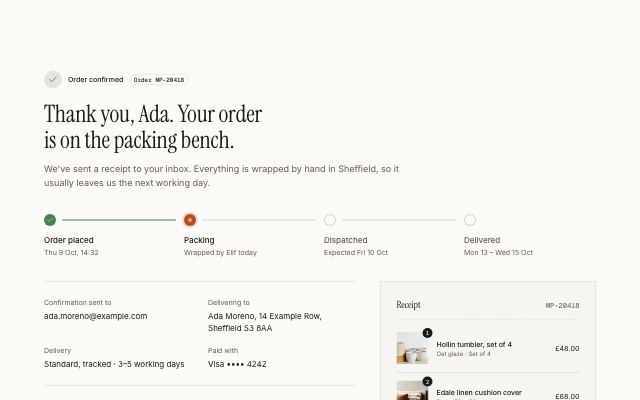
Order confirmation with progress and receipt
productA thank-you header with the order number, a four-stage progress track, delivery and payment details, a personal packing note and next actions, beside an itemised receipt.
In Marrow & Pine, Ondessa, Pebbleloft
Account · 2
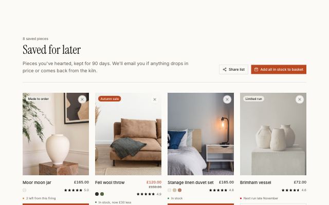
Saved items grid with stock and actions
productA saved-for-later grid: each piece shows stock state, move to basket or back-in-stock alert, and remove, with share and add-all actions and an empty state.
In Marrow & Pine
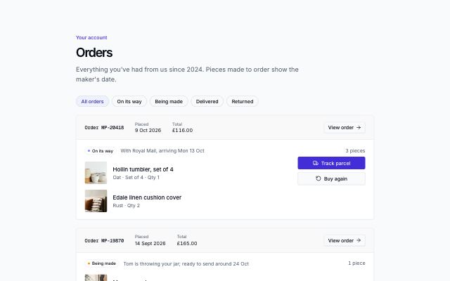
Order history with status and buy again
productAn account's orders as cards: number, date and total, a status badge with its detail line, the pieces in each, and track, view, invoice and buy-again actions; filter by status.
In Marrow & Pine
Product stories · 5
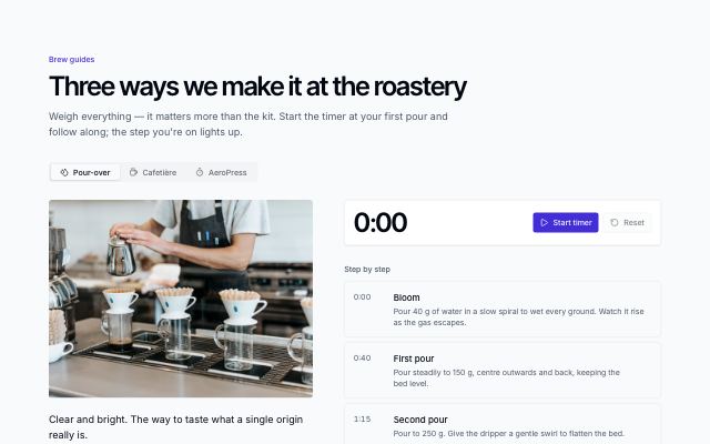
Brew guide with recipe card and timer
productBrewing methods in tabs: a photo and recipe card (dose, water, ratio, grind, temperature, time) beside timed steps and a running timer that lights up the step you're on.
In Rookbarrow Coffee
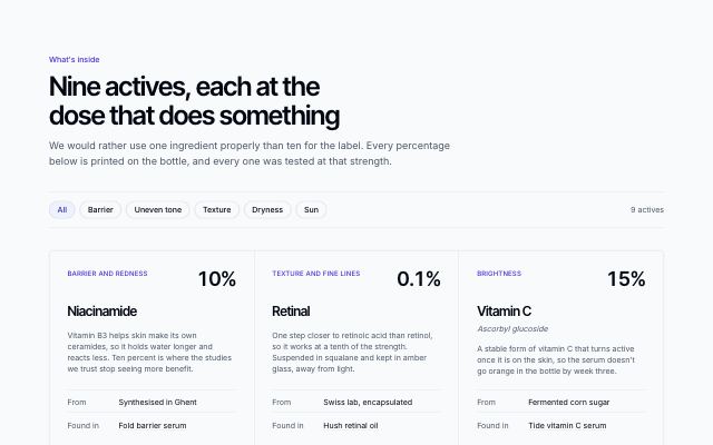
Ingredient glossary with concern filter
productEvery active in the range as a card — dose set large, common and label names, what it does, where it comes from and the products that carry it — filtered by skin concern.
In Ondessa, Tumblepaw
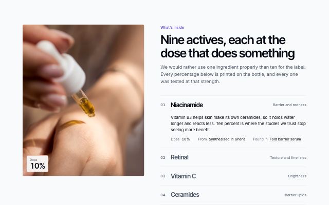
Ingredient spotlight with photo
productA tall photo beside a numbered index of the key actives; picking one brings up its photo, dose, story and where it comes from. Ingredient storytelling for a home or product page.
In Ondessa

Lookbook in an asymmetric grid
productA season's looks under an oversized title, laid out in an off-beat editorial grid — tall, wide and offset frames — each numbered and naming the pieces worn, linked to the shop.
In Halvane
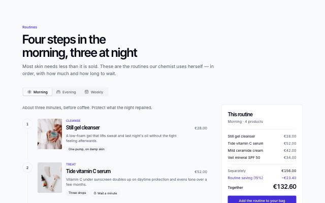
Routine builder with steps and bundle price
productMorning, evening and weekly routines in tabs: each step names the product, how much to use, how long to wait and why, beside a summary that prices the routine as a bundle and adds it to the bag in one go.
In Ondessa
Subscriptions · 2
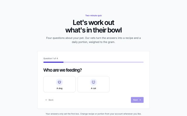
Quiz that recommends a plan
productOnboarding by questions: one question at a time with big icon options and a progress bar, back and next, then the best-matching plan with its photo, price, highlights and a recap of the answers.
In Tumblepaw
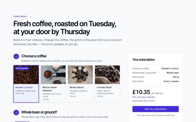
Subscription builder
productA subscription built in numbered choices — product cards with photos, then compact options for form, size and frequency — beside a sticky summary that prices each delivery, the frequency saving and the month as you choose.
In Rookbarrow Coffee
Launches · 2

Limited drop with countdown and lineup
productAn inverted band for a numbered release: oversized title and countdown over a full-bleed photo, the pieces with how many of each exist, the rules of the drop and a reminder signup.
In Halvane
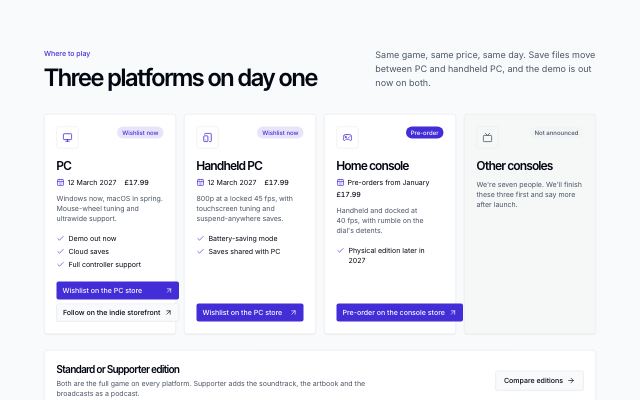
Platforms and stores
productWhere to get a game: a card per platform with its availability (out now, pre-order, wishlist, not announced), release date and price, how it runs there and its store buttons — text labels with generic icons, no store logos — then a band leading to the editions.
In Lanternfold
Marketplace · 4
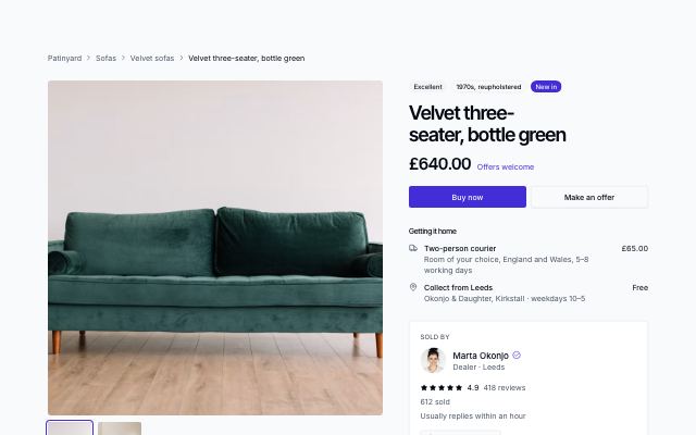
Marketplace listing with seller
productOne listing from a marketplace seller: photo gallery, price with buy now and an offer form, delivery choices, the seller's card with rating and reply time, buyer protection, measurements — and more from the same seller.
In Patinyard
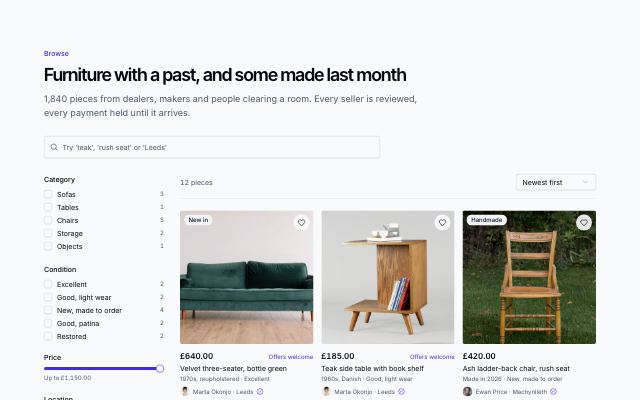
Marketplace browse with filters
productSearch and browse a marketplace: a sidebar of facets drawn from the listings (category, condition, a price ceiling, location, open to offers) — a sheet on small screens — beside a sortable dense grid of listings with seller and town.
In Patinyard
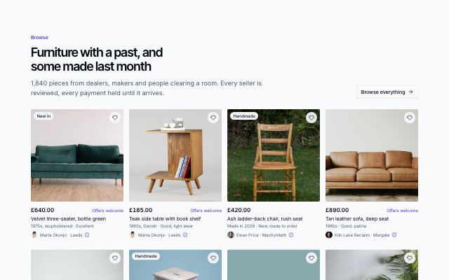
Marketplace listings grid
productA dense grid of listings from many sellers — square photo with a save toggle, price, offers, era and condition, the seller and their town — under a heading with a link to browse everything.
In Patinyard
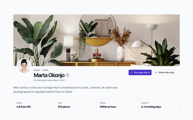
Marketplace seller's shop
productOne seller's page on a marketplace: cover and avatar header with verified tick and actions, rating, sales and reply-time figures, every listing as a dense card, the shop's story and trading policies alongside, and buyer reviews with the average.
In Patinyard
Auth · 14
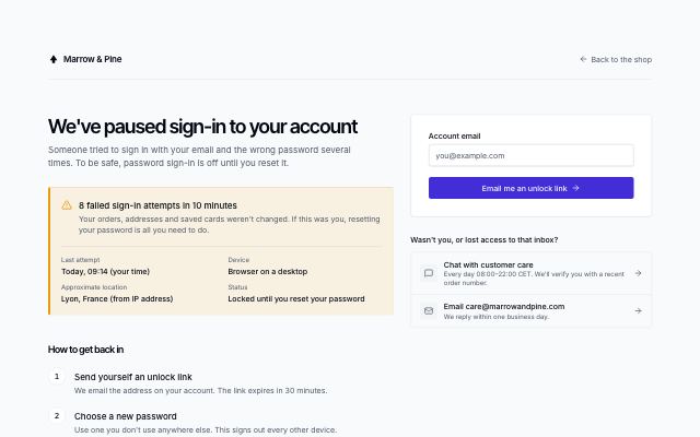
Locked account recovery
productLocked or suspicious sign-in notice with what happened (time, device, approximate location), numbered steps to get back in, an unlock-link form with a resend countdown and ways to contact support.
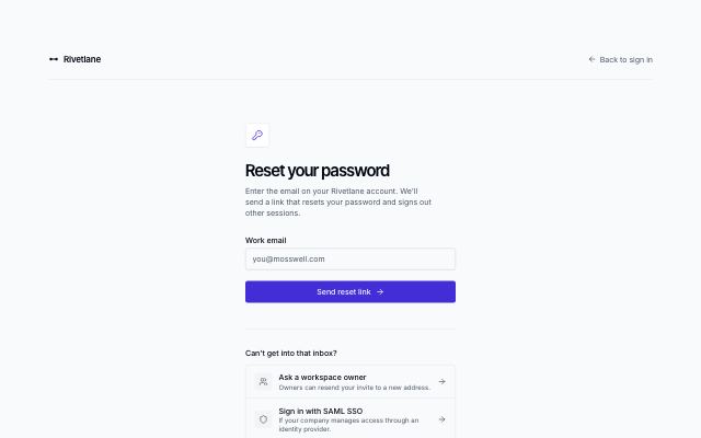
Forgot password request
productNarrow reset form under a brand bar with a back link; submitting swaps in a check-your-inbox state with tips, and recovery options sit below.
In Rivetlane app
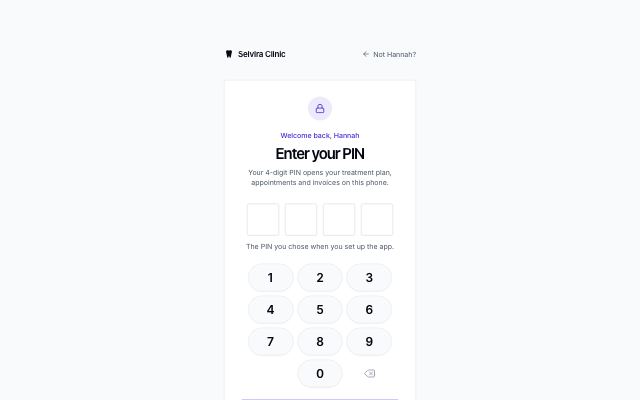
Four-digit PIN
productNarrow card with four large masked PIN cells, an on-screen number pad for touch and a wrong-PIN state that shakes (unless motion is reduced), with reset options below.
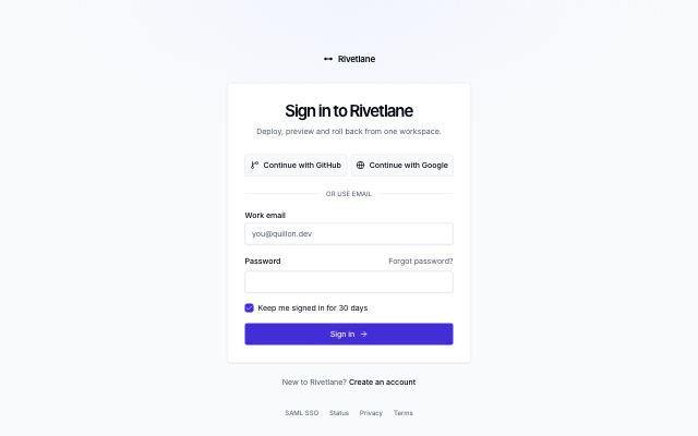
Sign-in card
productCentered card with SSO provider buttons, email and password, a remember-me checkbox, a forgot-password link and a sign-up line.
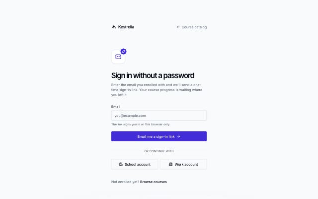
Magic-link sign-in
productEmail-only sign-in that sends a one-time link; submitting swaps in a check-your-email state with an open-mail-app button, a resend countdown and a change-address link, with optional SSO below.
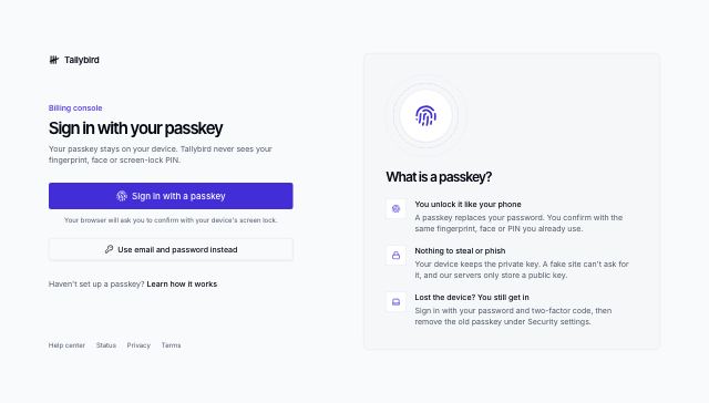
Passkey sign-in
productPasskey button as the main way in, with a waiting-for-your-device state and a password fallback; a panel beside it explains what a passkey is.
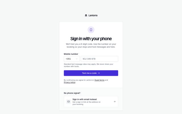
Phone sign-in with code
productCard with a country-code picker and phone number that moves, in place, to a 6-digit code step with a resend countdown and a change-number link; email fallback in a tray below.
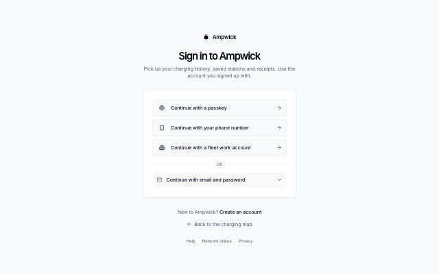
Provider-first sign-in
productCard that leads with large sign-in method rows (passkey, phone, work account) and keeps email and password behind a disclosure underneath.
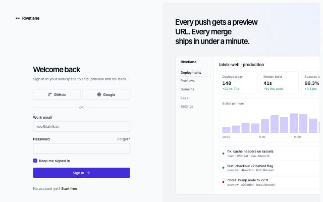
Split sign-in with brand panel
productSign-in form on the left; on the right a tinted brand panel with a headline, a live product screen and a customer quote.
In Rivetlane app, Threadmere
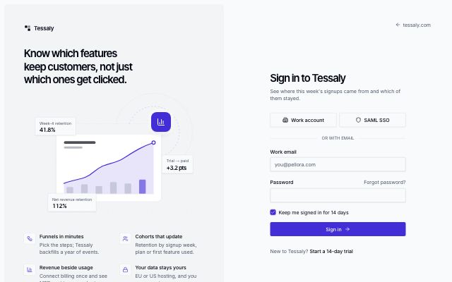
Split sign-in with illustration
productTinted panel with a headline, a drawn product scene and value points beside a sign-in form with SSO, email and password.
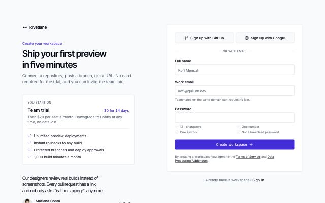
Sign-up form with plan hint
productHeadline and the plan a new account starts on beside a sign-up card with SSO, name, email and a password with requirement hints, plus a terms line.
In Rivetlane app
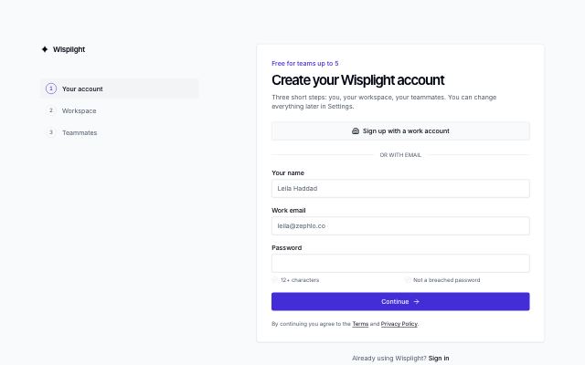
Multi-step sign-up
productSign-up in three steps (account, workspace, invite teammates) with a step list on wide screens, a progress bar on small ones, back and skip, and a ready state.
Two-factor code
productCard with the signed-in account, a 6-digit one-time code input and a trust-this-device option, over a tray of recovery options.
In Rivetlane app
Authenticator app setup
productThree numbered steps in one card: scan a QR-style code or copy the setup key, confirm a 6-digit code, then download or copy one-time recovery codes.
Shell & navigation · 9
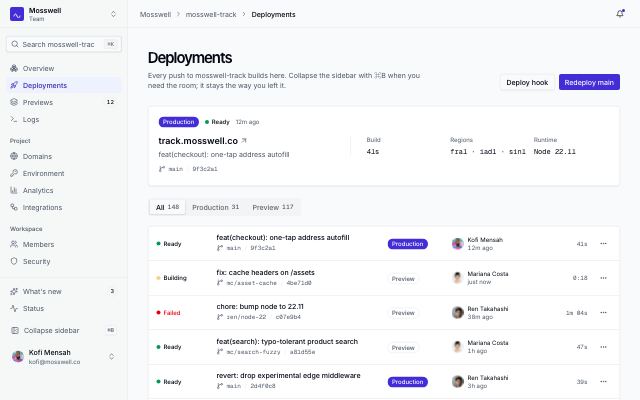
App shell with collapsible icon rail
productA sidebar that folds to an icon rail with tooltips; the choice is remembered per workspace and ⌘B toggles it. Breadcrumb top bar, mobile drawer that closes on navigation.
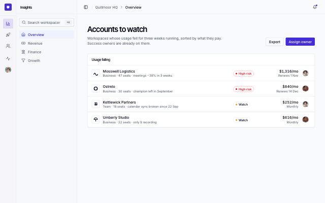
App shell with icon rail and panel
productTwo-level navigation: an icon rail of sections (a vertical tab list with tooltips and arrow keys) beside a panel of the chosen section's pages, which folds away to leave the rail.
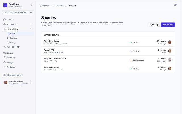
Inset app shell
productThe inset layout: a borderless sidebar on a tinted canvas and the page floating beside it as a rounded, raised panel; a drawer takes the nav on phones.
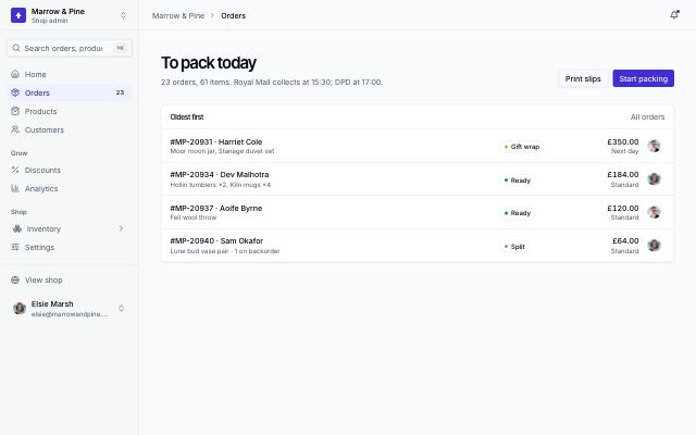
Mobile app shell with tab bar and drawer
productPhone-first frame: a bottom tab bar for the four main pages and a More tab that opens the full menu in a drawer which closes as soon as a page is picked; a sidebar from large screens.
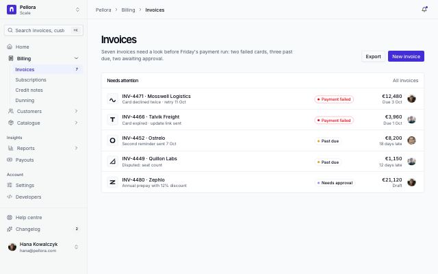
App shell with nested submenus
productA sidebar whose items open submenus of sub-pages on an indented guide line, the current branch open; search, lower links and account at the foot, and the same tree in a mobile drawer.
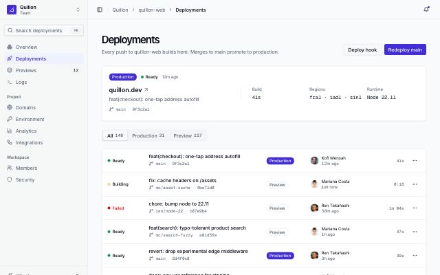
App shell with collapsible sidebar
productCollapsible sidebar with workspace switcher, search, sectioned nav and user menu; a top bar with breadcrumbs; and a page header over a deployments view.
In Rivetlane app
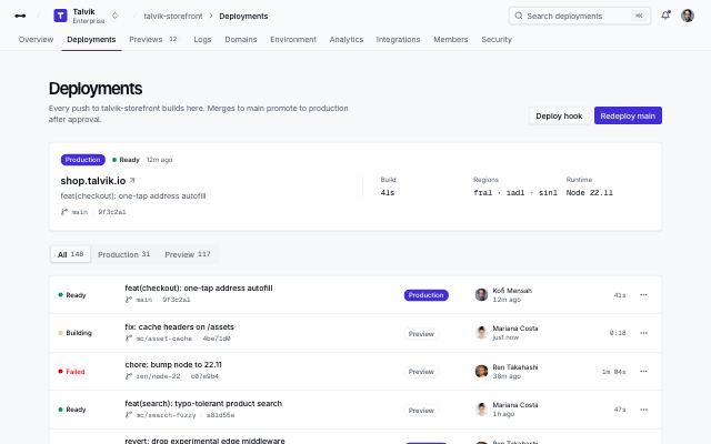
App shell with top navigation
productTop bar with logo, workspace switcher, breadcrumbs, search and user menu over a row of nav tabs; the page header and a deployments view sit below.
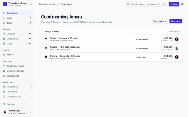
App shell with favourites and ⌘K
productA record-heavy app's frame: workspace switcher, nav with counts, pinned records and saved views in the sidebar; a top bar with a ⌘K palette, a New menu for any record and the account menu.
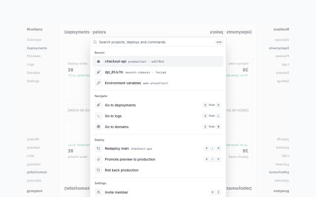
Command palette over the app
productA working command palette shown open in-flow over a dimmed app screen: search input, recent items, Navigate / Deploy / Settings groups with keyboard shortcuts, and a key-hint footer.
In Rivetlane app
Dashboards · 14
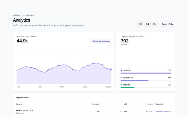
Analytics with period switcher
productAn analytics view: a period switcher in the page header drives a main area chart, a breakdown of bars and a top-services table with inline trends.
In Rivetlane app
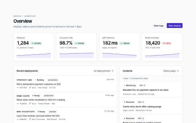
Overview with KPIs and activity
productA dashboard home: page header with actions, KPI cards with deltas and sparklines, a recent-deployments feed and an incidents panel.
In Rivetlane app
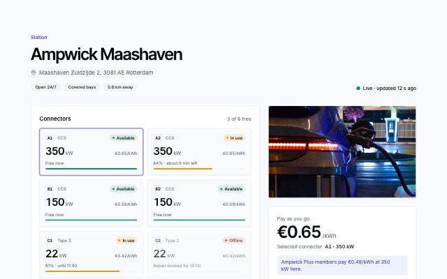
Charging station with live connectors
productOne station: every connector with live status, power and charge level, a price panel that follows the selected connector and starts the session, a photo and what's nearby while you wait.
In Ampwick
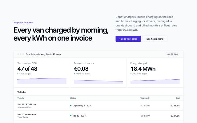
Fleet offer with a dashboard preview
productA fleet pitch proven by the manager's dashboard: three KPIs with trends that count up, a live vehicle list with charge status, four benefits and the fleets already on board.
In Ampwick
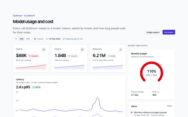
AI usage and cost dashboard
productWhat an AI feature costs to run: spend, tokens and requests, p50/p95 latency, tokens and spend by model, a model table with cost and errors, and a side column with the monthly budget gauge, alerts and the heaviest workspaces.
In Quillmoor admin
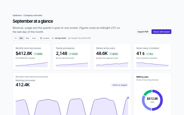
Dashboard chart cards
productA set of dashboard cards on one grid: KPIs with deltas and sparklines, an area chart with range tabs, stacked columns, a donut with legend, a radial goal and a short list.
In Quillmoor admin
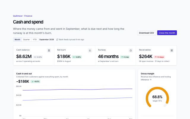
Finance dashboard
productA finance home: cash, burn, runway and receivables in one KPI band, cash in against out, gross margin against target, spend by category, budget against actual, upcoming payments and overdue invoices.
In Quillmoor admin
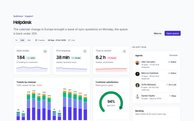
Support helpdesk dashboard
productA support team's live view: open tickets, first response and time to resolve, tickets by channel per day, CSAT against goal, tickets about to breach with assignees, top topics, response targets by priority, and agents on shift beside the grid.
In Quillmoor admin
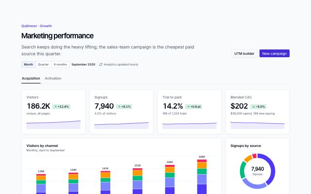
Marketing analytics dashboard
productGrowth in two views: visitors, signups, trial-to-paid and CAC, visitors by channel, signups by source, campaigns with cost per signup and trend, top landing pages — then activation with a signup-to-paid funnel and weekly retention cohorts.
In Quillmoor admin
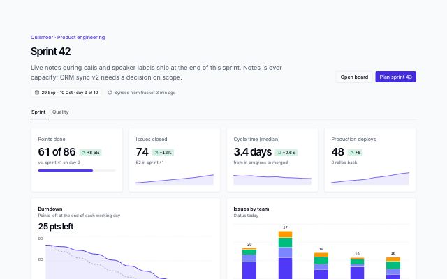
Project and issue dashboard
productAn engineering team's sprint in view tabs: points, issues, cycle time and deploys, a burndown against the ideal line, issues by team and status, epics with owners and progress, team load — and a quality view with bugs by severity and area.
In Quillmoor admin
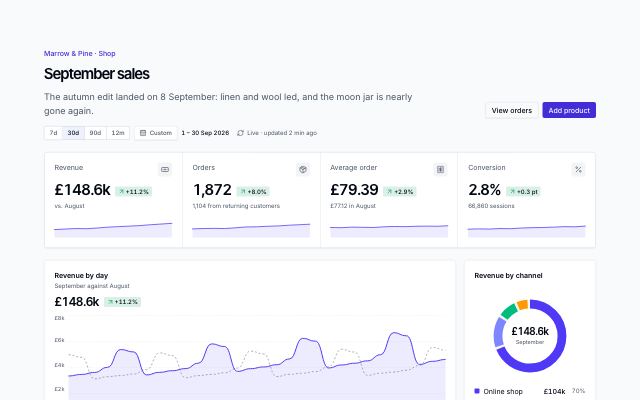
Store dashboard
productAn online shop's month: revenue, orders, average order and conversion in a KPI band, revenue by day against last month, channel mix, orders by category, the visit-to-order funnel, best sellers with stock and what is running low.
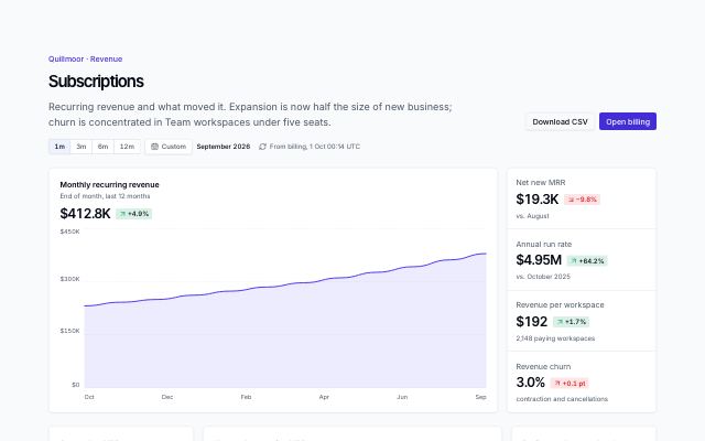
Subscription revenue dashboard
productSaaS revenue: twelve months of MRR as a lead chart with net new, run rate, revenue per workspace and churn stacked beside it, then September's MRR movement, new against expansion, plan mix, retention cohorts and recent plan changes.
In Quillmoor admin
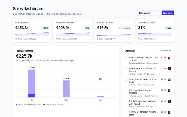
Sales dashboard with forecast and pipeline
productA sales team's home screen: KPI tiles with trends, forecast against target, tasks due today, pipeline value by stage, top open deals and a recent-activity feed.
In Threadmere
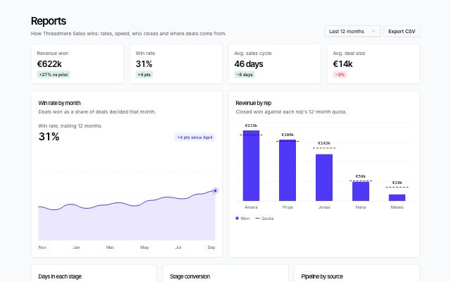
Sales reports with chart panels
productA sales team's reports page: KPI tiles, win rate over time, revenue by rep against quota, days in each stage, stage conversion, pipeline by source and a rep leaderboard with quota bars.
In Threadmere
Data · 8
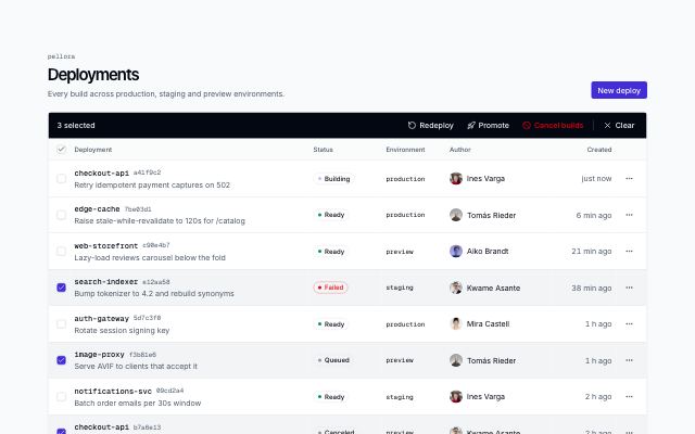
Data table with bulk actions
productA records page with row selection: per-row and select-page checkboxes, a bulk action bar that replaces the toolbar while rows are selected, row menus and pagination.
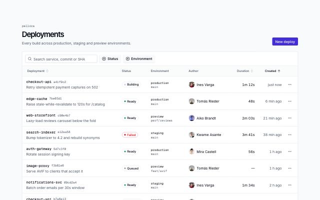
Filterable data table
productA records page: search, faceted multi-select filters with counts, sortable headers, status badges, row action menus and pagination. Scrolls sideways inside its card on small screens.
In Rivetlane app
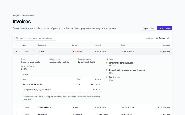
Table with expandable rows
productA records table whose rows open in place: key fields, a line-item table, an activity timeline and a note under each row, with search, expand all and a totals footer.
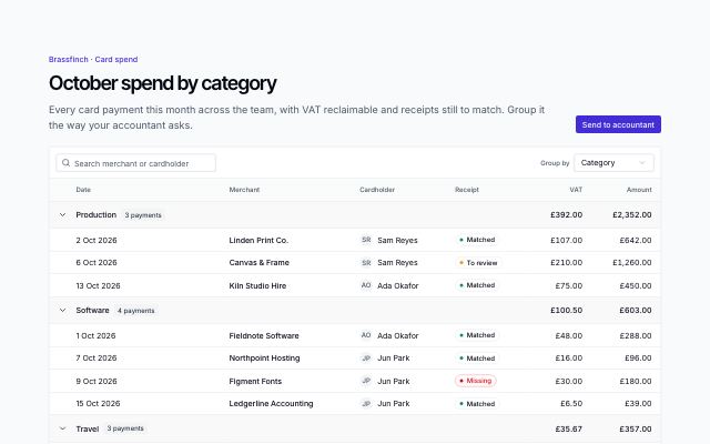
Grouped table with group totals
productA records table grouped by a column the reader picks: collapsible group headings with counts and subtotals in every amount column, search, and a grand total footer.
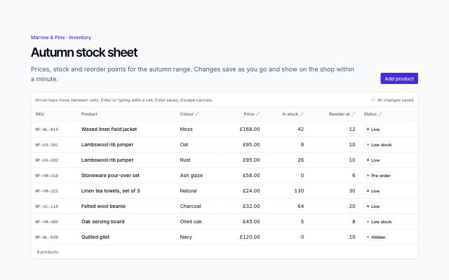
Inline-edit table
productA spreadsheet-like grid: arrow-key navigation, Enter or typing to edit a cell, number bounds with inline errors, status pickers, optimistic saves with a saving/saved indicator and undo.
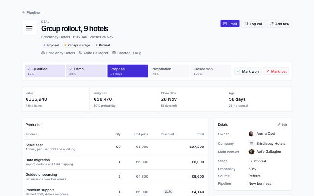
Deal page with stage path and line items
productA deal record: header with a stage path and won/lost actions, highlight figures, products with discounts and totals, the activity timeline, and an aside with details, stakeholders, pinned notes and next steps.
In Threadmere
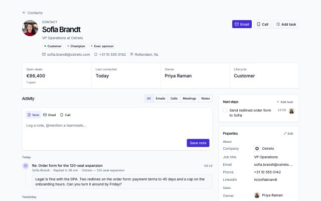
Record page with activity timeline
productA contact or company record: identity header with actions, highlight figures, an activity timeline with a note composer and kind filters, and an aside with next steps, properties and related records.
In Threadmere
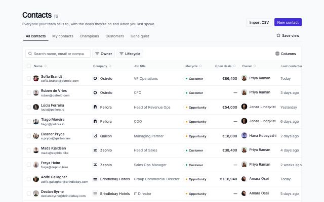
Record table with saved views
productA CRM list page: saved-view tabs, search, column filters with removable chips, a columns menu, sortable headers, row selection with a bulk action bar, row menus and pagination.
In Threadmere
Workflows · 6
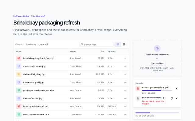
File upload and manager
productA shared project folder: a dropzone and file picker with per-file progress, retry and size limits, files as a list or a grid with search and row menus, an image preview dialog and a storage meter.
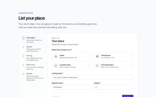
Multistep form wizard
productA long form split into steps: a stepper with complete, current and needs-attention states, choice cards and checkbox groups, per-step validation with an error summary, a review step with edit links, consent and a success state.
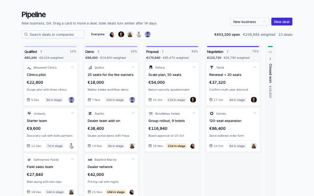
Pipeline board
productA sales pipeline as a kanban board: a column per stage with live count, value and weighted totals; deal cards with company, value, next step, close date, days in stage and owner; drag or menu to move; owner and search filters.
In Threadmere
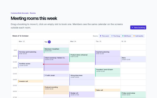
Week scheduler with drag to reschedule
productA week of time slots for a few rooms: bookings laid out side by side when they overlap, drag or arrow keys to reschedule, click an empty slot to book, a room filter, today's now line and a booking dialog.
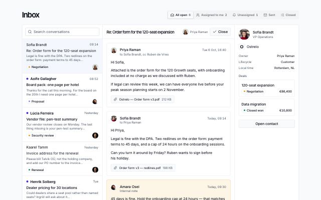
Shared inbox with thread and contact
productA team's shared email inbox: mailbox tabs with counts, a searchable conversation list with unread, tags and assignees, the open thread with attachments and internal notes, a reply or note composer, and the contact with their deals beside it.
In Threadmere
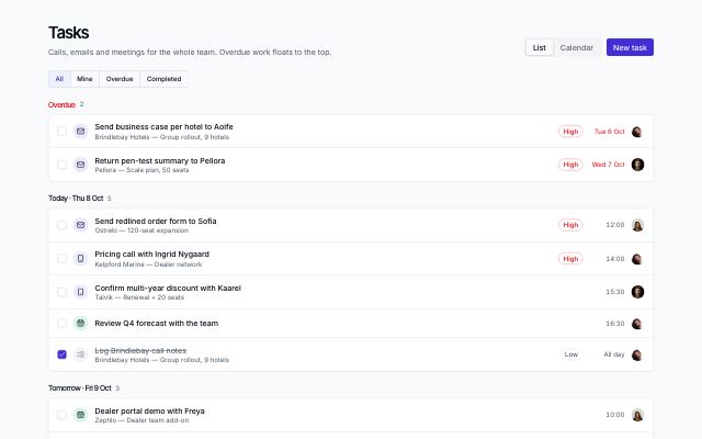
Task planner with agenda and calendar
productA team's tasks as an agenda grouped by due date (overdue first) with quick filters, kinds, priorities and done checkboxes, and a month calendar with event chips and a day panel.
In Threadmere
Settings & billing · 11
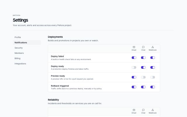
Notification settings matrix
productNotification preferences as a matrix: grouped events down the side, one switch per delivery channel across, plus a digest frequency and quiet hours.
In Rivetlane app
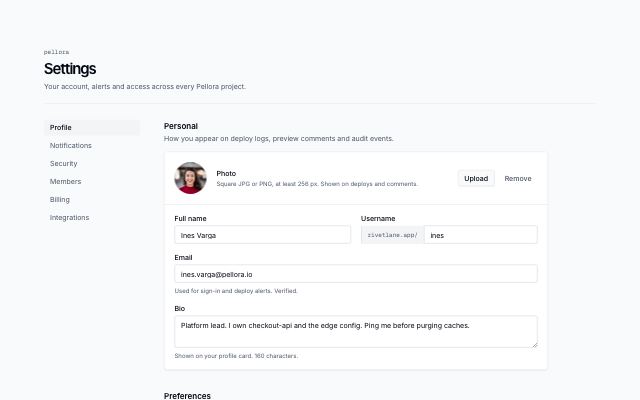
Profile settings
productAccount settings with a section nav: photo with upload and remove, personal fields, preferences with selects, and a save bar.
In Rivetlane app
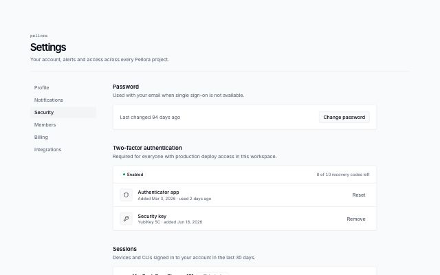
Security settings
productAccount security with a section nav: password, two-factor status and methods, signed-in sessions, masked API tokens in a table, and a danger zone.
In Rivetlane app
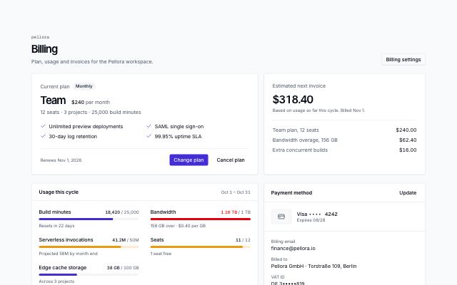
Subscription, usage and invoices
productA billing page: current plan with actions beside the estimated next invoice, usage meters that warn near the limit, the payment method as masked text, and an invoices table.
In Rivetlane app
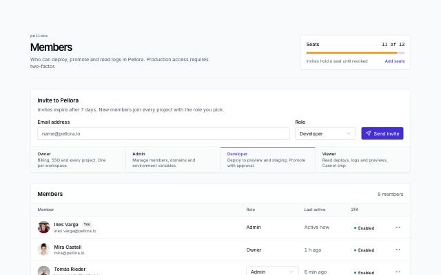
Team members with invites
productWorkspace members page: seat usage meter, invite form with role select and role legend, members list with role, last active and 2FA status, and pending invites with resend and revoke.
In Rivetlane app
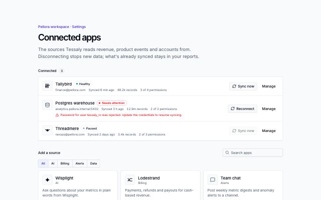
Connected apps management
productIntegrations settings: connected apps with status, account, last sync, records and granted permissions, sync now or reconnect, a manage sheet (permissions, sync frequency, pause, disconnect), and a filterable directory with a permission consent step.
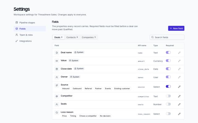
CRM settings: fields
productRecord fields per object (deals, contacts, companies) in tabs: type icon, API name, select options as chips, system-field locks and required switches, with search.
In Threadmere
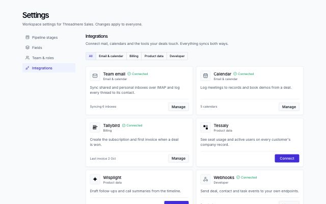
CRM settings: integrations
productIntegration cards filtered by category: mark or icon, description, connected state with a sync detail, connect or manage.
In Threadmere
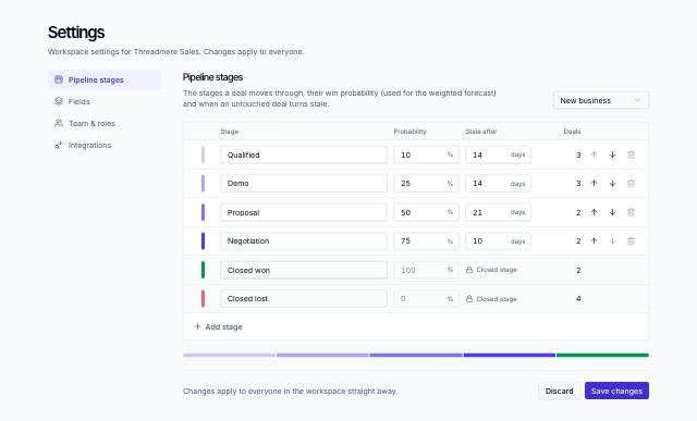
CRM settings: pipeline stages
productSettings for a sales pipeline: stages with editable names, win probability and stale-after days, reorder and remove (blocked while a stage holds deals), add a stage, closed won/lost locked at the end.
In Threadmere
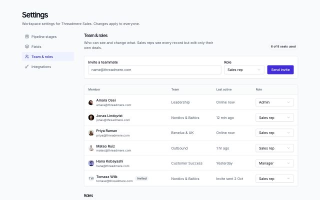
CRM settings: team and roles
productTeam settings: seat count, an invite form with role, the members table with per-member role selects and pending invites, and role cards explaining each permission level.
In Threadmere
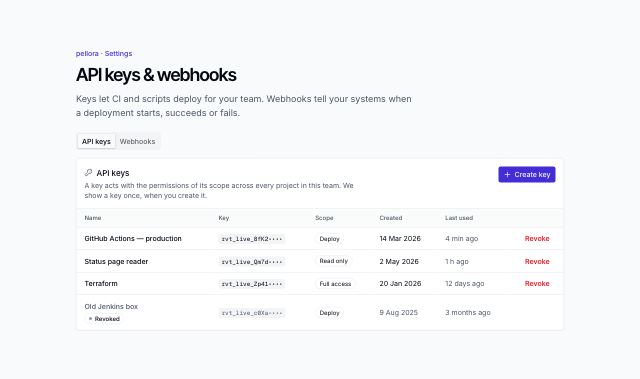
API keys and webhooks settings
productDeveloper settings in two tabs: API keys with scopes, a create dialog with a one-time reveal and copy, and revoke with confirmation; webhook endpoints with event selection and toggles, and recent deliveries with status, payloads and retry.
In Rivetlane app
Engagement · 8
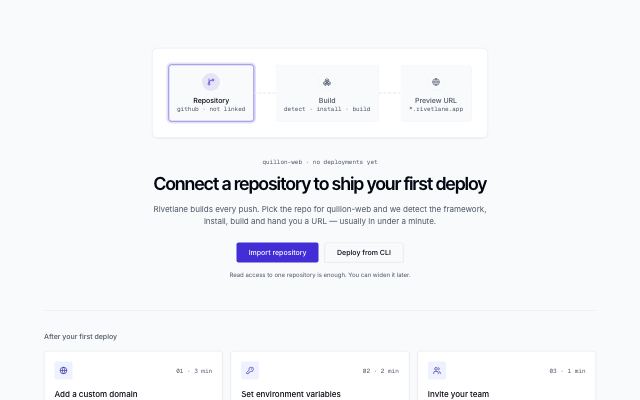
First-run empty state with next steps
productPipeline illustration over a centered title, primary and secondary actions and a note, followed by three numbered next-step cards.
In Rivetlane app
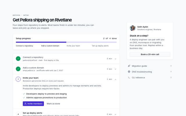
Setup checklist with progress
productFirst-run setup page: progress meter, expandable numbered steps with commands and sub-tasks, mark-as-done that advances to the next step and a completed state, plus a help card with a named engineer and docs links.
In Rivetlane app
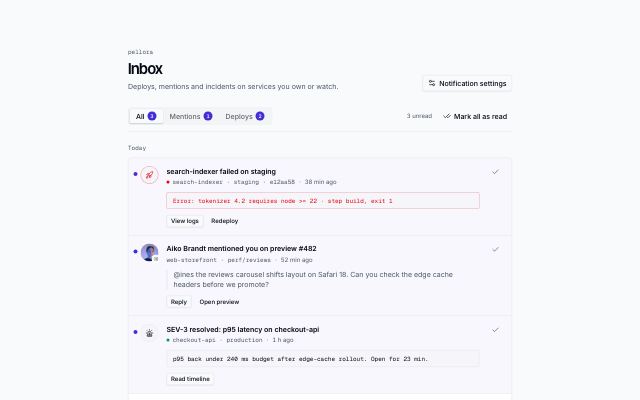
Notifications inbox
productInbox page with All / Mentions / Deploys tabs and unread counts, items grouped by day with unread markers, quoted mentions and log excerpts, inline actions and mark-all-read.
In Rivetlane app
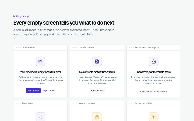
Empty states for an app
productA set of empty states drawn as app panels — first use, no results, inbox zero, no access, offline — each with its icon, a plain explanation and the one action that fixes it.
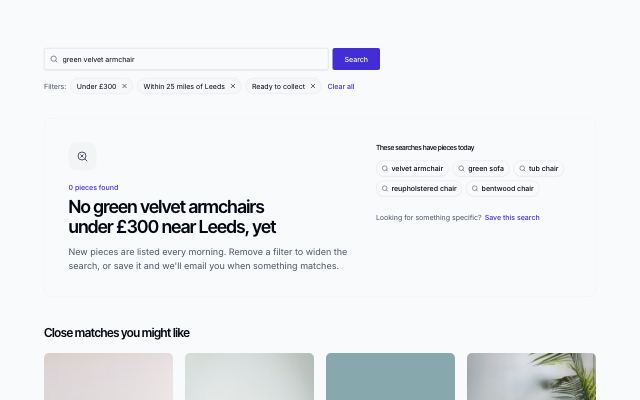
No search results with ways out
productA search that found nothing: the query kept in the box, removable filters and a clear-all link, searches that do have results, and close matches instead of an empty grid.
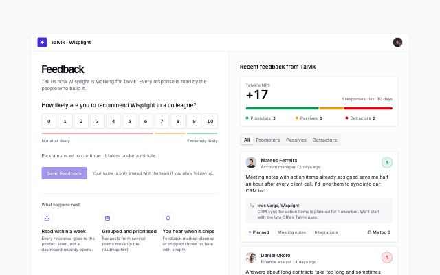
NPS survey with team feedback
productIn-app feedback page: a 0–10 recommendation scale whose follow-up question and reasons change with the score band, optional comment and follow-up consent, a thank-you recap you can edit, and the workspace's recent feedback with a live NPS, band filters, roadmap status, team replies and me-too votes.
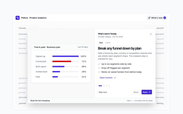
What's new tour over the app
productA release tour that opens over the dimmed product: one step per update with a chart, funnel, cohort or screen visual, progress dots, skip · back · next · done, arrow-key and Esc support, a changelog link, and an up-to-date bar with replay once it closes.
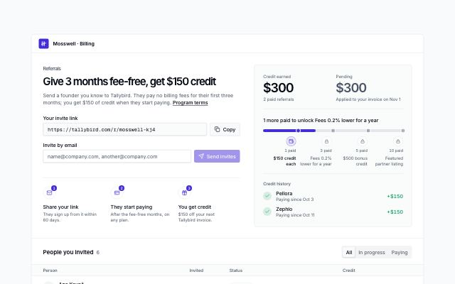
Referral program with rewards
productIn-app referral page: the offer, a personal invite link with copy, email invites that validate and join the list, credit earned and pending, a tier track to the next reward, and the people invited with their status, credit, resend and cancel.
AI · 8
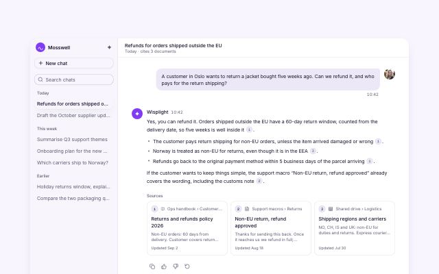
AI chat conversation with citations
productAssistant console: recent threads in a sidebar (a sheet on mobile), a question and a cited answer whose numbered markers link to source cards, feedback actions, follow-up suggestions and a composer with attach and model select.
In Wisplight
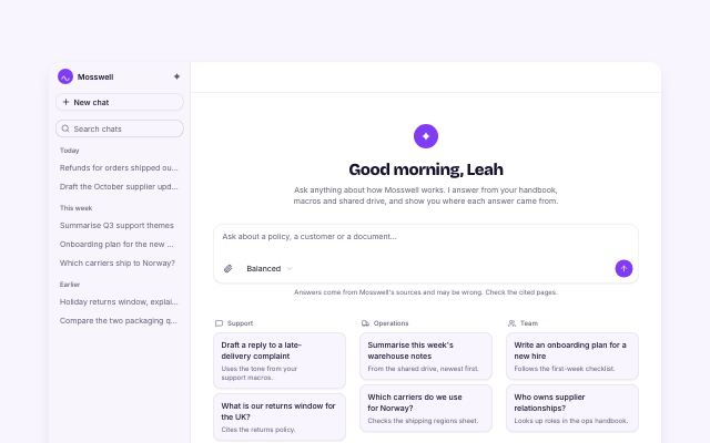
AI chat new-chat prompts
productNew-chat state of the assistant console: greeting, composer with attach and model select, prompt starter cards grouped by use case that fill the composer, and connected sources with sync status.
In Wisplight
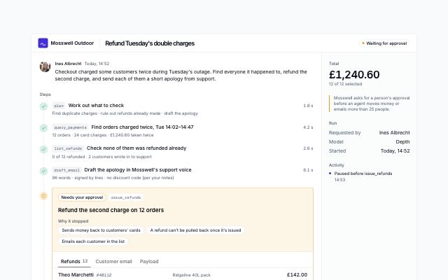
Agent run paused for approval
productAn AI agent run stopped before a risky tool call: the steps so far, the paused call with its line items, the email it would send and the live payload, approve, edit (leave items out, rewrite the message with a diff) or reject with a reason, then the rest of the run plays out with an activity log.
In Wisplight
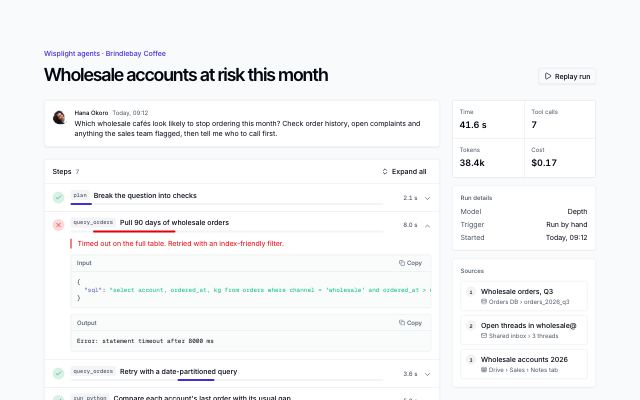
Agent run with tool-call steps
productOne AI agent run laid open: the task, expandable tool-call steps with statuses, timing bars, input and output with copy, a failed call and its retry, a replay, then the cited answer, sources and run totals.
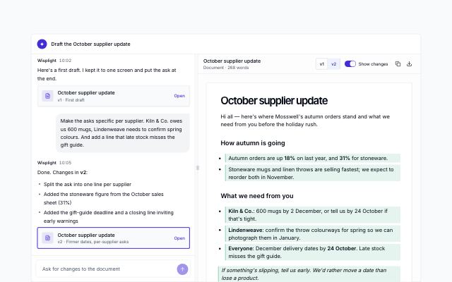
Chat beside a document preview
productA conversation next to the document it is writing: a resizable split (drag or arrow keys) on wide screens and tabs on small ones, version cards in the chat, version switching, highlighted changes, copy and download.
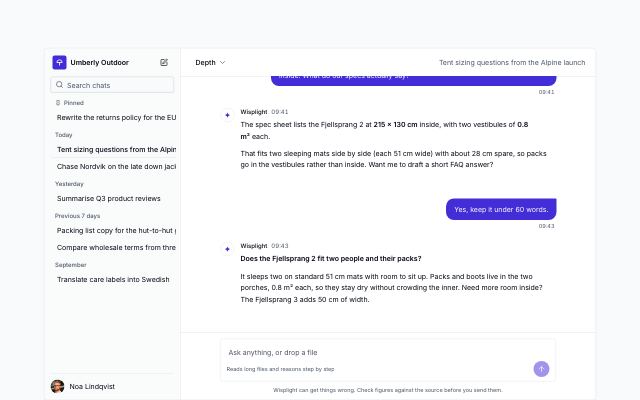
Chat with history sidebar
productAn assistant app with its conversation history: pinned and dated threads with live search, rename, pin and delete, new chat with suggestions, a model picker, multi-turn replies, copy and regenerate.
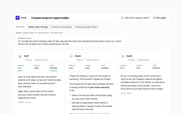
Model setups compared side by side
productThe same test prompts answered by two or three model setups in columns: latency, tokens and cost with the fastest and cheapest flagged, star ratings, a blind mode that hides which setup is which, a timed re-run, a scoreboard across test cases and a winner that becomes the default.
In Wisplight
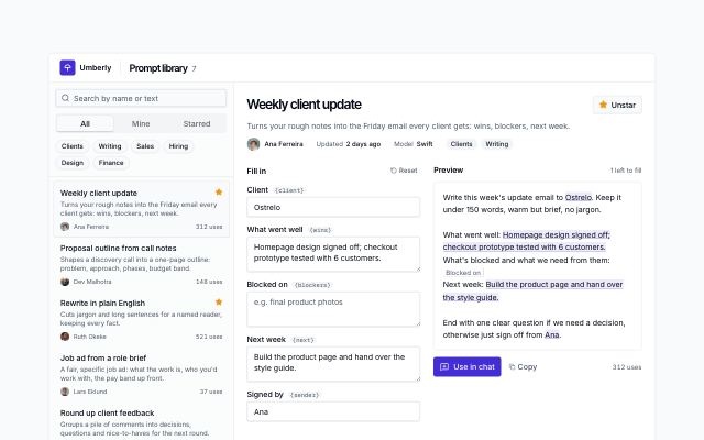
Team prompt library with variables
productA team's saved AI prompts: search, all · mine · starred and tag filters, owners and use counts, then the open prompt with a form for its variables, a live preview that marks filled and missing blanks, copy, use in chat and star.
In Wisplight
Guides · 4
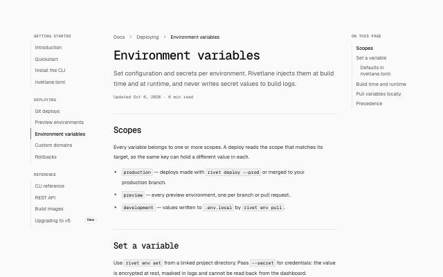
Docs page with nav tree and table of contents
productThree-column docs page: sectioned nav tree, an article built from typed blocks (headings, paragraphs, code with copy, callouts, lists), a scroll-tracking "On this page" list, feedback, edit link and previous/next pager. The nav moves into a sheet and the TOC into an accordion on small screens.
In Rivetlane docs
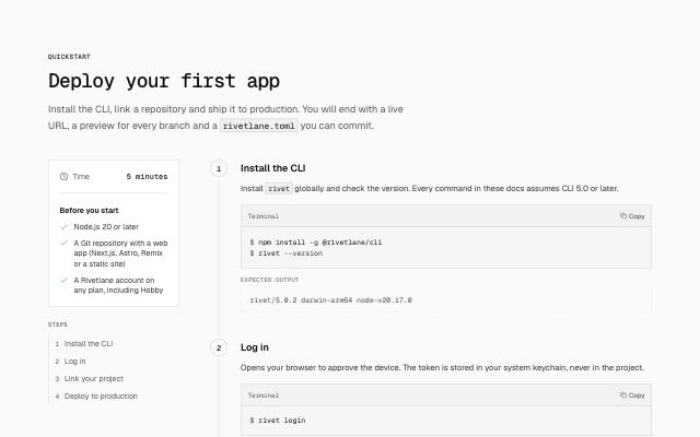
Quickstart with numbered steps
productA getting-started guide: time estimate and prerequisites beside a numbered rail of steps, each with a copyable command and the output to expect, ending in a "you're live" step with next links.
In Rivetlane docs, Hexmoor, Arbitrel
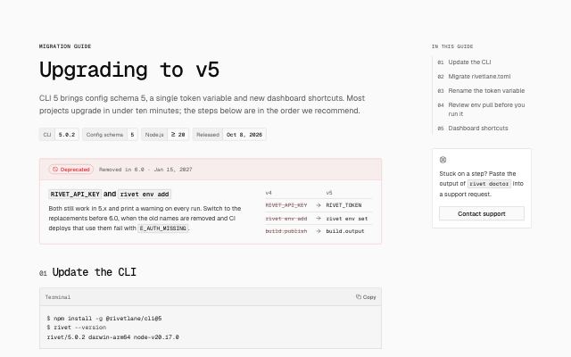
Migration guide with callouts and shortcut table
productA versioned migration page: version badge row, deprecation notice with old-to-new replacements, numbered steps using note, tip, warning and danger callouts with copyable commands, and a keyboard shortcut table marking what changed.
In Rivetlane docs
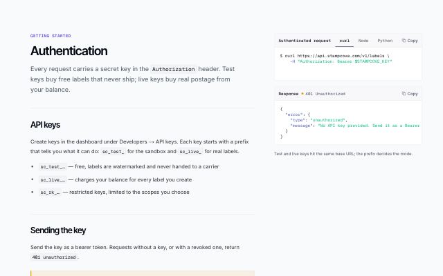
API guide with pinned code
productA guide page for API docs: headings, paragraphs, lists and callouts in the reading column, the request it describes pinned beside it in curl/Node/Python tabs with a response, and a previous/next pager.
In Stampcove API docs
Reference · 5
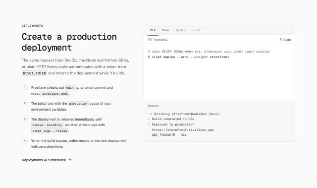
Multi-language code example with output
productAn explanation with numbered steps beside one code sample in several languages (CLI, Node, Python, curl): tabs, file label, copy button, light highlighting and the output or HTTP response each version produces.
In Rivetlane docs, Hexmoor, Lodestrand, Arbitrel
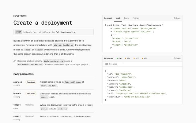
API endpoint reference
productOne REST endpoint: method and path, description, auth note and parameter tables (name, type, required, description) beside a sticky request example in several languages and response examples tabbed by status code.
In Rivetlane docs, Lodestrand, Stampcove API docs
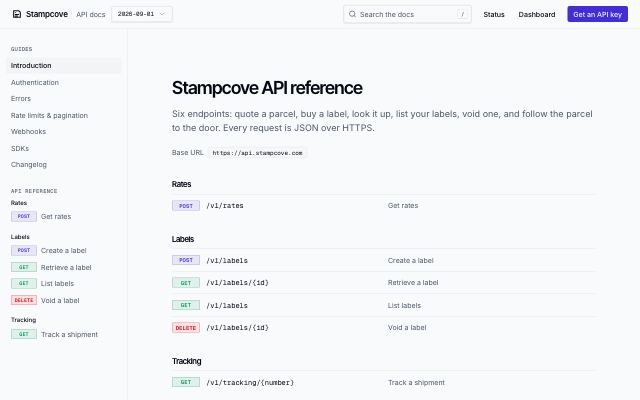
API docs frame with an endpoint sidebar
productThe frame of a reference-first API docs site: a sticky top bar with brand, API version, search and key links, and a sidebar of guides and endpoints grouped by resource with GET/POST/DELETE tags. As a site layout it wraps every page; alone it shows the endpoint index.
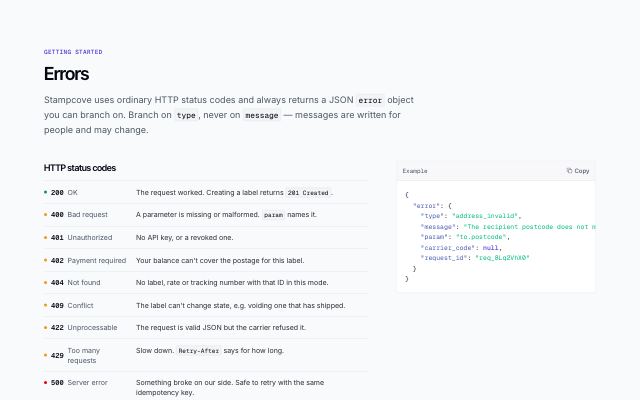
API errors reference
productThe errors page of API docs: the HTTP statuses the API returns with a tone dot each, the fields of the error object beside a pinned JSON example, and a table of every error type with its status, meaning and fix.
In Stampcove API docs
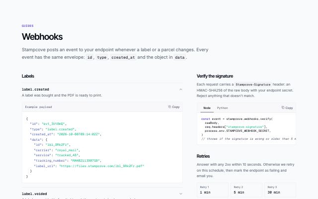
Webhook events catalog
productThe webhooks page of API docs: events grouped by resource, each expanding to its example payload, with signature verification in language tabs and the retry schedule pinned beside them.
In Stampcove API docs
Search · 1
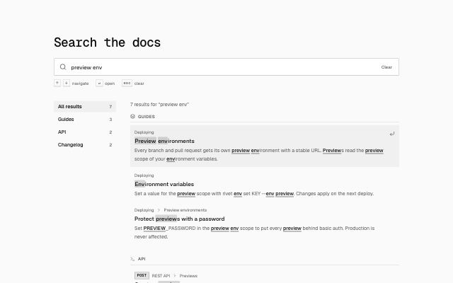
Errors & status · 5
404 with search and helpful links
productA centered 404 page: the status code as oversized display type, a message, a search field, and three or four cards linking to useful destinations.
404 with drawn lost-route illustration
productA split 404 page: message and search beside a drawn street grid whose route breaks off and whose destination tile, carrying the status code, has slipped out of place; below, popular destinations with icons and grouped link columns.
In Ampwick
404 with a photo, search and shortcuts
productA store or brand 404: status, apology and search on one side, a tall photo on the other, with icon shortcuts to the pages people usually want.
In Marrow & Pine
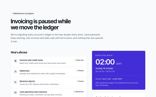
Maintenance or outage notice
productA maintenance or incident page: status pill and plain-language summary, the affected services with their state, a progress timeline, the expected-back time shown in the content's time zone (rendered on the server, with a second zone), an email form for the all-clear, and a link to the status page.
In Tallybird
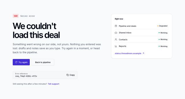
500 server error page
productA server error page: the code and what it means, what to try, an error reference with a copy button, and a live list of which parts of the product still work.
Confirmations · 2
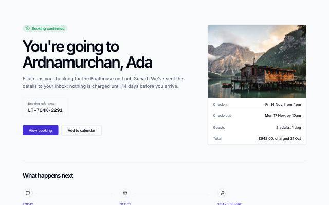
Booking confirmed with next steps
productA success page: status, a personal headline, the reference to keep and the way on beside a summary card (photo and booking facts), then a dated row of what happens next.
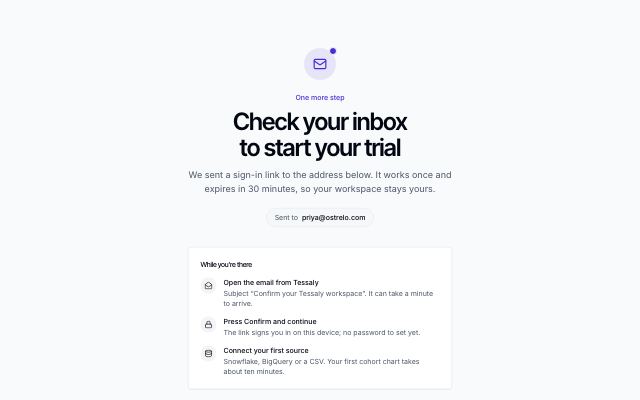
Verify your email
productA centred check-your-inbox state after sign-up: the address the link went to, three short steps, a resend button with a cooldown, a way to use a different address and a help line.